|
|
|
 |
|
 |
 |
 |
 |
| DM-CLAUSTROPHOBOPOLIS | | | Map Info |
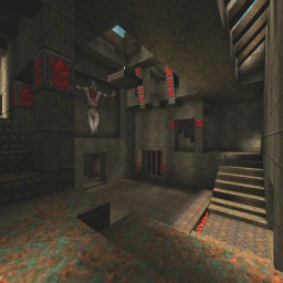
| | | | File Name | dmq1rfdm2.zip | | Author | redfist | | Gametype | UT Deathmatch | | Date Added | 12-31-2004 | | File Version | 1.00 | | File Size | 995 kb | | Player Count | 7 | | Map Description | This is another allmost exact redone level from Quake1.At the time I did some of these I didn't resize to fit UT, however it seems big enough. All you old Quake players will know this level. Bots work good, I added the redeemer way up high, and enhanced the textures by adding "detail" to them. All movers are there, and a different skyzone. Check it out. The original author is American McGee.
| | Review Rating | -- | | User Rating | 7 | | Overall Rating | -- |
|
|  | | | | Review |
| No review currently available for this map.
Click here to request a review of this map.
| | | | Map Comments |
| Kantham
01-09-2005 11:55 PM MST | | ho no
ramakes , always stupid quake 1 remake , i can't expect anything else from you redfist
| Magda
01-01-2005 09:11 AM MST | Rating: 8 | | Wow! I can't believe! I love this map and even now, in 2005 year i am still playing Quake. I think it's a good idea to make this wonderful map for UT. I'll have to check it out before rate it. Sounds great so now i can give it 8
| redfist
01-01-2005 10:43 PM MST | | Well,I aint gonna comment back on this level,other than I wish I would have upsized it properly.
And one cool thing was I got the bots to go across the top looping mover by attaching a health vial to it with "maxdesireability" set high,and fussy placement of the liftexits and liftcenter but they do make it across.And if there is funny bot activety,the lava zones and the size made it very difficult to get those bots to totaly act like they should.
Oh,this was a "DM" not a single player map.
Thanx to whoever checks it out,but it was one I never sent here,I figure some will appreciate it.
| Petrus
01-02-2005 08:39 AM MST | Rating: 6.5 | | I think it was a sense of nostalgia that motivated me to initially download this. After UT, I've tended to consider Q1 to be the greatest FPS in existence, all round.
The lighting is done well, in terms of using the skybox as a source. Redfist manages to get the shadow effects from sunlight coming down between beams that were more or less one of Q1's trademarks from what I remember. His enhancement of the textures seems to work fairly well also.
The lighting is a little bright, and personally I would have made uses in UT's lighting advances to add a little more darkness in places...but that's a minor quibble. He also doesn't set the red glyphs to unlit in order to give them a glowing appearance, or put red lights set to Special Lit in front of them, which he could have done.
In terms of the light-between-beams stuff...I've been experimenting with that, and he could have got some deeper/somwhat more realistic shadows if he'd made the distance between the skybox wall and the beams greater, and then put the light against the skybox wall...it would have made longer/deeper shadows. I was going to do it myself and re-upload the map, but he's intersected/merged all the brushes so it's not possible.
Not a map I'd play offline, but online could be interesting...I used to love Q1 online play myself.
| Hoose Bin Pharteen
01-10-2005 11:31 AM MST | Rating: 8 | | Excellent job redfist. Except for the opponents and the weaponry, I had a hard time telling the difference from the original. The bot pathing looks good, and they seem to travel freely for the most part, although I didn't see any of them traveling on the platforms moving over the lava. Not sure if that's a pathing issue or if there was simply nothing on the other side that they desired.
The sounds and textures were exactly as I remembered, which completed the trip into yesteryear. I think I would have experimented with a new texture for the lava, which could have added a little realism to the map. It was the same texture that Id used in the original, but even back then it tended to take away from the VR and made it feel a little more like an animated film than a real place. Dunno, that's just what I probably would have tried.
The skybox probably needed to be a little larger, as I could see the corners of the box itself, depending on what skylight I was looking up through.
All in all, it was a very good job. The pathing is good, textures appear to be well aligned, no bsp holes that I could see, no obstructions to movement, the triggers and movers all work correctly, sound and weapon placement is good. Plus, it's a pretty good bloodbath, which I appreciate.
BTW: Some people don't like remakes, in fact some people absolutely HATE remakes. Fine. Good for you. But you don't speak for the entire gaming community. To say that remakes like that are so wrong, is extremely presumptuous. They are so wrong, IN YOUR OPINION.
Being a good reviewer is more than just deciding if YOU like the map. Originality is only one aspect of the score. But I see a lot of people here that base their entire score, or a large part of it, on that one thing, and they ignore the fact that RedFist, in fact, is a talented mapmaker. Is he original? To be honest, not really. Neither am I. It's not as easy as people think to come up with a really original idea and make it fun as well. But he has the guts to keep putting his stuff out here and face the load of crap that invariably gets thrown at him. That takes some courage. Anyone who's done the same can relate. I do have a couple of original maps that are near completion, but it's pretty hard to be motivated to submit original maps around here when all you get in return is "this map sux" comments from those who don't even bother to back up their remarks with reasons. Even worse are the negatives from those who can't even MAKE maps. To me, that's like in the ice skating olympics, when the Hungarian judge decides that someone's Triple-Axle wasn't perfect. I'd like to see that old fart get out there on the ice and show us exactly how it should be done.
I'm fairly new here, so I don't know what all the history is regarding Redfist...and frankly, I don't care. All I know is, I downloaded Redfist's Claust map, and it's well done. As far as originality is concerned, I gave him a 0, since it was originally a Quake map. That's why in his total score he got an 8 instead of a 10. Otherwise, with the small exception of the skybox issue, which I mentioned, it's flawless. He did good on the pathing, the lighting, the sounds, the movers, etc. Yes, he used the old textures, but he already stated that he was doing that on purpose. He may not be very original, but he IS a good designer. It's not his fault if you didn't read the intro thoroughly.
FYI, I'm not biased in favor of all his maps. I didn't like his atro deck, for example. It's a little too lit up, some areas there don't appear to be light sources, I barely liked the deck-type maps as it is, and I just didn't generally enjoy it. Claust is different. It was meant to be a trip into the past, and IMO it succeeded. I wouldn't want to play nothing but old maps, or I'd just reinstall Quake and Quake 2. But occasionally I think it's kinda cool to be reminded of the FPS's roots.
| Lok
01-08-2005 10:21 PM MST | Rating: 5 | | why do you always create a remake?... Create your own
| NeoNite
01-09-2005 11:38 AM MST | | It's just like the Quake level, and that's what bothers me. Almost everything is...
The skybox, well I think it's inspired by Hellraiser?
Maybe.. it's not bad really. Sky is ugly though.
Why, why on earth did you use all the old textures? Look, I love playing Quake. All 3 quake games. I've been playing them for ages.
But this "staying true to the old" sentimental thing, I'll never understand this.
Things change. Graphics undergo major changes.
Look, take that water texture you've used from Quake.
IT'S HIDEOUS. It's always been hideous. At least in Quake it kinda worked. Water, slime or lava. It .. worked.
But to use this in UT, that's a major mistake.
As for the rest of the level, nothing new aside from the sky. Nothing new. Just the same old. Same old.
:-/
I don't mind the old levels I love playing being ported to UT, but at least they should be suitable for the game. Appropriate. It just doesn't really fit.
Ut also has gothic/dark textures. And I'm sure you can find good custom texture packs to "decorate" this level and give it a .. sigh.. fresh feel instead of the ooooooooold, boring same thing.
Feel free to ignore this, as you always do.
But conversions like these are so wrong :-/
| RayZidane
01-28-2005 03:01 PM MST | | ok redfist....maybe is time you make your own map!!
|

|
|
 |
 |
 |
 |
|
 |
|