|
|
|
 |
|
 |
 |
 |
 |
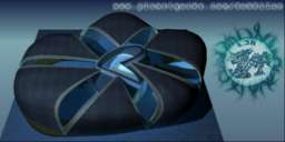
| DM-ModernHistory | | | Map Info |
| | | | File Name | dm-modernhistory.zip | | Author | Dubbilan | | Gametype | UT2k3 Deathmatch | | Date Added | 01-19-2003 | | File Version | 1.00 | | File Size | 7.26 mb | | Player Count | 4-8 | | Map Description | None | | Review Rating | 5 | | User Rating | 7 | | Overall Rating | 6.0 |
|
|  | | | | Review |
| | Reviewer | Mister_Prophet | Awe Score: | 1.0/3 | | Date | 01-21-2003 | Build Score: | 1.5/3 | | Review Schema | Cast Score: | 2.5/3 | | User Point: | +1 | | Overall Score: | 6.0/10 |
None of the pics of this map looked good when I took the request, but seeing all the positive reactions I decided that I might as well. Im glad I decided to play it, the map was much better than what I was expecting.
The Good. I usually rant about visuals first but Im gonna start with what interested me most about the map, gameplay. The map plays rather well, it remindes me of maps like Antalus, where you get a terrain zone with structures here and there. Theres a central area with a spiraling staircase that opens to catwalks on different levels. The whole layout besides that is centered around up and down terrain slopes, entrys/exits to buildings, and holes in walls, ect. The game went by rather fast paced, bots seemed to navigate the difficult looking environment pretty-ok, though a few had trouble in some terrain spots where they got snagged (very similiar to the the snagging that occurs in CTF-UnEarthed). While the bots fought decently, the best part of this map is the online playability. This map plays as fast as all of the epic maps, and should be popular on servers. The layout is better then the UT2003 epic maps, theres more places to dodge to, run too, jump to, ambush from, and attack from than the usual generic map. You can be attacked from anywhere at anytime, this map requires you to constantly be on the run and that keeps the momentum upbeat the whole time. Weapons could be placed a little more in reach tho.
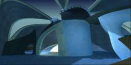
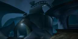
The OK. The map is supposed to be a decaying musuem for organic art, all that remains is a bunch of organic structures, mostly fragmented, and gravel. Lights are all around and cast well used emitter trails. Lighting is so so, used obviously, but without too much substance. The map looks rather dim and blue-gray the whole time. It is a tad average in the looks department but unlike DM-LightFalls, another user map that employs the organic mesh theme, this one uses the organic structures PROPERLY. They are placed to set the entire layout and encompass the whole map in one big twisted decaying mass of rock and dirt. All and all, the visuals are repititive. The detail isnt really advanced, it looks good enough not to be completely fugly, but it seems empty. I would have liked to see plants growing over the old structures, hanging vines, peices of glass, puddles from old rains in certain parts of the terrain, other crap. What IS here really doesnt suit the theme too well. You get more of a sense that youre in a big organic looking shell with wierd lights here and there, rather than feeling like youre in an ancient museum that has been battered by time, weather, and age. There isnt any wow in this place.
The Bad: Sound is bleak, the only sound I noticed was the music and the killing effects. With no real sound fx + the so so visual appeal, the map lacks atmoshphere. The few inventively placed mist effects dont nearly make up for the lack of a developed visual appeal. These things would have really given the map that needed boost, but without them the map lacks a sense of location. And the sky is aweful, making a big box with fog isnt the way to go. Why not add a destroyed city around the map, or something more fitting to the fossilized building idea? Its also possible to go outside the map and into the terrain, the collision needs work.
The Prophets Verdict: This map offers a pretty good game, the gameplay is more hectic than any of those UT2003 maps, but not without the occasional snags. Collision on the outer structures are rather underdeveloped and dead bodies go through them. Theme sounds good on paper but is unevolved in this map, even with custom stuff. The map feels similar to Antalus only with better gameplay and without the impressive visual effects or that certain sense of identity.
To the Author: I would gladly update this review if a newer version includes a more evolved visual theme, I would really like to see this concept come full circle. |
| |
No review screenshot available |
|
| | | | Map Comments |
| Desperado#2
01-19-2003 10:37 PM MST | Rating: 8 | | This map is very intresting and the gameplay is not bad. I like the design part most though... It is more openion of an 8 on this one it just looks so different from other maps.
If I was taking the review a little more on the technical aspects this would be 7 becuase the background looks pretty dull and some snags in a few little areas. Also the lack of trims where trims could have been added. Besides those this map is so different than any map I have seen and that is the special part of this.
| LondonsDArkestChild
01-21-2003 12:14 PM MST | Rating: 9 | | This map is fantastic, its possibly the most innovative use of architecture styles ive ever seen in a map, original to the point of a new style of map. It flows extremely smooth with excellent framerates, and despite its size you can work a good number of bots into and still have a good match. I cant decide wether i like this more than Lightfalls/Nightfalls, but i think it definately deserves ownage, if not for the gameplay then for the sheer technical ability of making a map like this.
| Doctor Nick
01-22-2003 01:06 PM MST | Rating: 9 | | A brilliant map. Possibly the first 'true' 0wnage contender in a long time. The author has perfectly married the ideals of a wonderful looking original map with brilliant gameplay. The architecture on this map is second to none, and the bot play is good. There is also a good amount of z and weapon placement is, again, brilliant. A must for anyones HD!
EDIT: I have just found a revised version of the map at unrealplayground.com with the bug fixes. now theres no excuse not to own it :D
| {DAM}MoxNix
01-21-2003 04:30 PM MST | Rating: 4 | | Wierd map... Very wierd. Poor flow, poor item placement, terrible lighting and sticky in spots, but I give it an extra point for originality.
It actually looks better from outside the map (as in the first screenshot)than inside the map.
| Hourences
01-21-2003 09:17 PM MST | Rating: 5 | | 5.5
ok new meshes, but the lightning has problems, and the map lacks a lot of sound, and the general thematic execution
I had to go look in the readme to see what it's actually suppose to be, other then 1 art statue somewhere in the middle of the map theres not much there to indiciate what kind of enviroment the map has.
pretty soulless
but gameplay is cool, tho could be better on some places, but it works.
but the graphics are so damn boring
| Luggage
01-22-2003 11:31 AM MST | Rating: 9 | | Great map, this is a 9 for architectural concept and style. It oozes style! :) Very original indeed. And Proph - I think you shouldn't complain on what could be added: Design is knowing when something can be left away. (among other stuff) :)
Gameplay is okish.
Technically - from a mapper's point of view - this would probably get a 6 from me. Some occlusion problems too, but nothing noticable due to the overall low polycount. The meshes are functional, but as Dubbilan himself pointed out, he's got a collision problem going on there. It was best described by Checker, so let me quote:
"UT2003 editor tips: Staticmesh Collision
Collision is one of the more complicated things. First there is per polygon collision (UseSimpleBoxCollision=False). But because of the small polygons in most staticmeshes this can cause some slowdown. So thats why simple collision was added.
You can add this simple collision in different ways. The easiest is to make a box, add the staticmesh and with normal BSP make a simple shape that covers the staticmesh. Intersect this shape with the builder brush, then select both the Builder brush and staticmesh, right click and save brush as collision.
In the staticmesh browser under view enable collision, and now you can see a wireframe of the collision mesh IF that staticmesh has one. In the collision tools you can also make primitive shapes as collision, but i prefer the other method i discribed.
SimpleboxCollision means: use the simple collision mesh for walking on the staticmesh.
SimpleKarmaCollision means: use the simple collision mesh for karma (this is on by default, if you don't have a simple collision mesh karma bodies will fall through the mesh)
SimpleLineCollision means: use the simple collision mesh for line traces (gun fire)
Some brushes are impossible to make a simple collision brush for. If this is the case you can just set all the simple collision properties to False on that staticmesh. But its best to only do this one meshes with large polygons.
Now your staticmesh will have all the right properties, remember to save the package !!
You can always go into the properties of a staticmesh and change the collision attributes per instance. You can play with the settings BlockKarma (logical) BlockZeroExtendTraces (Gun fire, zero extend is line trace) BlockNonZeroExtendTraces (everything else including player)."
- Source: Checker's Chapel (http://members.ams.chello.nl/b.frank/)
...just for anyone else who runs into this problem.
All in all I give this a 9. Because I like it.
| Gui
01-22-2003 08:22 PM MST | Rating: 8 | | 7.5
Very nice and powerful atmosphere whose "unrealism" is particularly worth of note and also well executed (I played the version2 which fixes the Karma issues). Reminds me the feeling of some scenes from "The Time Machine" by H.G. wells.
Good gameplay despite some minor gaps concerning flow and item placement, though more z-axis could have been a plus. Handles very well duel games -both 1on1 and 2on2- but plays better FFA with the minimum recommended playerload.
A keeper.
| starscream
01-25-2003 01:47 PM MST | Rating: 9 | | Prophet's failed to realize that the concept behind this is architecture over anything else, which is why "the detail isn't really advanced". I feel this barren-ness plus the lack of sound effects give the map a uniquely 'dead' atmosphere; and considering the story behind the map, this is exactly what I'd call an "evolved theme", Prophet.
Gameplay wise, the map's far more fast-paced than the majority of those that shipped with the game. The only thing I'd like to see different is the positioning of the playerstarts, moving them away from the action-areas (as you're often spat out next to a fully equipped bot/player). Also, there's been little consideration for ut2k3's 'special moves', particularly the stafe-dodge and double-jump - but since the author's just moved over from QIII mapping, this shortcoming's readily acceptable.
Excellent map.
**edit - dunno if this is allowed, but, anywho, here's the links to the collision-fixed versions of this map, hosted on unrealplayground.com (DM and DOM respectively):
http://www.unrealplayground.com/download.php?mapid=1909
http://www.unrealplayground.com/download.php?mapid=1907
| Geddy
01-25-2003 12:44 PM MST | Rating: 8 | | Simply put, this guy knows what he is doing.
| David Spalinski
02-05-2003 06:32 PM MST | Rating: 6 | | its ok. some collision issues and bugs. not bad, ok for gameplay. over pretty solid, could have been polished a little more. a brave undertaking though.
| yupalisk
04-18-2003 09:04 PM MDT | Rating: 5 | | Passable gameplay, very original shape, but with originality, comes funky sticky areas. Many a time you will find yourself either falling into or backing up a corner where there is no return (i.e. stuck). Needs some flow reworking as well. One thing I noticed was that my triple-rocket friend loved the rockets being on the top of the map, so he could load it up and plunge the full triple on top of someone's head. :)
| Obi-Wan
06-17-2003 03:14 PM MDT | Rating: 5 | | yah nice too look at, but that's about it...gameplay sucks ***
|

|
|
 |
 |
 |
 |
|
 |
|