|
|
|
 |
|
 |
 |
 |
 |
| DM-1on1-Ferkin | | | Map Info |
| | | | File Name | dm-1on1-ferkin.zip | | Author | gk | | Gametype | UT2k4 Deathmatch | | Date Added | 05-18-2005 | | File Version | 1.00 | | File Size | 3.8 mb | | Player Count | 2 | | Map Description | This is the second version of my map DM-1on1-Trinity. I fixed some bugs, added more details and ambientsounds. Itemplacing and lighting are also changed..
This map is quite small, like Trinity, too small maybe. But I think the gameplay and flow is pretty cool. There are some dark places, don't know why the lights didn't lit them correct. Well, I think it's a good one..
Have Fun | | Review Rating | 6.5 | | User Rating | 6 | | Overall Rating | 6.5 |
|
|  | | | | Review |
|
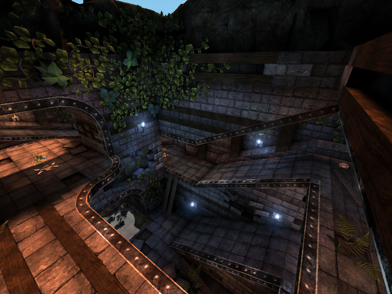
DM-1on1-Ferkin (UT2004)
A 1on1 map very reminiscent of UT2K4's shipped retail 1on1 maps like 1on1-Spirit. It's similar in layout, however it uses the albatross motif and doesn't quite measure up to its inspiration.
AWE: 2.0
The texture work is fairly good. There are some misalignments and there is also some missing trim. The missing wall bricks and deconstructed floor tiles are well done. The texture color palette is predominantly brown, from the stone walls, stone tile floor, wood supports, and rock/dirt poke-throughs. On the plus side, the pallete is broken up by green vine meshes snaking their way around the map which really helps bring the decaying building theme home and provides some much needed variation to the map's color scheme. Another source of variation is the placement of blue crystals shining soft blue light on the surrounding area. Although a nice idea aesthetically, they don't quite seem to belong - they don't seem well integrated into the map. Perhaps recessed cavities would have been a better way to merge them with the map rather then (seemlingly) random placement against almost flat rock/dirt areas.
As for the lighting, we have a mid to late afternoon setting. The sunlight shining in is rather heavily colored as only sunlight at dusk and dawn are, and does create a little bit of shadow work inside the map. I think expanding on the architecture more and creating broken arches or other 'overhanging' building detail could have made much more entrancing lgiht and shadow opportunities. The darker areas of the map are lit by torches. However, the torches are split between blue and yellow and although the author obviously tried to remain consistent with their placement, there are some yellow torches in places where they should be blue and vice-versa. Also, I didn't really get the feeling like they were casting light - the areas with the blue torches seemed a bit ambient lit. Finally, the torch emitters were moving too slowly to strongly indicate a flame.
The architecture was nice overall. I liked the rounded edging and the feel of a series of rectables was nicely reduced by the curves, and also by the added irregularities in the walls and floor. However, when using such an organic theme of a broken building slowly being invaded by nature, I found the overall forms too rectilinear. Also, although one can see the supports along the walls for the overhanging building segments, they still feel largely unsupported and I think moving them to the outside edges of the 'corridors' would have accentuated the overall architecture. Also, as stated in the lighting section, something arching over the top of the open sections would also have aided in bringing home the gestalt of the overall form.
In sum, the overall theme is well-executed but lacking polish overall. The texutre and trim work is good, but there are some discrepancies. The vines are very nice but the crystals could have been integrated better. The lighting is decent but was missing possible drama and the flames are a little inconsistant. Finally the architecture was a nice beginning but felt largely unfinished.
BUILD: 2.0
The map is built well. It's properly zoned, the BSP work is just fine, the pathing works fine, and the meshes are built in with no problem. In terms of the overall build, There are really only two things I think are worth mentioning - and one is mostly inconsequential. In terms of optimization the zoning works just fine. The map performs at retail and above FPS so I can't complain about the overall optimization, however, I think the author could have placed an antiportal in the center chunk of BSP in order to bring the FPS fully above retail wherever one goes. However, as I said, this is largely inconsequential considering the map plays at or above retail wherever one goes.
The complaint I have is with the ambient sound. The torches have a nice torch sound associated with them, however, it sounds too fast in comparison to how the torches are moving. At the top of the map, there's a nice wind and jungle sound combined together. Aside from these, I couldn't really hear any other sound aside from 1 water sound. More general ambience, and possibly some more triggered sounds on the dodge-ramp boards would have helped pull the theme together more. As for the water sounds, there's a nice triggered splashing as one runs through the water, but a really big problem is that the general water ambient sound somehow got placed in the wrong location. The lovely splashing sound the author chose is on the bottom of the map, diagonally opposite from the actual pool of water and is completely seperated by the central BSP spoke, and the two rooms on either side seperating the two areas.
Overall the build is good, but an antiportal could have increased the FPS, and the sounds don't meet their full potential. The misplacement of the water sound is really dissapointing.
CAST: 2.5
Just like the layouts from the retail maps it mirrors so strongly, Ferkin does have some good gameplay to reccomend it. However, there are some fairly significant problems that prevent it from being a true 1on1 map. The fisrt problem is with the aural quality of the map. A significant part of a 1on1 map is audio clues as to your opponent's position. This map does have a smattering of these in widely spaced health pickups, a cluster of vials, the weapon pickups, and the water. However, the remainder of the map s almost devoid of vials and adrenaline which could have been strategically placed in order to enhance the aural landscape of the map. Granted, the map is small enough that you almost don't need these. In fact the map borders on almost too small seeing as there's no place to escape to. Another sigificant difference from the retail 1on1s is the lack of speedy ascension opportunities. If I recall correctly, all the retail 1on1s had at least one lift in order to quickly get from the lowest level to the second level with the possibility of a lift jump to the top most. This map relagates the player to the surrounding ramps in order to ascend the map which leaves the top of the map a very easy place to control. Considering the lightning gun and the 100 shield are on the top level, this means that whatever player is not on the top level, is going to be at a severe disadvantage. Unless the lower player is an elite shock whore or has unerring accuracy with a parabolic flak ball, the higher player will most likely control the map for the entire game. One final complaint is the positioning of the 100 shield. On the retail 1on1 maps, it's always placed carefully in a dead end, or high above the map on a narrow ledge, or someplace that exposes the player trying to get it to some sort of danger. In this map, it's sitting flat in the open with no risk to grab it.
For a 1on1 map, the gameaplay is a bit disappointing. The higher area is too easy to control, the shield is too easy to grab, there's no easy way to ascend the map, and the layout overall is too similar to many of the retail 1on1 maps to really be considered a completely original piece. I think the best way to play this map would be not as a 1on1 but more as a 3 or 4 player limit. This would reduce the superiority of the upper level, however, on the downside, the map is so small that this might be too much at the same time.
The map has some good gameplay in general, but it lacks the tuning necessary for a true 1on1 map.
To put the map in perspective, it's attractive, fairly well built, and does offer some fun fragging. However, the map as a whole from the texturing, trimming, lighting, architecture, sound, and gameplay all feels a bit unpolished. The FPS is good, and nothing's truely bad - but it doesn't reach its full potential. |
| |
| | | | Map Comments |
| Hourences
05-18-2005 04:19 PM MDT | | 256*256 or 256*128 in resolution
Like UED
| Defeat
05-24-2005 12:35 AM MDT | | >Looks pretty cool from the pics even though they're a bit stretched. Will d/l and give some feedback.
---------------------------------------------------------
Hey you fixed the pics, still haven't gotten enough time to d/l, still going to though.
| D-7
05-20-2005 07:34 AM MDT | Rating: 6 | | After DLing and playing this and DM-1on1-Trinity I see now what were the differences.
Visuals:
-added crystals - why the ****? It's easy to mix it with vials / blue brightskin players from the eyewink
-curved the edges a bit - nice touch, but less visibility from up to the bottom.
Gameplay:
-removed the 50A from below, removed and rewamped vials and health a bit.
I don't really think it's better now.
You turned a hardly balanced map to a totally unbalanced one. Gameplay goes: grab flak, get on top, run around in circles, control the 100A (which is now the only shield) and pwn the opponent with flak sec. He cannot do nothing. No headshots, since it's also on the top, grabbing the shock can also easily prevented with a flakball. No chances for the one on the bottom.
IMO if you wanted to improve Trinity, you should have done the following:
-remove all ammo, the map is too small for any. The basic ammo that comes with the weapon should be enough.
-remove 100A shield from above, and place the 50A to the middle in the bottom. No visual contact from above, and it makes harder to control both the height and the shield, which are the 2 basic strategic points here.
-switch LG to bio. Fits better for this map.
-remove those silly crystals.
-make the ceiling for the ramps higher.
-prevent players to get on the upper corner of the map with a shieldjump to hide and wait for the time to run out or just to snipe.
I'll give you a 6 for now, there's lots of stuff to tweak!
| Nimbostratus
05-19-2005 04:26 PM MDT | Rating: 5.5 | | Nice 1-on-1 map. Could stand to be a little bit (well, maybe more than a little bit) bigger, but its good enough. Nice job on the ambient sounds and overall look of the map. Only thing that really bothered me was the lack of music.
| souldividersjosz
05-20-2005 07:02 AM MDT | Rating: 5.5 | | Looks nice, but plays cramped
| Purity Kin
05-20-2005 08:23 AM MDT | | //no comment: reply to first post)-
i find some map makers from south east asia area's (such as Australia and New Zealand) dont get screenshots up immedietly because of the time differnce between the U.S. and Australia. ive noticed it takes around 8-12 hours for me and my *Bue Humans* map making community to add sshots to our maps. simply because we are sleeping when they are added to the list.
| cUnNiNg_StUnTs
05-22-2005 07:16 PM MDT | Rating: 7 | | Some nice 1on1 game play there. The theme isn't one of my favorites but it works.
| gk
06-04-2005 06:10 AM MDT | | Hey, thanks for the review! I will try to make the gameplay stuff better next time..
| niX
06-05-2005 11:19 PM MDT | Rating: 5 | | that Mine pillar texture is over rated
| goldfenix
07-08-2005 07:29 PM MDT | Rating: 7.5 | | I liked this map the second it loaded up. Not because it uses Albatross textures and theme, but becasue it was a neat spitting image of 1on1 Spirit. I really like it, except those boards that squeek even though there on a flat surface. That was cheezy, but the map isn't, it's very awesome.
| redfist
07-09-2005 01:10 PM MDT | | The screenies be looking too much like DM-Achilies.
Level may be fine,just a comment.
| CursedSoul1
07-09-2005 04:05 PM MDT | Rating: 6.5 | | certainly nice :)
|

|
|
 |
 |
 |
 |
|
 |
|