|
|
|
 |
|
 |
 |
 |
 |
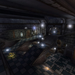
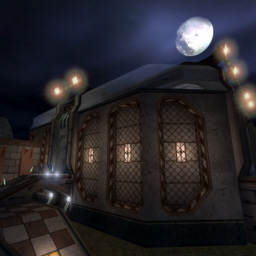
| DM-Ferrea | | | Map Info |
| | | | File Name | dm-ferrea.zip | | Author | Revelation | | Gametype | UT Deathmatch | | Date Added | 05-22-2006 | | File Version | 1.00 | | File Size | 4.69 mb | | Player Count | 4 - 6 | | Map Description | An old facility reopened as a Tournament arena... What else should I tell you?!^^
========================================
Before anyone starts complaining about, I need to explain the following:
There is no CloudZone. I didn't forget it, but you might know how big zone-portals, like CloudZones need, kill the performance. So in that case, I decided for a better playability instead of pure realism.
========================================
Special thanks to:
- Hourences, for the texture-pack "HourPitores" that I used. After everyone says how cool these textures are, I wanted to try myself, and I must say, it's hard to map with them, but they look great!
- Pomperi, for telling me how to put meshes into "MyLevel". I used this method here for the weapon bases.
========================================
Something funny about the name: At first, the map was named "DM-Corrosion", unfortunatelly I noticed too late that there already exists a map with this name on Nalicity. So I had to think of another name, when I had already finished the map itself, and because I'm uncreative, I simply used the Latin word for "Corrosion; Rust": Ferrea!^^ | | Review Rating | 6.5 | | User Rating | 7.5 | | Overall Rating | 7.5 |
|
|  | | | | Review |
|
DM-Ferrea
by Revelation
AWE: 2.5
BUILD: 2.0
CAST: 2.0
ADRENALINE RATING: 4/5
RECOMMENDED NUMBER OF PLAYERS: 4-6
GNOME: Another day, another review by everyone's favorite hosts, Gnome and Sapper.
SAPPER: Why is it your name always goes before my name?
GNOME: It sounds better.
SAPPER: Will it still sound better after I drill a hole in your lip?
GNOME: ...I don't want to answer that question.
THE AWE FACTOR
GNOME: The visuals in the map are wonderful. Excellent texture use throughout and a varied design that allows players to easily know where they are and where they want to go at all times. Lighting seemed appropriate and consistent throughout and was exactly what you'd expect it to be if this place were real.
SAPPER: Although the overall theme of the map was well presented, I didn't really find the correlation with the name. It wasn't particularly rusty or old. I think 'weathered' would have been a better adjective upon which to relate a name to this map.
GNOME: I think the weapon emplacements were a bit overdone, but at least there is a logic to having them. I does have a minor effect on gameplay when you're moving about and see one and think its someone in a shield coming after you only to find out it was merely a weapon emplacement and that it distracted you long enough to get fragged from behind.
SAPPER: I hate that!
GNOME: I liked the nodes used in DM-Xenome much better, far less distracting but just as easy to see.
THE BUILD
GNOME: Okay, let's work on this one part at a time. First: sound. Time has been taken to put about a dozen different sounds in providing a more realistic experience...not that you'll notice them if your music is too loud or if you're yelling at your computer for all the frags Osss-10 Hunter is making on you.
SAPPER: Yeah well...maps like this are maps where he really excels...ticks me off.
GNOME: Music. Standard epic track, however, given the gameplay of the map, a slightly faster and harder beat would have been more appropriate.
SAPPER: I'm thinking something like a W.A.S.P. concert finale...with or without the lyrics.
GNOME: Brushwork. Unfortunately, we're going to have to guess at the brushwork due to Revelation undying need to delete all his brushes before he uploads his maps. And for the sheer fact that we are afterall a review site, the Build score does suffer 0.5 as a result. At any rate, based on our explorations of the map, most of the brushes were relatively basic. Simple construction letting the lighting and textures do all the work.
SAPPER: There is a zealous use of zones here. Movers function exactly as intended. No design flaws or structural defects to mention. It is in fact reminiscent of another map we reviewed which was lost due to the crash, so I can't even remember what is was called. It's good, but it'll take more work and a redesign to be excellent.
THE CAST
GNOME: Between the two of us (or one of us depending on your point of view), Kabraxis, and Osss-10 Hunter, we usually include anywhere from 2 to 6 beefed up bots to suit our gameplay style.
SAPPER: What are you saying? That I'm a figment of someone's imagination? That's ridiculus. The would be like talking to myself. Throw you in and that like arguing with myself.
GNOME: On this particular map, Osss-10 Hunter raped everyone including the bots.
SAPPER: And the bots kicked the crap out of us. Seriously, how does he do so well on maps like this and yet can't keep up on, shall we say, flatter maps?
GNOME: Z-axis play is everywhere. Almost seems built exclusive for jumpers.
SAPPER: And let's not forget about all the ramps...more ramps than you'll find in a cripples' hospital.
GNOME: Will you please stop interrupting my every sentence!
SAPPER: ...
GNOME: Finally, we have flow. As we mentioned before, the map is keenly designed to allow players to know where they are and where they want to go so flow is quite smooth. And it's not very hard to find a weapon, though considering the map size and testing it out with different numbers of players, we definately feel there are a few too many weapons and perhaps some too close together.
SAPPER: So what if I interrupt every two or three sentences?
GNOME: It has always been a rule that we maintain. You should not be able to see another weapon spawning point while you're standing on one...unless you're like on top of a building there's some big obstacle between them. Straight lines to more weapons are out.
SAPPER: Health packs and vials are also green instead of blue for some reason...not sure way Rev decided to do that. Certainly doesn't seem necessary.
OVERALL
GNOME: I would have to say that this is a pretty good map. Visually is it superior to classic epic maps, design and gameplay wise however it is somewhat lacking.
SAPPER: It won't be making our rotation, but it was close. |
| |
| | | | Map Comments |
| Schrodinger
05-22-2006 02:15 PM MDT | Rating: 8.5 | | Wow, another map from Rev, going to download this one !
EDIT :
Well, awesome job here, very nice architecture and layout, nice item placements and meshes (i loove the redeemer place ;)) and very good z-axis.
But something is bad, there are two rocket launchers and two sniper rifles, and the weapons are too closest.
And, I don't like the sound track, but it's personnal :D
So, it's a very great map, good job dude ! ;)
| Idren
05-22-2006 03:08 PM MDT | Rating: 8.5 | | Excellent map! The bots will kick your ass!
| cooloola
05-22-2006 04:13 PM MDT | Rating: 5 | | I was very disappointed by this map.
The architecture is very good and lighting is also nice, although the coronas were too damn big. Visuall this map is top notch but sadly i cannot say the same about the gameplay. Let me start off with the small things; firstly those weapon pick-ups are overdone and a bit exagerated, there were just too many effects to know which weapon it is or even if there was a weapon, and the coronas got in the way too often in the midst of battles. There were lots of bits snagged while running and more often while jumping. Plus the corridors were generally too tight and polys were way too high, i mean the average poly count is probably 560 and peaks over 900, that's a bit too much IMO. Whatever was left by the flow crumbles under the weight of the weapon placement: there is a deemer, a U Damp, a Shield Belt, an armor, thigh pads, and two rocket launchers and health is almost absent in the whole map. Sorry Rev but this map just doesn't feel right at all.
@Rev
Thx for understanding and I just felt that this doesn't stand up to your better maps (Erebus and Nyx). I also would like to add that my score is subjective so if I were to review I would have scored higher
| Revelation
05-23-2006 04:23 AM MDT | | @cooloola: Well, you may be right about the weapon bases, it's really hard to see which weapon is there. Problem is, I placed the weapons, so I know where they are, and I simply didn't notice that fact.
Polycounts are high, of course, but the map still runs very fine for me, and if a map runs fine, I would never make it look less interesting by reducing the polycounts.
And about the weapons: I PLANED to place many weapons and not that much health, simply because this what makes fast gameplay imho. I personally don't like maps where you sneak around collecting health and armor until you have 150/199, then start to fight, notice you are close to die, run away and start collecting health again.
I tested the map many times, and imho it has the fastest gameplay of all maps I've built so far (except Nyx).
Don't get me wrong, I won't say anything against your rating, everyone has his own taste. I only say, I wouldn't have rated down a map because of these facts.
[edit] Let's make a deal: You review EternalSands and leave Ferrea to someone else ;)
@The others: Well... THX:D
| redfist
05-22-2006 05:17 PM MDT | | Your basicaly right, but, once I see I am dieing I run away to hunt down health.If too few health it gets frustrating fast.I think a place to go for things is also a good place to get swacked.
low health-run for health-no health spawned yet-holys__t swak swak swak, dead.LoL.I probably put too much health in maps, but I donta.wanna.die.
| z0rr0
05-23-2006 04:11 AM MDT | Rating: 9.5 | | why should there be more health when you have belt, armor and two thigh pads?? i think it's perfect as it is. great map all toghether!
| TheDane
02-10-2008 10:27 AM MST | Rating: 5 | | What i can't possible make out is why Revelation doesn't map for ut2k4? It's like every map he makes is an imitation of a standard ut2k4 deathmatch map. I don't fall for all the cool textures and crappy weapon pickup effects .... they do not add good gameplay. I agree on the statement that Hourences textures are good, but seeing how they are used in this map makes me think: Here's an author who might need to get back to basics.
This map features an avarage gameplay compared to other maps in it's class, the rating on this is way too high. And even the author think he can make a deal on who to review his map? man, it's a game, map for the gamers, do not map for other mappers who only looks at the map in editor to drewl over your skills. If the map is unplayable to most players by the killing polycount, you should reduce it, or make it for an engine capable of running such map @ ut2k4.
I wasn't gonna comment this but .....
A talented mapper, but wasting the talent on the wrong game.
| Manticore
03-12-2008 09:04 AM MDT | Rating: 7.5 | | It's amazing that I've had this map on my system for a couple of years and haven't made a comment on it.
As much as it looks good and the frame rates are good the layout does it for me. The tight confines and the open rocket arena mix makes for a decent flow and some variety in the gameplay.
Nice one....
| darkdt
04-17-2008 05:56 PM MDT | Rating: 9.5 | | Niceeeee ........ the aparience is of a 1on1 x)
|

|
|
 |
 |
 |
 |
|
 |
|