|
|
|
 |
|
 |
 |
 |
 |
| CTF-Damned | | | Map Info |
| | | | File Name | ctf-damned_v1.2.zip | | Author | Axeminister | | Gametype | UT Capture the Flag | | Date Added | 05-23-2006 | | File Version | 2.10 | | File Size | 907 kb | | Player Count | 6 - 8 | | Map Description | Updated...
Small to medium ctf castle indoor map :)
My first attempt at CTF | | Review Rating | 4.5 | | User Rating | 7 | | Overall Rating | 5.5 |
|
|  | | | | Review |
|
CTF-Damned
by Axeminister
AWE: 1.5
BUILD: 1.5
CAST: 1.5
ADRENALINE RATING: 3/5
RECOMMENDED NUMBER OF PLAYERS: 8
GNOME: Hey everybody! It's been awhile since our last review. Things have been going up and down for us but we finally have time to commit to a some reviews. We've built a to-do list of sorts. We're going to review most of the recent content uploaded and then we'll hit all the request queue's in the archives.
SAPPER: Right, after having spent the greater portion of the lasst six months getting ganked all across Azeroth...not saying that we haven't done our fair share ourselves, it's time for a change of scenery.
THE STORY
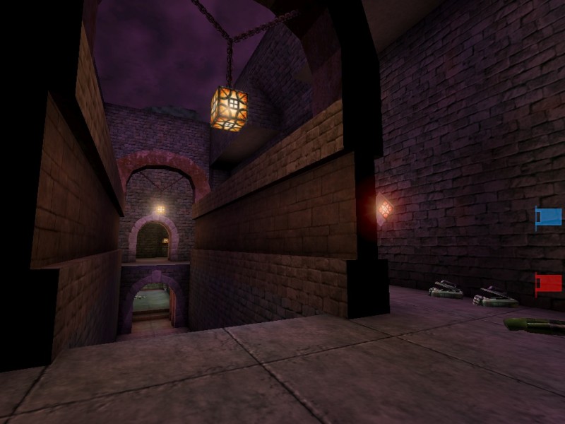
GNOME: There are three places of torment you might expect to visit if you live a life of evil and then die. The first of course is Hell, which despite its obvious sanction of dwelling in fiery depths for all eternity, it does in fact have an architectually appealling quality that is rare to find. The second place is Purgatory, which is kind of like a layover on your way to Hell. The food isn't really bad, but you'll get bored to tears trying to find anything interesting at all in this tiny train station. Last but not least, there is the Damned. This is where people go who couldn't go up and were too average to get into hell. So, in a way...it's just like living in Queens.
SAPPER: God...that actually sounds WORSE than Hell...
THE AWE FACTOR
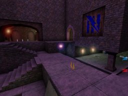
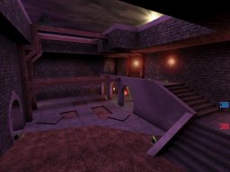
GNOME: This map is average in pretty much every way. Nothing about the architecture was particularly impressive or interesting. Although theme was present, it was quite bland.
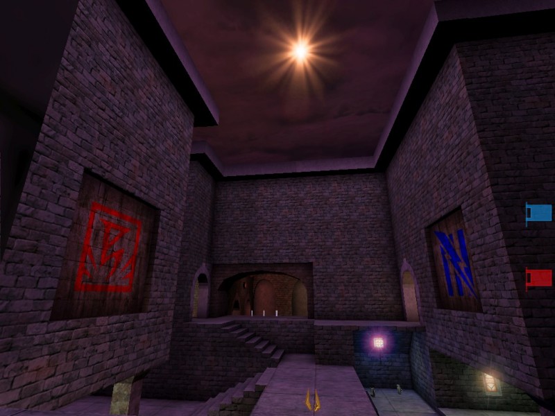
SAPPER: The use of sick purple lighting is really starting to grate on me. There is a star in the sky which you can see from our first capture that has somewhat of an orange to it. This map would have been much warmer and appealing had the lighting represented that.
THE BUILD
GNOME: Again, nothing unique or out of the ordinary worth mentioning. The map is perfectly symmetrical right down to the piles of dirt in the flag rooms. Zoning is good however and the author has clearly shown a good understanding of how to make a map and the elements that need to be present.
SAPPER: Couple of lifts in the map complete with sound. No flaws or defects that we noticed. Again, not bad but not great.
THE CAST
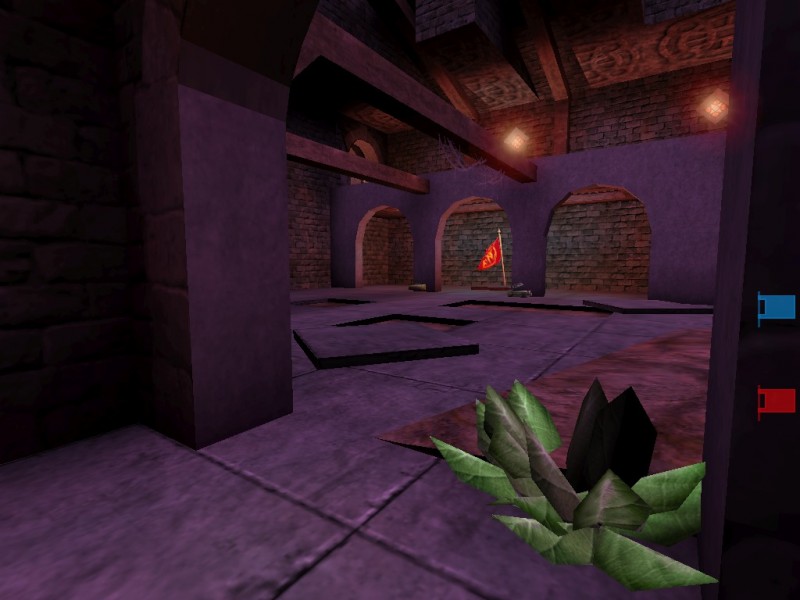
GNOME: This is one of those maps where the gameplay suffers somewhat as a result of the layout and design. Given the size and make-up the ideal number of players for this map is 8, however because there are so many different routes between bases and several out of the way areas to get good stuff like the flak, playing this map as a CTF would require upping the capture limit to 7 or 8 as well.
SAPPER: Except the map is so average that we're betting most people wouldn't want to stick around that long. Item placement is good but the flow lacks.
OVERALL
SAPPER: Axeminister should have called his map CTF-Average.
GNOME: For a first map, it's definately a good attempt. Keep it up Axe! |
| |
| | | | Map Comments |
| XYZ8000
05-22-2006 01:18 PM MDT | | Avoid dead ends. Don't make anti-flow thongs (corners (e.g. the PulseGun zone), low beams and lamps, unnecessary lifts, dead ends...).
Add details to the map (especially ceilings. Now it looks too cubic). The lighting can be better.
Add a power-up in the center of the map (maybe a UDamage).
Make it symmetric. The broken floor's tile in the center is in different position for red and blue.
Add more ammo. And place it near the appropriate weapon (not all the ammo).
For the bots: they can follow different ways only if there is some AlternatePaths (Actor - NavigationPoint - AlternatePath). You don't need to place them how pathnodes, you can place them in some points that the bots can cross returning with (or searching) the flag.
Without AlternatePaths, the bots tend to follow the shorter way to the flag.
Place another weapon in the Flag Room instead the RL. There is already the ShockRifle. Maybe a PulseGun or a Ripper... you can place the RL in the center and the Rip where the Pulse is, and after move the Pulse in the Flag Room (where the RL is now)....
Not a bad map.
.:| EDIT |:.
Yes, I mean that Dead-end. The broken tile makes it less dangerous, but you place here only two ammo packs... maybe you can move the two 20+ health packs...
I don't love also the Shocky position, but it's acceptable.
remember that it's my opinion, and the 99% of UT players can have different preferences.
.:| EDIT |:.
Better...
But you can't stop me!
- You've placed some AlternatePaths, but they don't work for red team because you assigned them to the green team (Team 2). change it in 0.
- Some lights are too bright and product greeeeeeeeen. (read DavidM lights tutorial: http://www.planetunreal.com/teamvortex/davidm/tutorials.htm)
- There is a BSP error in the red base's terrain. (Duplicate the blue's terrain and read Hourences's tutorials: http://www.hourences.com/ and http://phalanx.planetunreal.gamespy.com/tut's/tutorial_bsp.htm)
- The bots cannot defend the base well (place more DefensePoints, and set the team and priority for each one. (I suggest a defensepoint (or more) near the two 20+ HP near the flag with priority 192 and give to other DefPoints smaller priority.
- Don't use colored Lens Flares. Use only the LensFlares 3 and 6 (I prefer the 3) of the GenFX.utx
- I don't see Ripper ammo for the blue base...
- Don't use PNG images. 3.5 MB Zip with 800 KB map zipped? JPEG...
I like the layout and weapon placement. Keep up the good work.
If you need tutorials, go to this site: Wiki.beyondunreal.com .
:EDIT:
I forgot some things: you can change the map name when you change the versior (so call it CTF-Damned-V120.unr or siomething similar) or it can generate troubles if it runs on a server and peole have different versions of the map.
To try the flow of a map I usually use this cheat: play the map without bots, open the console and type Slomo 4 and run around the map. If you don't find mistakes at this speed the map has got a really excellent flow :)
| Axeminister
05-06-2008 03:01 AM MDT | | Thanks for the hints!
Now im working at this map and i have already fixed path nodes, weapon placing, exchanged two lifts for stairs and now im on the details (ceillings and lighting).
Oh, and i have one question. Of wchich dead end do you speak? You mean that one in the center with ammo (PG & RL)?
Soon i'll update..
P.S: This is my first attepmt at CTF
#edit# UPDATED!
#edit2#
- AlternatePaths - fixed
- I searched for greening but didn't find any. Im blind ;) Tell me please where is it so i can fix it.
- There is a BSP error in the red base's terrain no more :)
- more DefensePoints placed
- I think there is no need for changing colored flares. I think now it looks good...
- missing Ripper ammo added
- exchanged ThighPads with BladeHoppers and PMammo from Dead-end
#EDIT
Version 1.2 is coming right up...
#EDIT
Sir! Something strange has appeared on our radars! Sir, it's Nalicity! IT'S ALIVE!
Lol, nice to see something is still going on on N3 :) Don't stop. And thanks for the review, i won't stop mapping :P
| security
05-20-2006 12:38 AM MDT | Rating: 7 | | first attempt, nice. it looks very good! keep it coming
| West
05-23-2006 12:54 AM MDT | Rating: 7 | | Yes, quite a nice little map. Could use a bit more detail in places -- too much plain brick walls, you know -- but other than that I like it very much. I didn't find any greening either to be honest... maybe that has been fixed? Overall I found the lighting to be very good, actually. Will try this in MP with a friend of mine and our trusty bots tonight, I'll add some more feedback to this comment after that.
Keep up the good work!
| darkdt
05-02-2008 09:06 PM MDT | Rating: 8 | | good :)
| KurtonTheMagician
05-05-2008 09:26 PM MDT | Rating: 6.5 | | Gets a bit boring rather fast.
Still, first maps are like that.
|

|
|
 |
 |
 |
 |
|
 |
|