|
|
|
 |
|
 |
 |
 |
 |
| DM-1on1-Mati | | | Map Info |
| | | | File Name | dm-1on1-mati.zip | | Author | Kantham | | Gametype | UT2k4 Deathmatch | | Date Added | 03-25-2006 | | File Version | 1.00 | | File Size | 5.02 mb | | Player Count | Unknown | | Map Description | None | | Review Rating | -- | | User Rating | 5.5 | | Overall Rating | -- |
|
|  | | | | Review |
| No review currently available for this map.
Click here to request a review of this map.
| | | | Map Comments |
| Wesley "Boreas" van Dijk
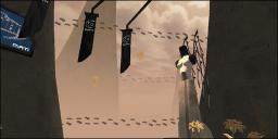
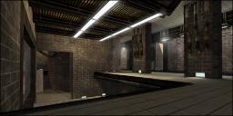
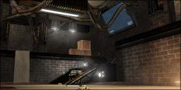
03-25-2006 07:11 AM MST | Rating: 5 | | Yikes, this map looks far from finished to me.
-Player count is still set to default 6-10, while the map is intended for 1on1.
-The map description is incomplete.
-The skybox has ugly seams showing.
-Outside, you get blocked by invisible things where it seems possible to keep on walking.
-When going back in, you almost get blinded by the coronas.
-Above the health pack near the minigun, light/texture combination is extremely bright. I saw this in many more places in the map.
-Health is poorly distributed.
-Map contains far too much adrenaline.
-The size fits 3-5 players better.
-The black/yellow trim texture used above the pit is horribly alligned.
-When you shoot someone into the pit, you don't get a frag, but it counts as a suicide.
-Rocket Launcher and flak cannon are simply too close to eachother.
-Texture usage is poor, the blackish ramps with health vials on them (near flak/biorifle) contrast really bad with the light textures around them. Not properly alligned as well.
-Lifts stay open for far too long.
-The lower part of the thin pipe meshes (the stretched looking part of the mesh) next to the Double Damage lift look pink/purple from a small distance. WTF?
-Parts of the hallways look very cubish without any detail in them.
All in all, I feel like I just had a look at a beta...
| nELs0n
03-25-2006 12:05 PM MST | Rating: 6 | | some of the things i noticed have already been covered by what wesley said so i won't say it again.
i noticed that the invisible block outside also blocks the secondary of the asmd.
the lighting in general could use a little more variation imo and because of the bright textures the compression shows pretty clearly (which isn't your fault but rgb might have solved this).
it also felt like the overall scaling was a bit off but that could just be me...
still, i somehow like the theme/setting and think this has some potential.
maybe wait for some more comments and then make a se or something?!
| Turns2Ashes
03-26-2006 09:40 PM MST | Rating: 6 | | Bad for 1v1 play. Shields are too close and near the lightning which, conveniently enough, sits on a ledge that overlooks more than half the map.
Why can't you shoot people off the 100a area?
@redfist: This is Kantham we're talking about though. If you don't remember, he released a map and then soon after released the same map with nothing but texture changes to up the size of the map by 20 MB (or whatever it was). :P
| Manticore
03-25-2006 06:36 PM MST | | I just downloaded this again from here as opposed to the version from Atari Forums and I still don't get any brickwork deco at all.
The map appears totally different to the screenshots. What gives?
| dahaka
03-25-2006 08:17 PM MST | | like said above, the map seems completely unfinished.
more like an early beta than a final map... so i'll give no score this time.
| GTD-Carthage
03-26-2006 03:40 AM MST | | The news tablet in the main site explains this map is "easy-on-the-eyes" so it really looks unfinished in order not to look too complicated.
| Kantham
03-26-2006 10:16 AM MST | | Version 2 on the way, with all things gathered from forums to forums. Will add the brick work texture instead, and i'll try to push the walls a littel bit to add some details.
| redfist
03-26-2006 01:02 PM MST | | You know, I don't believe in versions 2 3 4 5, after torching my quake1 maps etc etc there is NO excuse for having to fix things.
I see it happening more and more around here, all that watsed bandwidth and hard drive space all because the kids don't know how to map.
Wish nalicity would crackdown on this.
| CyMek
04-04-2006 11:00 PM MDT | | Tried the map, and I agree with a lot of what was said above. I really gotta say though, it just seemed really disjointed, like a salvador dahli painting. Some of the stuff I erally liked, some of it I didn't. Some things, like the custom wire meshes were well done.
I didn't much care for the way the map flows, but if it was bigger it would be suitable for DM, though not 1v1s necessarily.
|

|
|
 |
 |
 |
 |
|
 |
|