|
|
|
 |
|
 |
 |
 |
 |
| CTF-Assidaria | | | Map Info |
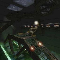
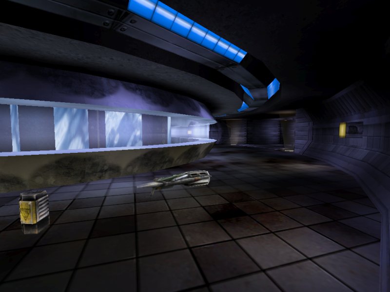
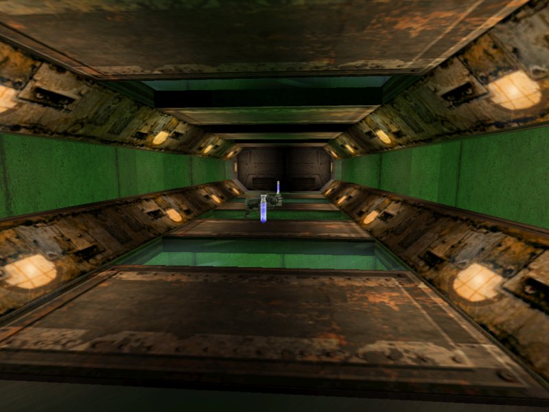
| | | | File Name | ctf-assidaria.zip | | Author | Thunderstrike | | Gametype | UT Capture the Flag | | Date Added | 03-06-2006 | | File Version | 1.00 | | File Size | 6.7 mb | | Player Count | 6-12 | | Map Description | Bathed in opalescent blue moonlight, the Assidaria Effluent Processing Plant is thrown into sharp shadows. The highly corrosive effluent carresses its concrete containment with a sickening green fluorescence, whilst the darker areas are illuminated with palid yellow stabs of artificial light. Tendrils of decay seep into every aspect of the plant, and even the last bastion of purity, the Cryonics Section, is now beginning to fall victim to their insidious invasion. Step with care, but never let it slow you down, for you have a flag to capture amidst the acrid atmosphere of Assidaria.
Make sure you read the text file for important information regarding the custom code contained in this level! :) | | Review Rating | 6.5 | | User Rating | 7.5 | | Overall Rating | 7.5 |
|
|  | | | | Review |
| | Reviewer | Ironblayde | Awe Score: | 2.5/3 | | Date | 03-16-2006 | Build Score: | 2.5/3 | | Review Schema | Cast Score: | 1.5/3 | | User Point: | +1 | | Overall Score: | 7.5/10 |
AWE: 2.5
I beta tested CTF-Assidaria sometime in the middle of 2004. Until a few weeks ago I'd been out of the loop for quite some time, so I assumed that the map had long since been released -â imagine my surprise when I saw that it was just recently finished! I thought I was the only one who took two years to finish a map.
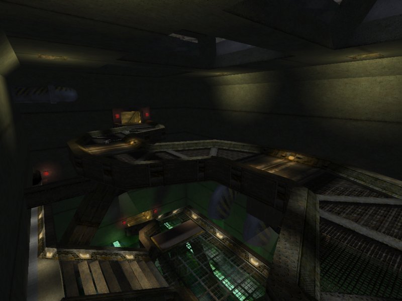
Anyway, what we have here is an attractive, medium-sized facility processing some kind of industrial waste. There are custom textures everywhere, taken from several different sources, and the author's used them well. If the central area looks different enough from the extremities of the map to give you pause, there are still enough architectural similarities that the facility as a whole is believable. Speaking of which, the architecture as a whole is quite good. I especially like how massive and sturdy everything looks, particularly in the areas right outside the flag rooms. The author's description of his level makes it out to be a pretty dangerous place, and the architecture reflects this, giving the impression that it was built to withstand a lot of abuse.
The lighting looks nice as well. The color choices all work perfectly and provide enough contrast to keep things looking interesting. The author has used a lot of spotlights to make each light fixture's area of effect a little more obvious, and the result is a lighting scheme more interesting than most. There are even a few places where there are light fixtures slowly swinging from their supports, and the light they cast shifts as they move. Pretty cool!
I have only a few complaints in this department. First, the large, slime-filled room outside each flag room relies a little too much on zone lighting at the corners. I seem to be saying this a lot lately, but a little more contrast there would have been welcome. This might mean adding a few more light fixtures, or simply placing a very low-brightness, high-radius light under the ceiling to simulate the light coming in from the skylights and reflecting off interior surfaces. Second, the boundary between two zones is sometimes too evident where the two use different colors of zone light and there isn't enough other lighting to hide the disparity. The other thing I wasn't crazy about was the use of coronas. Most of them have an unusually low draw distance, and some are larger than is usual as well. So you'll be walking through the map when suddenly a set of coronas flares into life in front of you, which is certainly not what you'd expect to see. The effect is not being used believably. It would be nice to have the draw distance turned up to a more usual level, and the coronas themselves considerably reduced in size. Perhaps the author turned the draw distance down out of concern for performance, which I could understand, but even then, the size reduction would have helped reduce the strangeness of their sudden appearance somewhat.
BUILD: 2.5
One of the first things I noticed upon playing this game for the first time is that much of the standard text has been replaced, which is not something you see every day. Thunderstrike apparently got sick of seeing all the same messages over and over, so he subclassed all the weapons and ammo pickups and gave them custom text. Now when you pick up the GES BioRifle, the message is, "Can you GES what this is?" Unreal puns, how I love thee. Nor is that all. There are also custom messages for the various degrees of killing sprees, and for all flag events. A couple of these get pretty silly, but something different is always interesting. The problem is that the actors which provide the custom messages do so by resetting the default properties for various classes in the game, which is not good. This means that once you load CTF-Assidaria, the killing spree and flag event messages will persist until you shut the game down, even if you start playing another map. An embedded mutator would have been a better way to go; such an approach could have provided the same functionality without this rather unpleasant side effect.
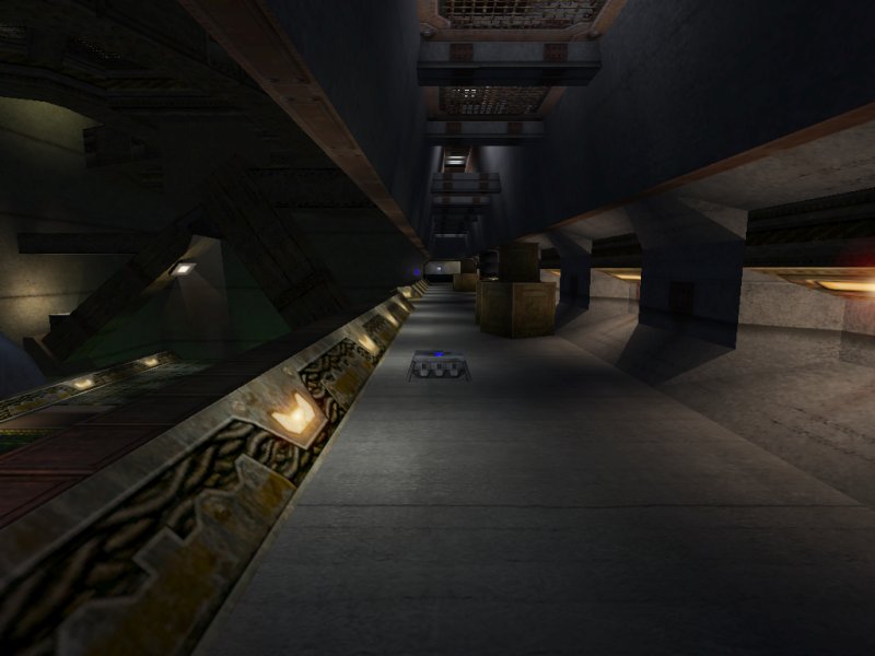
Getting back to the more typical aspects of the build, the author's brushwork here is all right, but seems to have met with some problems. There are BSP errors in the central part of the map in the form of invisible barriers; if you're too near the inside track of the central corridor, you may suddenly stop moving forward, or find yourself unable to jump, due to the errors here. Once you figure out where they are you can simply avoid them, but it would have been nice if they could have been reduced. Certain kinds of brushes, like those that provide the curving central corridors in this map, will of course be off the grid and involve some strange angles that may be problematic, but there are other places in CTF-Assidaria where brushes are off the grid where it isn't necessary, or look to have been formed using needless intersections. There aren't too many of these, and it's no guarantee that they're contributing to the BSP problems in the center of the map, but I wonder if a bit more care with the brushwork might have yielded cleaner results.
Bots played the map effectively in my testing, so this one should do just fine for offline play. They navigate the map without any problems, with the possible exception of the lifts in the flag rooms which should have been set to StandOpenTimed rather than BumpOpenTimed. Sometimes they take a couple tries to use those lifts properly, though it's not a significant problem. There are AlternatePaths to ensure that the bots used multiple routes to and from the flag, and DefensePoints set up so the bots can guard their flag. There are even a couple of DistanceViewTriggers to aid in sniping, something not often seen. Unfortunately these have been set up incorrectly, as the corresponding TeamTriggers are set to the wrong team, an easy mistake to make since TeamTrigger is so counterintuitive. But on the bright side, the distance is short enough that they aren't necessary in the first place, so this doesn't really matter.
Despite the BSP errors and that annoying bug with the custom messages, I'm willing to bump the build score up half a point, for a few reasons. First, the quantity of custom work that went into this map is most unusual. Aside from the messages, there are also the swinging lights I mentioned earlier, and a few nice uses of particle systems to enhance the theme of decay. There's a door fitfully trying to close, and failing because the other door has broken off and fallen into its path, another nice thematic touch. And finally, Assidaria's use of sound is outstanding, and that's an area that often seems to be overlooked. Instead of having one sound here and another there just to keep the level from falling silent, Thunderstrike has constructed a more complex, immersive, and believable soundscape. You might have to listen to it a bit to pick out everything that's going on, but it all makes sense once you do.
CAST: 1.5
And now for the big question: how does it play? For me, the answer was somewhat disappointing. CTF-Assidaria has the makings of a good map, but lots of little things hold it back.
First, let's talk about the layout. Though the map initially looked somewhat complex to me, it's actually pretty straightforward and very easy to learn, which is always good. The bulk of the map is divided into five areas: the two flag rooms, the two effluent storage areas right outside the flag rooms, and the cryonics lab (the center). Each is of three-tiered construction, so there are several ways to reach the flag. The first problem I encountered was with the way the three levels are connected to one another. In the storage rooms it's not too bad, but if you want to reach the uppermost level you'll probably want to use your translocator. There's a lift that goes from the center level to the top, but once triggered there's a full two seconds of delay before it starts moving, and then it takes two more seconds to rise. That delay is especially irritating, particularly as it's placed in the part of the map where much of the action tends to occur, so you're always in a hurry. That elevator also leaves a gaping hole in the middle section when it rises, which makes it very easy to "take an ill-considered dip in the slime," as the custom death message informs you.
In the center of the map, the three levels are much more separate than they are in the storage rooms, so once you get in here with a flag, you usually won't encounter much resistance. The primary means of transportation between levels is a series of elevators, but I don't like the way these movers work either. Once again there's a delay when you step onto one, which is obnoxious, and then by contrast, the delay between floors may seem too short. I would have liked a visual indication of which way the lifts travel on the second floor; since you can't see either of the lifts themselves from the second floor, only the shafts, you have to remember which one to jump in if you want to go down to the first floor quickly. What I would have liked better would be for the three-tiered lifts to be removed entirely in favor of a better means of moving between floors.
The whole map feels cramped to me. There are too many areas where the ceilings are too low or the corridors are too narrow. The middle level in the storage room is just a straight walk down a passage that's littered with crates and barrels that are easy to get stuck on, and leave you very little room to maneuver as you're passing them. The storage rooms often have some diagonal trim segments that rise slightly above 45 degrees, so when you hit them you temporarily lose control. If you're lucky, the effect is very small and you'll barely even notice. If you're not, then it's time for another ill-considered dip in the slime. This problem is not as bad as I remember it being in beta testing, but it's still here. All these things conspired to keep me from having much fun playing the map; I too often felt as though I were battling against the map's construction, instead of having it facilitate a smooth gameplay experience.
On a final note, the item placement is fine for the most part, though I really don't like the position of the Flak Cannon, which requires a translocator to reach, and that of the various armors, which are all balanced on horizontal beams.
FINAL SCORE: 6.5
Visually and technically, this is an unusually good map, but the gameplay just left me wishing it had been carried off better. The layout is at least decent, so don't let my lack of enthusiasm stop you from at least giving it a try, but too many confined spaces and irritating mover settings really get to me. Given the amount of work that went into this, and the solid results in many areas, I'm convinced Thunderstrike can do better. Hopefully we won't have to wait two more years for his next map! |
| |
| | | | Map Comments |
| John DiFool
03-06-2006 10:32 PM MST | | Hmm surprised nobody's commented. This is...interesting.
Your classic industrial setting, with multiple levels,
interconnected with elevators all over the place. The
cool twist are all the custom kill messages for the
weapons, along with ones for killing sprees etc.
Unfortunately these weapons do not work with the WORM
replacer, so you are stuck with the defaults, for that
small minority which runs custom weapons. Still learning
the layout, but definitely something different.
| cooloola
03-07-2006 04:44 AM MST | Rating: 7 | | Nice map. First of all I love those weird kill and pick up messages. The overall look of the map is a bit hectic and crazy. I'm not too fond of the layout since there are three completely differnt entrances to the base and it's almost impossible to get the flag runner if he's in the central area making his job a lot too easy and making for some very short matches. Archi is great but sometimes gets in the way. The theme is very confused mainly due to texturing. And a few hallways are cramped height wise. But it's still a good map.
| Rokhead
03-20-2006 04:10 PM MST | | I cant play it. When i run the map, it says "missing package, sgtech" or something...
| Ironblayde
03-20-2006 09:02 PM MST | | SGTech.utx is from Bonus Pack 4, I believe. You can download it from one of these locations:
UMOD: http://download.beyondunreal.com/fileworks.php/official/ut/utbonuspack4.umod
ZIP: http://download.beyondunreal.com/fileworks.php/official/ut/utbonuspack4.zip
| Manticore
03-22-2006 02:01 AM MST | Rating: 7.5 | | A very complex CTF layout which probably lends itself to online play with a large load of players. Decent deco and good construction make this definitely worth taking a look at in my opinion.
| tgm79
03-30-2006 03:03 PM MST | Rating: 9 | | Pretty cool map. It has a ârealâ feel to it. The texturing is properly done and the architecture is convincing. The lighting is like in a sci-fi horror movie â this means â sparse and leaving many dark corners. For this reason there are lot of places where you could fall down and âtake a dip in the slimeâ. The gameplay suffers a little from the darkness but the awe factor is taking advantage of it. The music is good and the custom messages are fun. My personal favorite is this one â âAhh, the shockyâ! Lol
Overall - Very good work.
| Hostile
04-06-2006 06:09 PM MDT | Rating: 7.5 | | Well a long time ago I sent a few maps to ThunderStrike that he reviewed. They were my first, and they sucked of noobe problems. He was fair and had allot of good comments. I've learned allot since those days, although my maps probably still suck. I felt the need to comment on his map, not that I can tell him how to map, but first of all the thing made me feel as if I were playing Doom 3 or something not UT. He has done a very nice job with this 1. He put a lot of love in this map, the lighting great job, although its a bit moody, but good job. The textures NICE! All in all very good job. The details in this map are outstanding. I liked the tube under the flags and slim. I loved the feel of this map.
Now for the part I don't like. :(
I found myself lost a few times but learned it rather quickly.
The collision on the central area "The big Mid area with window" was "hangy". I think it should have a semi-solid brush or something over the windows to keep this from happing.
I did not like the lifts, they were to complicated. To me this was hard to deal with. I lost some fun trying to figure them out.
There is rooms were the stairs are to step that cause you to loose control and nose dive in the slim :/ The same rooms have to much wall to look at. Plus there is a wall that hangs over the walk way that you hit your head on by were you come down the said stairs. This makes it feel cramped. Also he put the flak cannon on top of a grate that's not easy to get to. I think all weapons should be easy to access, maybe not health or power ups. Weapons yes! Other people may not find this to be an issue.
The ramp in the small hallway looks as if it were crammed in there. It don't seem to fit. When you open the bottom door there it is in your way :/. Also the texture on the ramps seem not to fit the rest of the map either.
This map has a great feel to it, but has a few troubles that take away from the experience. This can easily be a featured map but needs some areas fixed. The main part is the lifts.
ThunderStike has just about out done himself but it's going to need a few tweaks that I know a mapper such a thunderStrike can manage.
GOOD JOB ThunderStrike! I love it, please fix those problems! This is your best work in my opinion. To the rest of you DL it give it a try. IT'S NICE! Different
| FraGnBraG
04-07-2006 04:33 PM MDT | Rating: 7.5 | | ... at long last, this one :D i agree with the review, there's a few problem areas but nothing serious imo - i tended to like the "bluer" areas for the finishing - i always like to see what others do with the SS sets, which are quite difficult to work with, imo - TS has put a _lot_ of work into this map and also lot of nice touches - could argue perhaps too much in one map in terms of theme, but who am i to talk, lol =P once learned, the layout works well -- oh, you will need a plan to grab the flag and get out alive tho ... all in all GJ Thunderstrike :D
|

|
|
 |
 |
 |
 |
|
 |
|