|
|
|
 |
|
 |
 |
 |
 |
| BR-Kryo | | | Map Info |
| | | | File Name | br-kryo.zip | | Author | 3-dee | | Gametype | UT2k4 Bombing Run | | Date Added | 01-28-2006 | | File Version | 1.00 | | File Size | 12.09 mb | | Player Count | 0 - 16 | | Map Description | None | | Review Rating | 5 | | User Rating | 5 | | Overall Rating | 5 |
|
|  | | | | Review |
| | Reviewer | Ironblayde | Awe Score: | 1.5/3 | | Date | 02-22-2006 | Build Score: | 1.5/3 | | Review Schema | Cast Score: | 2.0/3 | | User Point: | 0 | | Overall Score: | 5/10 |
AWE: 1.5
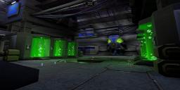
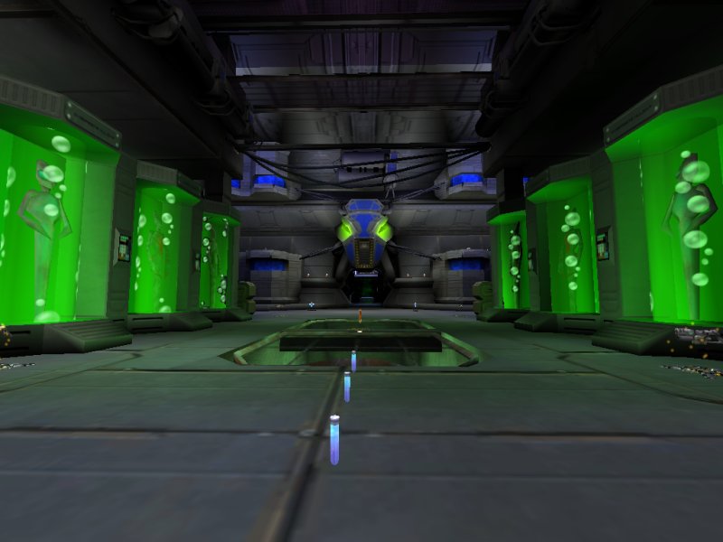
Sadly, Bombing Run isn't a very popular gametype. Not many maps get made for it, and I always get excited when one comes out, since I'm a big fan of BR. In this case we've got a modestly sized arena that features a number of custom-made textures and static meshes. Custom content always scores points in my book as it goes a long way towards differentiating a map from everything else that's out there. The most obvious of the new meshes is a large cryogenic tank holding a number of aliens in stasis. I don't know what Liandri Corp is planning to do with these guys (something evil, no doubt), but they do give the map a certain character.
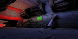
Unfortunately, the BSP geometry is a bit rough around the edges. In most cases it serves its purpose sufficiently, providing the skeleton of the map while the static meshes fill in the details. There are a few places, though, where unappealing edges occur. The corridors leading from the Flak Cannons into each base are a good example -â see the third screenshot at the right. The sides of the corridor are decorated as one would expect, but where it opens into a room, there's no mesh or BSP trim to break up the boxy look of it, and an abrupt change in wall textures makes the effect all the more obvious. Meshes aren't always placed exactly as they should be, either. Some of the doorways are off-center, for example.
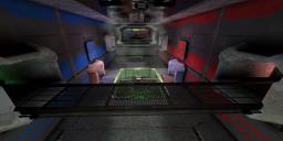
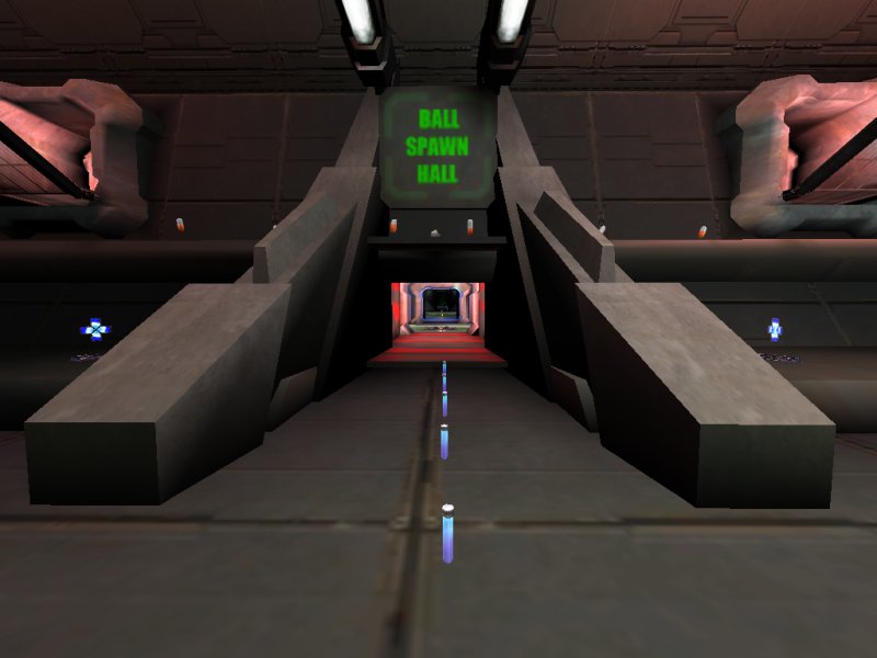
The map's biggest weakness in the aesthetics department, though, is its lighting. A great deal of it is unsourced; there's light, but you don't know where it's coming from. Sure, there are some light fixtures here and there, and the cryogenic tanks bathe their surroundings in an appropriate green glow, but far too much light has been added without the architecture to justify it. This is perhaps most noticeable in the central corridors leading into the central room. The entrance to the corridor from either base has a big mesh surrounding it -â see the fourth screenshot -â and the sides of that mesh are extremely dark, finally becoming fully black at the end. Suddenly this gives way to a small corridor with no light fixtures which nonetheless has an extremely bright, high-radius light sitting right in the middle of it. The effect is very odd, and very unpleasant. The light gray mesh on the far side of the corridor, in particular, is sickeningly bright.
BUILD: 1.5
While playing this map, I noticed that my framerate was strangely low given the modest level of detail on my screen. I've seen more graphically intricate maps that perform considerably better, so what's the problem here? Upon opening the map in the editor, I discovered that much of the zoning has failed to take effect, which doubtless plays a big part in this. The bulk of the map comprises five rooms: a room for each goal, an anteroom of sorts for each team, and a central room where the bomb spawns. Although the author attempted to separate them with portals, the two anterooms and the bomb spawn room are all one zone. Part of the reason is simply that the author forgot to seal up a few corridors, but the zoning still wouldn't have worked. The walls and ceilings of each anteroom are provided by a single, large static mesh, and meshes can't seal off zones. If you hide the meshes in the editor and look at the BSP by itself, you'll see that the various rooms are far more connected than you'd expect. I don't think the author had zoning in mind when he was setting up the BSP skeleton for this map; watch out for that in the future.
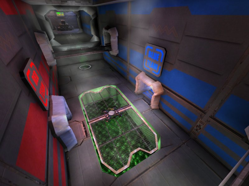
The rest of the brushwork is passable, though hardly ideal. The author hasn't used the grid very well, and so there are some small overlaps where you wouldn't expect. One spot with very odd brushwork is in the center of each anteroom, and in the bomb spawn room as well, where an octagonal hole has been cut away and fitted with a grated static mesh. The off-axis sides of the hole don't match the angles on the corresponding sides of the mesh, and those sides have been created by triangular additive brushes that extend beyond the boundaries of the original hole. This wouldn't be noticeable, except that the author has used a different floor texture on the triangles! So you've got this grate floating in a hole that doesn't quite match its size, and inexplicable triangles on the ground around the edges. Very strange.
Bots play the map reasonably well, although once again, the author's performance here is less than ideal. The most serious problem is in the bomb spawn room. There are corridors leading off to either side, but no paths for the bots to follow. Thus they are allowed only one way from the bomb spawn point into the opposing team's anteroom, which makes them easy to defeat. There's a single ShootSpot in each goal room, but it's too close to the goal, and besides, they're on the wrong sides of the map. A BlueShootSpot should be near the blue team's goal, not the red. There are a few spots where translocator paths would have been really handy, but haven't been added. There are also a number of items the bots can't reach, but in most cases this doesn't matter, as we'll see in the next section.
Finally, there are some ambient sounds to be heard, if not as many as I would have expected given all the machinery operating in here, and they're often not placed very well. That is, rather than placing the sound actor as near as possible to its source, he seems content to just place it in the same room. Sometime this is noticeable; a large machine will be on your right and you'll realize that the sound is emanating from a point on your left. And for some reason there's a water sound playing in the goal room, with no liquid to be seen that would explain it. The author has included a custom music track as well, but I found it very annoying and turned it off after about thirty seconds of play. Part of it is that I just don't like the style of music, so your mileage may vary, but I also thought it was not at all suited to the map's theme.
CAST: 2.0
As I've mentioned, the layout of this map is relatively straightforward. There are five main rooms laid out in a linear formation, with corridors and catwalks off to either side to present a few more options for attackers. It's very easy to learn, and easy to navigate, although a few misalignments and collision oddities provide rough edges to get stuck on. For instance, the side corridors with the Flak Cannons each have a spot where it looks like you should be able to step up a slight ledge in the floor, but which in fact stops you if you run into it. A few simple BlockingVolumes in these and a few other places to smooth things out would have been welcome. Basically, the map works reasonably well as long as you don't stuff too many players into it. The author recommends 6-16 players, though any more than ten is pretty chaotic, and even that's pushing it.
Now let's talk about item placement. The author went absolutely nuts with pickups, particularly with adrenaline pills. Seriously, this map has more adrenaline than Jerry Bruckheimer's entire filmography. Many of them are scattered about in silly places, like on ledges along walls that you'll probably never visit. Most significantly, though, there are eight places in the map that have sixteen adrenaline pills each laid out in a small 4x4 grid. In each anteroom, there's a ledge near the top of the room that has two such groups of adrenaline with a Big Keg sitting between them. So that's 100 health and 64 adrenaline you get for going up there. You'll have adrenaline combos going constantly, especially since the bots can't get to that mother lode. The mapper is clearly suffering from some form of insanity (or just watches way too many Jerry Bruckheimer movies).
The rest of the items are placed with a little more restraint, though it's still a little overkill. There's a shock rifle and a link gun in each anteroom that the bots can't reach, but that doesn't matter since there's a second copy of each weapon in the same room. As I said, it's a little much. Hopefully the author's next map shows a little more discretion as far as where items are placed, and how many there are.
I was torn on how to score this section, and finally decided to give the author the benefit of the doubt, despite the maniacal item placement. As simple as the layout is, it works, and I had fun playing it. Besides, it's Bombing Run, and Bombing Run is awesome.
FINAL SCORE: 5.0
Given my love of this gametype, I really wanted to like this map more than I did. The author deserves credit for pulling off a decent map, and for taking the time to create custom content for it, but so many things keep it from being really good. The technical side of the map especially needs work -â better brushing, better optimization, and better bot pathing would have gone a long way. Still, it's worth a download if you're looking for a game of Bombing Run. |
| |
| | | | Map Comments |
| Wesley "Boreas" van Dijk
02-01-2006 03:51 AM MST | Rating: 5 | | This one just doesn't really do it for me.
- The layout is way too simple, just a straight walk into the other base. I really get a "hardcore sniping map" feeling when walking through this one.
- Item placement is absurd. Think of stuff like 10 adrenaline pills right next to each other, and a base with like.... 16 of them (haven't counted them).
- The colors in some of the areas don't look right. Very bright colors are used to show which way leads to each base, but it is a bit overused. Some textures look very stretched, making them look like it is just one basic color.
EDIT: There was one bad looking texture somewhere on the floor in the map, not the team color stuff
| goldfenix
03-05-2006 08:14 PM MST | Rating: 5 | | Felt too empty, needed more static meshes, rooms, and basically more decoration. Didn't think the aliens in the chambers matched the theme much, I suppose the ydo, but they just seem bizzarely designed...
|

|
|
 |
 |
 |
 |
|
 |
|