|
|
|
 |
|
 |
 |
 |
 |
| DM-Contest | | | Map Info |
| | | | File Name | dm-contest.zip | | Author | ultrakaka | | Gametype | UT Deathmatch | | Date Added | 11-23-2005 | | File Version | 1.00 | | File Size | 708 kb | | Player Count | 2 | | Map Description | None | | Review Rating | -- | | User Rating | 6.5 | | Overall Rating | -- |
|
|  | | | | Review |
| No review currently available for this map.
Click here to request a review of this map.
| | | | Map Comments |
| Pomperi
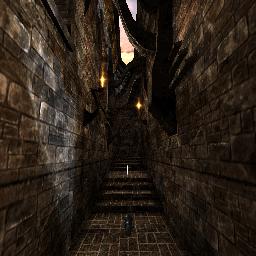
11-23-2005 06:13 AM MST | Rating: 7.5 | | First of all I would like to say that the screenshot is kinda misleading. The map is so much more then just that.
Secondly I'd say this map is better then I first thought. At a first glance it felt a bit average, but after a while i realized how good this map was. Ok, I have seen prettier maps, but the style is still pretty unique, and the gameplay was pretty smooth as well. What i missed most was a little more atmosphere, that little extra that makes the map breathe. It could also need some more weapons laying around.
For those who haven't played this yet; download it and give it a try.
Looking forward to see more of your work here.
| REDpittBULL
11-23-2005 08:17 AM MST | Rating: 6 | | small,good,funny
| quillion
11-23-2005 12:31 PM MST | Rating: 6 | | I like this map, but heres 2 errors i quickly noticed.
1) a good few textures are out..needs adjusting.
2) The lighting needs a little work. you have shadows
and lighting colours in the wrong place/direction.
You have orange flames giving white light, moonlight shining from the wrong direction, in relation to the moon itself. The flame lighting would give a flicker of some sort too. I like the layout, nice and simple;)
it has the makings of a really good map just needs...well to FEEL better. well done!
| ultrakaka
11-23-2005 01:10 PM MST | | Thanks guys! This map was meant to be more for playing than for watching, but still, the bugs You metioned quillion, are n00b bugs :P My other maps around here shouldn't contain such errors.
| IndySkyz
11-23-2005 06:25 PM MST | Rating: 4 | | Do most of you just make maps? It seems to look that way because you give fairly high scores to maps that may look ok, but offer nothing beyond that.
This maps brushwork is good and gives it a cool look, but after that its all downhill, first off the layout is unispired and does nothing to make 1v1 gameplay good, second the textures are too much the same, maybe a grey stone floor would have been a better choice. And third if you are going to have spot that are not meant for play then block them, with translocator on you can get into the back hallways thru the windows and even go up to the roof top where you see a very ugly looking mess of brushes, block those areas.
| Agent X
11-24-2005 07:38 AM MST | Rating: 5 | | Not everyone maps for 1v1 gameplay Indy, I sure as hell dont. I prefer mass FFA gameplay, which requires a more innovative layout.
The level is ok, nothing special about it. It does play nice.
| Charon
11-24-2005 05:25 AM MST | Rating: 7 | | Fun to play, nice design details:) Lighting effects nice, but overall light could be done a little better - I just prefer another kind of lighting. And yes, texture usage could be more different, just more textures. Still nice, impressive and atmospheric attempt.
|

|
|
 |
 |
 |
 |
|
 |
|