|
|
|
 |
|
 |
 |
 |
 |
| DM-Avghazer | | | Map Info |
| | | | File Name | dm-avghazer.zip | | Author | Pomperi | | Gametype | UT Deathmatch | | Date Added | 08-05-2005 | | File Version | 1.00 | | File Size | 5.9 mb | | Player Count | 2-4 | | Map Description | The bright sun shines through the bars at the old factory. The only things left alive are the machines - and you of course, but for how long...?
Tight deathmatch-map with high connectivity and plenty of z-axis.
Enjoy :) | | Review Rating | 7 | | User Rating | 7.5 | | Overall Rating | 7 |
|
|  | | | | Review |
|
DM-Avghazer (UT99)
Does game industry mean that we must all make an industry-themed map - sorry, Industrial-themed map - at some point in our mapping careers? And must they all be composed of grey and/or brown? Just as the Egyptian theme scoured the creativity out of the UT2003 custom maps, the industrial map has been a scourge in the community since the theme grew tired back in 2000 - or maybe even 1999 - lol. So, does a new industrial map have anything to recommend it these days? Hmmmm.....
AWE: 2.0
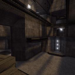
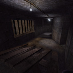
There's nothing barring a mapper from choosing the industrial theme. But these days one expects more out of it than concrete walls, metal panels, grates, and variously shaped metal beams - all of which also tend to be quite rusty. This map doesn't quite bring anything new to the table in terms of color palette, or the materials involved, but it does give us a bit of a dirtier setting than were used to - enough so that it's mildly refreshing. The texture color palette throughout is brown - light brown outside, dark brown inside. Gritty cement coupled with some 'seemingly' dirt-floors coupled with extremely rusty metal platforms and supports compose this map. The textures are well-applied and relatively well aligned. But the wall, floor, ceiling, and accessory textures are all too similar in color to be very interesting except for a few desultory crates, and the nicely contrasted outside areas. The texture usage implies a drier, more arid, dirtier environment than usual which is a little refreshing. However, it's still as brown as a Quake map and we've all seen this before.
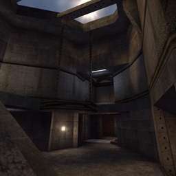
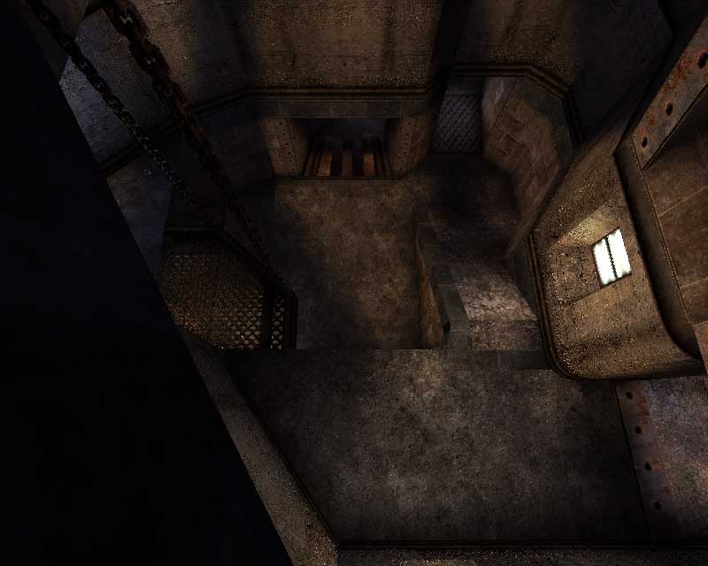
The lighting helps bring out the grit a bit more than if just left to boring white lighting. Subtly blue lights illuminate the inside with a few red accents, and an almost golden orange offsets the lighter brown of the sand(?) outside. This contrast is carried into the map by the various skylights dotting the map's interior. This brings nice color contrasts and mixed shading to the areas where the light is able to enter. Although there were some nice shadow and light contrasts, it felt a little like the light and shadow work were missing a little bit of potential depth/drama in relation to the architecture.
The architecture, in turn, was fairly basic overall. There were a few nice touches like the chains supporting the grated walkways and the long metal plates leaning against the wall behind the crates, but the implied weight of the walls and overall structures felt a little ill-supported by supporting architecture. The overall forms were there, with a little detail, but I felt a little more supporting details were needed. Plus, in the shield belt area, the pointy-topped windows seemed a little out of place, and the angled walls were nice but almost non-existent elsewhere in the map. Consistency of design paired with variation on a theme is a difficult balance to strike and I think the author was on the right path but that he missed some opportunities here.
For a brown industrial map, the visuals arenât bad. Thereâs nothing particularly new, or innovative, but what the author did, he did pretty well. Itâs not the most beautiful industrial map out there, but it wonât hurt your eyes.
BUILD: 2.5
The author knows what he wants to do with the editor and he does it pretty well. The BSP is well made and I was unable to find an HOM and the CSG was of varying solidities, thus resulting in some polysaving. The gameplay movers worked well and even allowed a liftjump. The decorative movers work well and there are some nice locational sound attached to them. In fact, the sound in general was a cut above the norm. Although there were a few quiet areas of the map, there were many good locational and triggered sounds peppered throughout the map. I missed more general sounds, and sounds attached to the exterior of the map â like a wind sound could have been placed next to the âwindowâ openings - but the author went a step further than many. One pathing problem involves the shield belt. The author placed it in a location only accessible via a jump to a narrow window then to the top of the crate it rests on, or by impact hammer jump. The author left the pathing cost high and did not give the option for the bots to impact jump. This combination means that the bots did not go for the shield belt â nor did I see them go for the 100A. The zoning was good and although framerate was no problem whatsoever, I do think a couple more zones would not have hurt.
In general not a bad build by far. A bit more attention to sound, and some pathing tweaks, and I think it would have been just about perfect.
CAST: 2.5
The bots function well here. They travel the map, they surprised me from time to time, and theyâre pretty savvy in general. As mentioned earlier, they do not grab the shield belt, nor the 100A so theyâre pretty much always there for the picking. The weapon layout is fairly good. Everything seems fairly well spread out and not really imbalanced. The flow is good with nice z-axis and decent connection. I do think some areas, especially up top, could have been widened a bit more. Thereâs not much room to fire down upon opponents and much of the map will cater to those who prefer splash damage. Still, there is some room for hitscan, but the map is weighted more heavily in the direction of splash damage weapons. The default player count of 2 to 4 is pretty appropriate, I think. Moving it to 4 to 6 I think would be a bit too many, and although 2 other opponents may feel a little bare for some, I think it will feel just right for others.
In fact, the gameplay in general makes up for the mapâs visual deficiencies and is worth spending some time in.
Although it may not please you to be offered yet another industrial map, this one does have some nice visual tweaks that downplay the similarity to other industrial maps. Aurally the map is nice, and the gameplay is perhaps its best aspect. A recommended download for good âole UT99 DM players.
|
| |
| | | | Map Comments |
| Arch-E-Tech
08-06-2005 07:36 PM MDT | Rating: 8.5 | | hmmm, pretty sweet map man. great job.
| Altimartin
08-09-2005 08:10 PM MDT | Rating: 7.5 | | Great Map... but the suggested amount of player should be increased... 2 players is very boring...
| redfist
08-10-2005 01:43 PM MDT | Rating: 4.5 | | Ah yes you do have somthing going for making a level,it has some ok stuff,but any effects or things you did were cancled out by the ,purple,brown,gray looks.
The gameplay kinda has the feel of,wich room am I in? this map and all your work on it could be dramticaly improved with just lighting and adding some radical texture changes.
Fairly good map.
| Pomperi
11-01-2005 06:09 PM MST | | Altimartin: Playercount is 2-4, which means it could be played with a higher amount of players than 2. I personally thought it played okey with two players. Guess that people have diffirent opinions on what is an acceptable numbers of players.
redfist: I must agree with you that the maps looks rather dull, but it was my intention to bring a somewhat dry realistic feeling to the map. I bet you've played too many look-alike abandoned facilities by now :P
At least I have...
And the layout is rather messy, yes, but I found this map laying around on my harddrive (had almost forgotten it), and I did my best to complete it's layout.
Well, once again, a good example on how diffirent peoples opinions can be.
Nothing is better than a big can of constructive critisizm. Cheerz ;)
[EDIT]
Thanks alot for the review Arcadia =)
Anarchist: Lol! Read the review. Botpathing has it's flaws. Glad you enjoyed the map though.
| Defeat
08-25-2005 11:39 PM MDT | Rating: 7.5 | | >A very well made map using the industrial theme which is also what i'm hooked on right now. I like the layout, simple but not extremly simple. The bots worked well and the z-axis was good too. The 2-4 player limit is perfect and the music was iffy at first but it fit in after i listened to it some more. I didn't see any HOMs and it looked as though all the trim and textures were right. A very good map. d/l
| |bc|Anarchist
10-29-2005 02:18 PM MDT | Rating: 9 | | once again another great map by pomperi. good for fast paced action as is all of his dm maps. this one also has perfect detail and botpathing... *bows* :)
| Cyrss's Female Dog
02-02-2006 08:39 AM MST | Rating: 7 | | I usually play 1 on 1 with the bots on DM as 2 to X ends up being fun for only 10 minutes.
I like this map.
EDIT: 'abandoned facilities'..heh,the whole of the Unreal universe is Pomperi.
| cooloola
02-02-2006 02:51 AM MST | Rating: 7.5 | | @redfist
The lighting in this map is very good and i don'y know how you can get lost in this map no room look like the other.
The flow is very good although it's a bit crampes in a few spots. And item placement can be improved some weapons are too close to eachother and others too far from eachother.
| Manticore
02-21-2006 03:43 AM MST | Rating: 8 | | A very nice map. Definitely worth a look.
|

|
|
 |
 |
 |
 |
|
 |
|