|
|
|
 |
|
 |
 |
 |
 |
| CTF-Catatonic | | | Map Info |
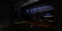
| | | | File Name | ctf-catatonic.zip | | Author | CyMek | | Gametype | UT2k4 Capture The Flag | | Date Added | 06-29-2005 | | File Version | 1.00 | | File Size | 1.27 mb | | Player Count | 4 - 6 | | Map Description | Catatonic - adj. A description of a system that gives no indication that it is still working. This might be because it has crashed without being able to give any error message or because it is busy but not designed to give any feedback.
You fight to the death in a decript facility once used to assemble small-scale teleportation devices, that is now in a state of such disrepair its only remaining useful purpose is for destruction. Don't bother looking for signs of life - you won't find any.
It's a small map in terms of area, its a big map in terms of scale. I like being able to move a lot. It is meant for 4-6 players. 4 seems a little low, but 8 seems to be pushing it. It's a dark, factory type of map, although I tried to go with a somewhat-different look. It's my second release, and my first CTF release. I hope you enjoy it!
Note: It's not as dark as the screenies show. I just play with my gamma and brightness down since I like darkness. | | Review Rating | 5.5 | | User Rating | 6.5 | | Overall Rating | 6.5 |
|
|  | | | | Review |
|
CTF-Catatonic (UT2004)
The second map from this author. One would expect it still to be quite noobish. But the author has certainly learned a few things from his previous attempt. Will the map render you Catatonic? No â in fact I can really only think of one map that could â so I find the name a bit of a misnomer. But this is about the map, not the name, so letâs delve into that.
AWE: 2.0
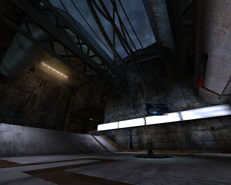
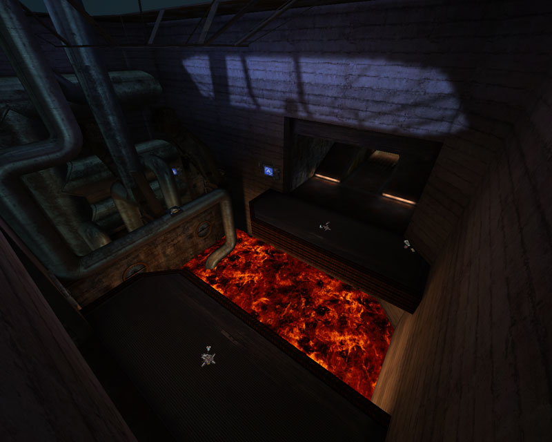
The author chose an industrial theme. How original. Still, this is a darker, slightly more interesting industrial location than us UT players are used to seeing so itâs a bit fresher than most Asbestos-wannabes. Oh, and it has a lava pit. Or perhaps molten metal.
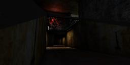
The texturing here is fairly nice with interesting contrasts in floors and the de rigueur concrete block walls. The flag base floors have an intriguing âzig-zagâ etched into them which is not something often seen. The desultory concrete walls are an adequate choice â but only because one cannot see much of them due to the shadows and darkness. The facility in general is a bit mysterious due to a combination of dark lighting and dark textures and thus blurs the borders between playable and non-playable areas. In general itâs a nice effect, the textures are somewhat well aligned, and a decent job was done overall
The lighting is not quite as good. Thereâs some nice shadow work, and a hint of hotspotting, but both need more development. The addition of more shadows would enhance the already existing drama of the dark areas blending with the lighter ones, and better hotspotting would aid the ambience even more, creating more âbalancedâ pools of light than exist now. In addition, there are several very dark areas in the gameplay field. Although I did like the darkness melting up into the ceiling, it's always important to have the gameplay areas adequately lit - and not all were here. Also, a fair number of lights are white, or close to white. White lights are always more difficult to work with as one is relying solely on the textures to being color into a map and when using an industrial grey, grey/brown palette, this tends to wash out the lighting. The combination of white light, and various colored coronas does help reduce this effect, but still it could be better. The different colored coronas attached to white lights are also a no-no in that the corona should closely match the color of the lighting. I would also suggest the author delve into the corona texture package further because there are many strip fixtures used combined with ball coronas. In the corona texture package, there are strip coronas, which I think would have been more effective here. Still, unlike many mappers early in their careers, the coronas were not overdone and were of a good size and intensity.
The architecture was difficult to make out amongst the darkness. I got the impression of rectilinear forms primarily, but the ceilings and walls were mostly covered in various meshes. Which was nice although I got the sense they were placed with little planning, except for the pipes. The pipes fit nicely and provide an important gameplay mechanic. The main window to the sky above created a very nice shadow, but I found it was inverted. I cannot but think the author did this on purpose, but I found it very out-of-wack and would much preferred to have seen it poking out of the building rather than into it. The only other architectural detail I feel worth mentioning was the lack of trim in some areas - most notably around the doors to the flag room, and along the slanted forms separating two paths.
Overall the awe isnât all that great, but itâs also fairly far from bad. It does show potential and I think with further development weâll see a refinement to the authorâs implementation of the visual aspects of mapping.
BUILD: 2.0
The BSP work is simple, but solidly accomplished â no HOMs in sight, and everything seemed pretty much on-grid. The fluidsurfaceinfo was set up well, except it seemed to vibrate a little too quickly. It looked a bit more like jello in an earthquake than lava, or molten metal. The general pathing was done well, but the CTF-specific pathing was a bit off. The names the AI scripts were tagged to were incorrect, so some of them got used and others did not. The assaultpathing was theoretically set up well, except that, again, the names were not tagged well. So the bots were left without these two path infos for their travel information. Still, the map is fairly basic in layout so it did not hurt gameplay too much. Finally, the sounds were done somewhat well. There were mostly general ambient sounds, and not many locational sounds. There were no triggered sounds. Blocking volumes were set up around some meshes to improve flow and reduce collision.
Overall not to bad a build. A better grasp of some of the finer details is in order and I would recommend reading Hourenceâs sound tutorial at the Team Phalanx site.
CAST: 1.5
The overall layout basically provides two and a half flag routes. One route exits the rear of the flag room but then joins another route about a third of the way to the enemy base, and then thereâs a separate route. So crossing the middle of the map, there are only two routes, and there is opportunity to cross paths, but itâs very one-sided. One route takes you over the lava/molten metal. The problem here is that it takes a perfect dodge-jump to go across. Which is something that you canât easily program the bots to do, if at all. The other option is to wall-dodge across â again, a problem with bots, or you can walk along a pipe along the side that joins the other path. The bots will use the pipe â but only by Xloc so at the lower skill levels, bots will generally avoid this path. The other path is a simple, straight run down, and then back up again, which is largely unexciting. There is a lift on each side close to the flag room that does add a little spice to the layout, but unlike most lifts these days, there is no lift-jump â or there is but you crack your head on the ceiling. I am of the camp where a lift automatically means lift-jump and this would be something I recommend the author keep in mind on his next map.
The weapon layout is satisfactory. I think perhaps the shock rifle right over the lava/molten metal is a bit much and could have been moved a little ways away, but I do like the opportunities it offers. Aside from the layout deficiencies mentioned above, the map does flow a little, giving one varying spaces to favor hitscan or splash-damage weapons. But most of this variation never really co-exists except in the location in the middle where the paths join.
In general the gameplay was decent in terms of flow and z-axis but in terms of CTF route strategy, it kind of falls flat.
Overall, not a bad second map by far. The visuals are not spectacular, but are nice and do provide a little bit of a change from the standard grey industrial weâre all used to. The build is decent although assaultpathing is something the author certainly should research a bit more, and the gameplay isnât all bad either. Some better initial layout planning is recommended. Not necessarily a must-download for CTF fans, the map will play better with humans than bots so if youâre looking for a smallish sized new CTF, this might suit your taste. But you may later abandon it for something better.
|
| |
| | | | Map Comments |
| Jebidiah
06-30-2005 06:30 PM MDT | Rating: 6 | | Not to shabby for a second map, not to shabby at all.
Here we have an industrial facility that is, surprise, abandoned. We've seen it a trillion times, so I'm afraid I can't give any theme kudos, but the author does pull it off well enough. Architecture is simple, but not as simple as might be expected from a second map. Next time I would suggest the author go for some more complexity and variety, but this is a good start. Static meshes are well used, but not abused. Lighting is decent, though not dramatic enough to be noteworthy. Some major hotspots and sharp shadows would be appreciated. I liked the skybox though! Sound lacks many sourced ambient noises, and music is stock. Room to improve, no problem. To the author: Yes, you should feel guilty about not making some loose floor tiles! ;-)
Now for playing this sucker: The layout is simple and pretty cool, in my opinion. There is a reasonable amount of z-axis, and good routes to and from the flag, with one major exception: Make that gap over the lava small enough to jump! You can use a detour over a pipe or a translocation or wall jump to cross, but just a simple hop would have been better. This also seems to prevent the bots from using this path to return the flag. While the AI was very good in general, this area was a bit troublesome, as the bots weren't taught to jump from the pipe down to the other path, a trick I found useful. Also, the big open area was pretty easy to defend with a sniper rifle, so some cover would have been nice.
That's how it stands: Middle of the road most of the way, but I see a lot of potential in the author. I think I'll hang on to the map a while too, so consider this one a success, CyMek!
EDIT: @ Redfist: The map is not nearly as dark as the screenshots, don't worry.
| CyMek
10-23-2005 02:46 AM MDT | | Well I'm glad it wasn't a total atrocity. :)
It is actually possible to make it across the lava - a perfect dodge-jump will do it, or a walldodge makes it easily. I tried to get teh bots to do it, but they tried to sheild jump across. Oh well.
Oh, and I think that loose floor tles are tacky. Cleanup on aisle 5! :P
Thanks for the review Arcadia.
| Kantham
06-29-2005 08:19 PM MDT | Rating: 8.5 | | Very cool map, i liked it alot.
The middle is very well desinged, but unfortunately, the fastest path is where you can grab the unreal amplifier and go get that gap at the bottom. I really like that idea, but it makes me want to use it everytime since it's the fastest path. And snipers have more difficulties to get me.
I don't think that bot use that path, but i am sure they don't use the left side (lava pit).
That should be fixed
| Ma!ice
06-30-2005 01:41 PM MDT | Rating: 4.5 | | played botmatch and then threw it on for LAN party,
graphics: Ho hum, definetly not pushing it
gameplay: not bad, not great though
feels very small
just feels like a UT99 map slightly converted
| redfist
06-30-2005 04:29 PM MDT | | Is it just teh sceenshots up there that look dark?
| Gaian
07-02-2005 10:05 AM MDT | |
You need to post better screenshots.
These ones are too dark. Use a program like Paintshop Pro (free trial) to lighten them. It only takes a couple of minutes.
| goldfenix
10-23-2005 03:23 PM MDT | Rating: 7 | | This map was pretty fun. It may be small, in my opinion, but i am not going to rate it for size, because I have made a small CTF map too. It is dark, has much decoration, has pits and jump pads, could be better with lifts... Unless there is lifts, and I forgot.
|

|
|
 |
 |
 |
 |
|
 |
|