|
|
|
 |
|
 |
 |
 |
 |
| UT Classics2k4 2 Map Pack | | | Map Info |
| | | | File Name | ut_classics2k4_2.zip | | Author | yournan | | Gametype | UT2k4 Other | | Date Added | 06-12-2005 | | File Version | 1.00 | | File Size | 45.32 mb | | Player Count | Unknown | | Map Description | None | | Review Rating | 7 | | User Rating | 7.5 | | Overall Rating | 7 |
|
|  | | | | Review |
|
UT Classics2K4 2 Map Pack (UT2004)
MsM has done it again; creating remakes for some of the more popular maps from the original UnrealTournament (circa 1999). In general a remake can go in one of two directions. Simple reproduction of the original, as in MsMâs remakes, or one can change just about every detail besides the layout â as in Moonflyerâs TheDeck2004. MsM used his knowledge of the editor to bring those favored classics from the 90âs back onto your hard drive, graphically updated, and tweaked appropriately for UT2004 movement. Does he succeed or fail? Letâs find out.
Note: Because these are remakes I am scoring aspects of them more in terms of âIs it like the originalâ rather than âdoes it work as an original creationâ. Since MsMâs goal was to recreate the setting and the gameplay of the original, one cannot fault him for, for example, a bad layout. Scoring will not fault him for any inherent problems in the map â only for faults that are completely his fault. :)
Note: His UT99 remake mappack was reviewed here a while ago and garnered a 6.5. Here's the first half: http://nalicity.beyondunreal.com/map_hub.php?mid=7971
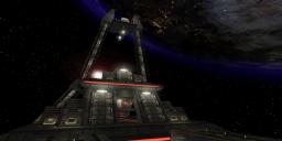
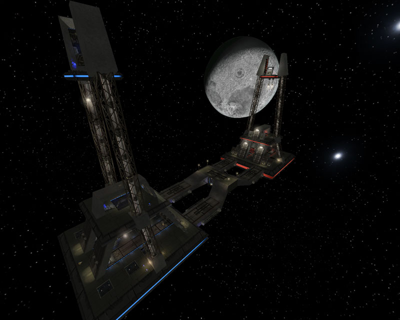
CTF-Face][2K4
The first âofficalâ remake, if I remember correctly. So here we have a remake of a remake! Is MsM going to remake his own remake of an Epic remake when UT2K7 comes out?
At any rate, a remake of arguably the most popular CTF map that debuted with the game, CTF-Face. In the remake, the setting was still in space, but the rest of the map was changed to metal towers and a metal platform connecting them.
AWE: 2.5
Well, the texture work is pretty good here. Some misalignments are to be expected because of the inherently slanted BSP work but in general the texture work is solid. The same dark grey palette of the original is kept intact with a few more browns mixed up in it this time around.
The lighting is also pretty good here. Nothingâs overbright, maybe the team colors are a little oversaturated but the orignalâs were a bit too so⦠The coronas are of a reasonable size and add to its aesthetics a bit. The overall lighting colors and intensities are used well. I would have like to have seen a little more hotspotting but that may just be me.
The architecture is dedicated to the original and the same forms dominate the map. Added static mesh accents help decrease the stark feel of the original and are a welcome addition.
Overall, not the prettiest map to begin with. But MsM has done a pretty good job of slapping a fresh coat of paint on it. Itâs still not the most beautiful map out there, but it looks like its predecessor and thatâs an important part of a remake, no?
BUILD: 2.0
The biggest problem is that the brushes arenât aligned to the grid. Itâs my understanding that MsM has been importing the brushwork from UT99 and then tweaking it appropriately, but brushes not on grid are always a risk. There are two tiny HOMs, and Iâd attribute their presence to the âoff-gridnessâ present. Lifts work fine, teleporters work fine, and the jumppads work fine. I would have left the redeemer jumppadless and still relied on the XLoc, but thatâs a matter of personal preference. The map is zoned appropriately, although due to the layout it doesnât affect FPS much. Further optimization was accomplished through antiportal and collision replacement methods and do help. Framerates were well above retail. Sound was a little disappointing. Considering there are no ambient sounds in the original, MsM was left on his own to work them up for his remake. The ambient sounds seemed to consist of an electrical buzzing along the massive vertical girders running up each side of each base, and an electrical throbbing noise at the keg location. Removing the objection that no one in space can hear you scream, I donât really agree with the sound choices. Why are huge metal girders buzzing like a fluorescent lamp? Whatâs making the keg throb so painfully? As the sound stands, These were locational only, there were no general sounds, and no triggered sounds. Another item of note â the assaultpaths were not set up properly. The assaultpath objectives were tagged to the >Object>Name property instead of the >Event>Tag property, which essentially means theyâre broken. One last complaint â the big window directly above the center entrance to the base, has no collision. I shot my XLoc right through it. Not good.
A bit of brush wonkiness, and disappointing sounds are really all thatâs bringing down the score here.
CAST: 2.5
May peopleâs complaint about the original layout still stands here, only because MsM was attempting to recreate, rather than reimagine, the original map. The flag routes are few, unremarkable, and provide little options for evasive manoeuvers. Still, this is not MsMâs fault so we must push this aspect of the gameplay aside. The question is, is the gameplay that was present in the original still there? Yes. And is there room for the necessary dodging and related UT2004 movement? Yes. So, Iâd say MsM largely succeeds in bringing the gameplay of the original, to UT2004. The weapon loadout is the same as the original which should make snipers very happy, and the bots work sufficiently well; despite the lack of functioning assaultpaths. However, I get the feeling MsM could have felt at liberty to accentuate the original a bit without losing sight of his goal of exacting recreation.
Overall, a very dedicated remake of the original and kudos to MsM for getting all the slanty parts aligned well. Still, itâs not without its faults, but it does look nicer than the original and still plays just about the same. If youâre looking for straightforward UT2004 CTF action, then youâll like this.
CTF-Face][2K4 overall score: 7.0 (+/- User Comment Score)
/---------------------------------
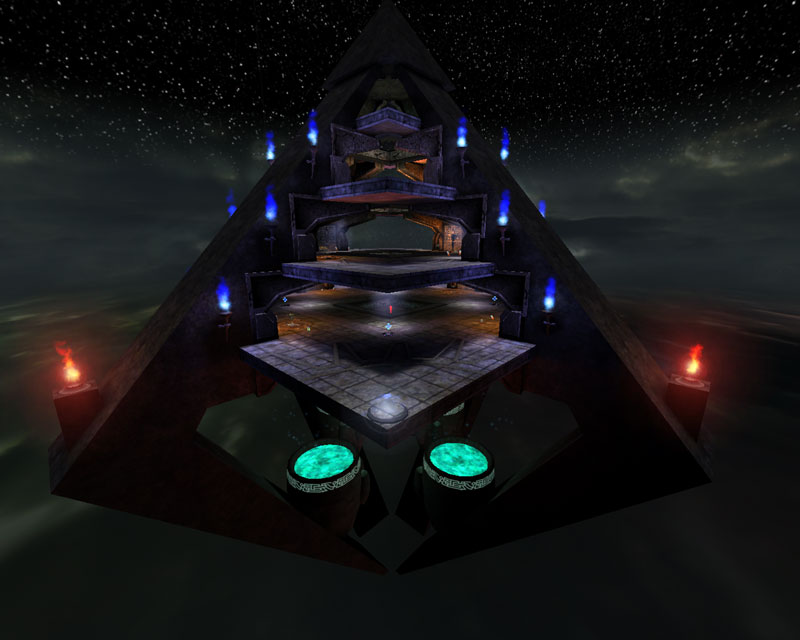
DM-1on1-Pyramid
You may recall this rather fanciful map by the intrepid Innox. An open pyramid-shaped structure with a central shaft of low-grav providing the only means of travel up to a different floor. Down can be effected by simply jumping down the exterior of the map. MsM has faithfully recreated this map and made it a little prettier to boot.
AWE: 2.5
Fashioned after a temple-like design, like the original, MsM uses stone and âheiroglyphicâ textures mixed with torches and a bit of a Tokara flair to recreate the pyramidic temple of the original. The texturesâ color palette remains very similar but they look better in the update. Theyâre aligned well, making exceptions to the architecture, and the colors on the meshes chosen to accentuate the place mix well with the overall theme - except for the Tokara âgoo-podsâ, IMO.
The lighting suits the theme well and is certainly reminiscent of the original. Decent hotspotting from the torches, and some soft light from the skybox certainly add to the ambience. The colors, although perhaps approaching oversaturated, are not and suit the map well.
The architecture is simplistic, like the original, but really MsM did not have to dress it up any more than he did. One visual problem is that the smoke from the torches floats toward the center due to the architecture above it. But on the other side of the map, the same emitter is used which means the smoke is still blowing in the same direction. The effect of this is that the smoke blows into the wall and not toward the center. MsM really should have fixed this after duplicating the emitter.
In general, a faithfull reproduction dressed up with UT2004 engine improvements.
BUILD: 2.0
Thereâs really not much to mention here. The BSP is fine, although a bit of alignment issues exist, they donât create HOMs. The two Build-related complaints I have are, first, the sound. The edges of the pyramid are populated by wind sounds, which is all well and good, except that they all sound either the same, or at least very similar. Some variations in pitch, at the very least, would have been welcome. The only other wonky sound in the map has too small a radius. The central âlow-gravâ shaft has a string of sound actors that create the âsoundâ of the low-grav but one needs to pass quite close to the actor to hear it with any clarity. Their radii should really have been enlarged. The other sounds on the map â the torch sounds were nice, but were not on all the torches. The other build problem is in the low-grav volume itself. It doesnât feel the same at all. Thereâs an upward drag present thatâs not there in the original, and movement within it is much slower. Checking the properties of each, MsM did not replicate them exactly. And, due to UT2004âs speed in general, it pretty much makes one even more of a âsitting duckâ than in the original. So the low-grav zone, although present, just isnât the same and, unfortunately, in a bad way.
CAST: 2.5
Well, the weapon and pickup layout is the same but the playercount is completely different. Wisely, IMO, MsM changed the default playercount of the original from 8 â which was an all-out spamfest â to 2, making it a 1on1 map. Due to the mapâs size, this certainly makes sense. The bots function fine, and will actually function better than you in the low-grav zone. This zone is a problem point however, as you move quite slowly through it, unlike the original where the movement speed seemed very close to regular movement speed on âdry landâ. If you get stuck with a bot in the low-grav zone, and it has the flak cannon, you can pretty much guarantee that youâll soon be having some jam with that toast. Other than that, the map has been sized up a bit to accommodate UT2004 movement and speeds and it seems sized well.
So in general, I think MsM did a good job recreating the gameplay of the original, with the sole exception being the low-grav zone.
Another faithful reproduction of the original. The gameplay is a little wonky, like the original, but the low-grav zone is a little worse than in the original. Still, it looks better with the new engine, and MsM has done a fairly good job in the recreation.
DM-1on1-Pyramid overall score: 7.0 (+/- User Comment Score)
/-------------
DM-1on1-Viridian
Curves and angles and green, oh my! Based on the familiar semi-futuristic industrial/space station map, MsM has used many of the stock semi-futuristic industrial/space station meshes from UT2004 to increase the atmosphere while retaining the theme of the original.
AWE: 2.5
The texture work here is solid, with similar metallic greys dominating the palette, just like the original. Everythingâs pretty well aligned and the textures are well-chosen and well-applied. Since most of the textures come from the same color palette, MsM relied on the lighting to add color to the map.
The lighting is well-implemented. The white lights cast subtly different colors bathing some areas with a cooler blue hue, and others a yellow-brown warm hue. This serves to reduce the boringness of white light and also serves to mix color into the grey textures which is a welcome relief. There was some nice shadowing in a few areas as well as some decent hotspotting. There were a few areas where the lighting seemed mostly equal across the entire surface which produced a somewhat ambient lit feel, but they were few and far between. As for the green lighting, not present in many non-Skarrj based maps, itâs effected well here and is neither overblown nor garish. I will say I think MsM would have been wiser to have kept the green lighting from the original in the shock rifle pit instead of replacing them with white lights because the green travels throughout the map in the original and here it feels as if thereâs a lighting âholeâ.
The architecture was effected well and nicely enhanced with the addition of static meshes and some nice outer areas, some of which are not present in the original. The meshes really accentuate the location well and merge well with the BSP architecture. The added exterior areas really help add a sense of place to the map and accentuate the idea that this is not really a closed location. Theyâre a little sparsely decorated to my taste, but they are nice as they stand.
A very nice looking Viridian in general. The green is back and used tastefully, the textures work well, and the architecture has been expanded upon a bit. A couple lighting issues are the only problem I have with the map visually.
BUILD: 2.0
Like many of the other maps ported over, there are a few unaligned BSP brushes. In this case, none produce HOMs. The jumppads work just fine and have an appropriate sound. I would suggest either a little less of a boost, or a higher ceiling for the jumppad in the curved hallway room, but if nothing drastic is attempted in mid-air, thereâs really no problem. The map is zoned, although I saw opportunity to separate the map even more. Although FPS never drops below retail, it does come close from time to time and I believe a few extra zones would have helped a bit. Antiportals were effected well and collision was smoothed on some of the meshes. Botpathing was good and the bots used the jumppads effectively. Sound was a bit of an issue, however. There was one sound I didnât think fit â a very âcompuerâ-ish sound that I couldnât really attach visually to anything in its immediate vicinity. The were general ambient sounds, and a few locational ones, but I really missed triggered sounds. Triggered sounds are especially important in a 1on1 map and I feel MsM left out the opportunity to aid players by leaving these out.
In general a good build. Some brush issues and sound issues prevent this from being better.
CAST: 2.5
MsM has replicated the original gameplay here fairly well. Using the same layout, we have the obvious z-axis, weapon layout, etc⦠MsM has expanded the play areas to take into account the UT2004 movement. This, as well as the collision work he did with the meshes, helps keep flow smooth. I only noticed one location where the bots tended to get stuck a little but it was few and far between. Other than that, the bots function well, and theyâre count has been reduced from the original. MsM turned this into a 1on1 map and due to its size, I entirely support his decision to do so. The FPS, as mentioned before, is above retail but more zoning would have brought it up futhur. Also, the jump in the curved corridor could have used some better tweaking.
So MsM has pretty effectively reproduced the gameplay of the original along with updating the proportions for UT2004 movement. Itâs a nice place to re-visit.
MsM has successfully updated another map to UT2004. The addition of meshes, and the colored lighting very much accentuate the original architecture and layout of the map. The gameplay remains the same as the original so if you were a fan before, you should certainly consider giving this one a try.
DM-1on1-Viridian overall score: 7.0 (+/- User Comment Score)
/-------------
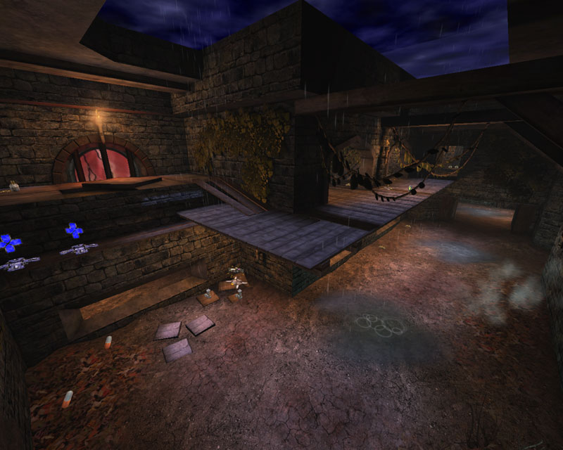
DM-Agony2K4
One of my personal favorites from the original, MsM has again brought this slightly decrepit arena to life. Prettied up for the new engine, but not without its faults, it was a pleasure to spend some time here again.
AWE: 2.5
Some of the textures may be unaligned, and a trim or two may be missing, but in general you wonât notice these. What you will notice is the light streaming through the naked windows and the rain puddling on the ground. The basic stone textures used for the walls take a back seat here to the wooden meshes used throughout the map and to very good effect. In general the textures were well applied â both the walls, and the various wooden BSP supports. The wood was always well aligned and applied while the walls less so.
The lighting was pretty good throughout the map. Torches dotted the walls throughout the map and gave a nice hotspot/falloff effect, although I think their radii could have been reduced a little to enhance the difference between the light and dark areas. Most of the light was the same color â I think I also would have liked to have seen the blue from the skybox coming through a little clearer and not washed away by the yellow/orange torches. The setting is a rainy day so I wonder a bit about the strength of the lightbeams shining through the naked windows. Perhaps a projector would have been better instead of the static mesh light beams. Also, the windows are now transparent so one can see whatâs behind them. Although MsM placed a space back there, and did some basic texture work to suggest something, thereâs nothing really there. Believability that the arena extends beyond the play area was broken by this. The red upper windows lack the same decadence of the original but do have a nice strongly saturated red light casting onto the BSP below them to indicate light coming through and being colored by them.
The architecture is almost exactly like the first â a decaying stone fortress/temple. MsM has changed much of the upper ramps from stone to wood with spaces between the slats. Supported by wooden timbers, the architecture looks really nice. MsM did a very nice job integrating the wood and stone, and BSP and meshes, together.
In general a very nice looking remake of the original. The added rain and light effects really enhance the atmosphere and the architecture is very reminiscent of the original. I would have liked to have seen a little more lighting tweaking and texture alignment but I can only complain so much. Itâs the prettiest Agony Iâve seen.
BUILD: 2.0
There are a few problems with the build. The first problem regards the torches, and this seems to be a recurring theme when MsM uses these, is that the smoke drifts to the side as well as up, depending on the BSP above it, thereby forcing the smoke away from it. This is very nice, but all the emitters move the smoke in the same direction regardless of where the smoke is in relation to the BSP. For the lucky locations where the smoke moves away from the BSP, it looks really nice. But when the BSP is formed in either of the other 3 cardinal directions, the smoke flows right into it. A simple change of the X or Y properties of the velocity or acceleration would have set these right. Another problem is with the zoning. There isnât any. Okay, there are two, but the entire play area is not zoned. MsM has terrain running through the map and terrain cannot cross zones. So I understand the lack of zoning in that regard. But although the FPSs hover around retail values due to the antiportals used, so much more could have been gained back by zoning the map, and then adding a series of small, simplistic terrains. The map could have looked very similar but also have retained the higher FPS which one has come to expect from an MsM map.
The sounds were pretty good with a nice mix of general, locational, and triggered sounds. My only complaint here would be a little more variation in the general sounds. The BSP was worked well, although there were some unaligned brushes. No HOMs result, so thatâs good. The lift functioned well with an appropriate sound. The pathing was pretty good as well except for the redeemer. None of the paths reach the redeemer which means if youâre playing with bots, the âdeemerâs all your whenever you want it. Simply forcing paths between the jumpspots should have solved this. If not, forcing paths combined with a class-based blocking volume along the edge should do it. As for the redeemer location, although it held true to the original, I did get stuck every time I went to grab it. A slight shift away from the wall set me straight, but still â to be stuck up high where I can only go back, forward, or down, and then to have forward arrest me, something should have been done to alleviate that problem.
One last problem was with the rain. I would much rather have seen an xweather effect and then xweathereffect canceling volumes for the rain rather than the emitters. Simply because of the areas where is was raining through the wooden platforms.
In general not a bad build. Aside from zoning, optimization techniques were applied, like antiportals and collision replacement, which made the map hover around retail FPS, but there were some dips which zoning would have addressed. Otherwise, just a bit of an accessibility error around the redeemer. And the emitter smoke.
CAST: 2.5
The gameplay remains very similar to the original. Fast, mostly tight gameplay with the occasional more open area and plenty of z-axis. The map has been scaled to accommodate UT2K4 movement, although the infamous tight spots were still, I feel, a little too tight. One of the liberties I believe a mapper should take when making a remake, even when trying to make an exacting copy of the original, is to correct possible flaws with the original. For example in this map, the flak cannon area I think is too tight. Thereâs barely enough room to move by oneâs opponent and almost no give in the ceiling height. I think that in the original, this area was tight but it suited the movement of the original. In terms of UT2K4, I think MsM left the area too tight. This does occur in a couple other locations around the map but this was the worst one. But for the most part, the map was scaled appropriately. In terms of flow, itâs just as smooth as the original. Youâll find yourself using all of the map and switching between splash damage weapons and hitscan weapons to accommodate the change in areas. I found that, like the original, the bots tended to neglect the second floor areas unless they spawned up there, or to go after the Rocket Launcher. Considering the bots are so easily distracted by opponents this is understandable and not really MsMâs fault. I think lowering the default bot count would have been a wise choice both to encourage bots to use the second floor more, but also because itâs hard to travel the map searching for help and not run into a bot. I think reducing the total number of bots would have helped balance travel through the map better.
In general the bots play pretty much the same as the original. Perhaps a lower player count would have helped the AI flow through the upper areas better, but as they are now isnât too bad. A little more loosening up of tight areas would have helped as well but in general the map was sized for UT2K4 appropriately.
A return to the pit of Agony never looked so good. The textures, lighting, and architecture, though not flawless, all worked very well together and were well implemented. I had a few complaints about the build and gameplay but nothing that strongly affects it. In all, if you enjoyed it the first time around, youâll enjoy it again. For those that never tasted the Agony of UT99, get yourself a sample of this one and taste the pain.
DM-Agony2K4 overall score: 7.0 (+/- User Comment Score)
/-------------
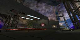
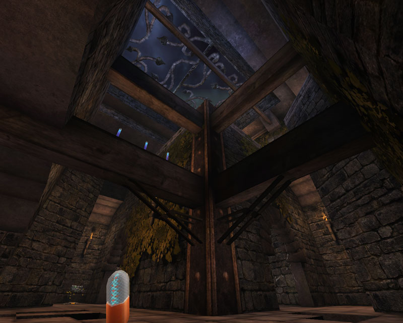
DM-Codex2K4
Another classic remade for the masses. MsM takes the theme for Agony and transposes it onto this oeuvre as well. A decaying temple/fortress that has had a bit of lava injected into it. The remake succeeds well but also suffers from the same problems as agony.
AWE: 2.5
The textures are chosen and applied well with cut stone walls and stone tiles. Alignment is a little worse here, as some of the stone tile textures are not aligned with the BSP cut-outs. Wood beams support the various ledges and bridges although this time theyâre also mixed with metal. Alignment on these detail pieces was good. But the walls and floors needed more work.
The lighting was nice overall with the now standard MsM torches dotting the walls. Although some places seemed a little ambient lit there was some nice shadow work dotting the place and some nice hotspotting. I would have liked to have seen the blue skylight a little more pronounced to contrast with the warm yellow/orange torchlight.
The architecture was very in keeping with the original. Low ceilings, somewhat intricate connection passages, wood and metal supports â they all work together very well. MsM has combined BSP and static meshes very well to add to the overall architectural gestalt of the piece.
BUILD: 2.0
Again, there were some unaligned brushes but, again, no HOMs to be found. We see here, again, the problem with the smoke from MsMâs trademark torches spewing into the walls in many places rather than following the contour of the BSP above it. The fluidurfaceinfos looked good, but the lava ones were too âactiveâ. I think reducing their frequency would have been better. Also, as fluidsurfaces do, they influence the FPS fairly heavily. I would recommend that MsM starts with a smaller fluidsurfaceinfo, and then scale it up, thereby getting a fluidsurfaceinfo of the same size â but with a lesser FPS hit. The lifts worked well and had appropriate sounds. The map was zoned appropriately, however FPS did drop a little below retail in a few areas. Most of the map performed above or well above retail FPS, however. Collision was smoothed out with blocking volumes around the meshes with not only smooths out gameplay but also increases FPS. The sounds were implemented fairly well with some nice general sounds, and some locational sounds. But I really would have liked to have heard some triggered sounds particularly on some of the wooden platforms/bridges.
Oh â and no level preview? MsMâ¦..
In general a fairly good build. Putting some more attention to detail with the smoke emitters, a few more sound interests, and tweaking the fluidsurfaceinfos would have helped.
CAST: 2.5
The gameplay here is much like the original with many tight areas to employ your splash-damage skills effectively. The more open areas are a challenge to handle effectively with hitscan weapons due to the multiple variations in z-axis. MsM has scaled the map up to accommodate UT2004 movement, but I really donât feel it was scaled up enough. Many ceilings are low enough to feel claustrophobic despite there being enough room to jump. There seems to be just enough room and no more. Also, a few of the tighter areas are too tight. Like the flak cannon area in Agony, mentioned above, I think MsM could have used this opportunity to revise those areas slightly and widen them up, and raise the ceilings around the map in general. Of particular not, gone is the secret invisibility pickup area. MsM has left this tiny corner open so you know itâs not available.
In general the map flows like the original and the bots will give you a challenge. However the tightness of many of the areas may turn you off.
Put together the map looks good and plays well. The tightness of some of the areas may turn off some of the players. But if you have fond recollections of the original, youâll enjoy this one.
DM-Codex2K4 overall score: 7.0 (+/- User Comment Score)
/-------------
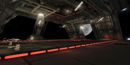
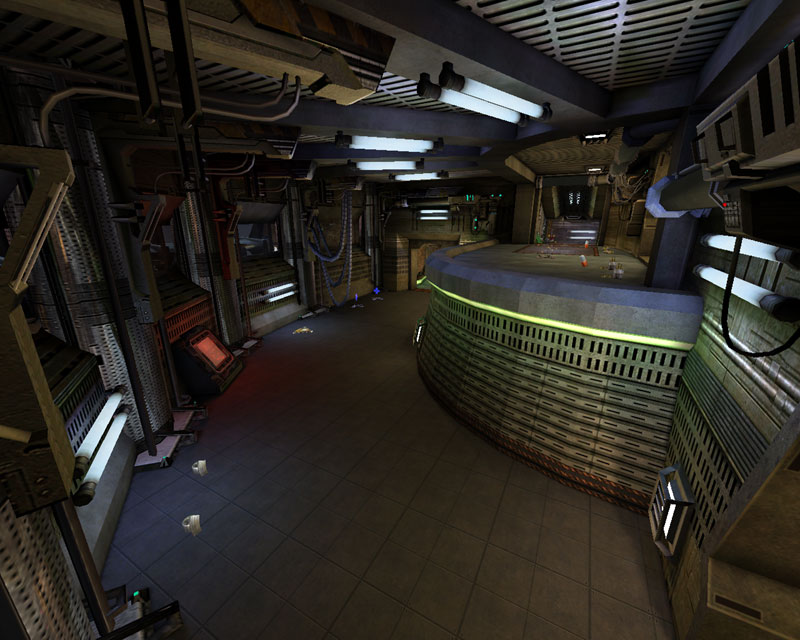
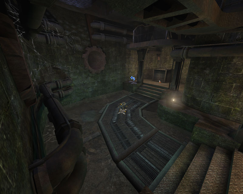
DM-Turbine2K4
Back to the industrial side of the mappack. Here we have a wet facility with algae-stained concrete block walls and tight DM action. I wouldnât go so far as to say itâs pretty, but the facelift in the new engine has done much for it.
AWE: 2.0
The textures are fairly well aligned throughout the map. The downside is that the same texture is used everywhere. Not so much an issue with previous maps, it really is pretty evident with this one. Texture variety within a consistent theme is hard to accomplish but really helps breathe life into a map. For some reason in Turbine2K4, the green cinder block texture sticks out like a sore thumb throughout the map. Perhaps this is due to the contrast given against the light and dark accent texturing on the trims and various support pieces. As for the support pieces, they are very well aligned and well chosen. I think building the main textures off of these accents would have produced a more pleasing industrial location overall.
The lighting is adequate but gives a generally ambient lit feel to the map. Enhancing the pre-existing lighting from the original, MsM has added small kerosene(?) lanterns dotted through the map. These are enhanced by some nice coronas, but I didnât really accept that these were giving off light other than the corona. Some more/stronger hotspotting perhaps? Otherwise the lighting seemed pretty standard throughout. The overall impression was the same color and general brightness throughout the map, although there were specific locations that were different.
The architecture feels more like the original UT than any of the other maps in the pack. Again, there are locations that differ, but the overall impression is that of right angles. The pipes, boxes, and other accents were integrated well into the map and really helped spruce it up a bit.
In general the texture variety could have been more developed, and the same for the lighting. The architecture was very blocky, but that somehow suits the mapâs roots in the original UT and helps exemplify an industrial setting.
BUILD: 2.0
The brushes are, like the other maps, not aligned to the grid in places although they do not produce HOMs. The meshes are integrated well into the BSP, as mentioned earlier. The lifts and âdoorâ worked fine with appropriate sounds. The sounds overall were nicely effected with general and locational sounds. I missed triggered sounds, tho. Perhaps a little more variation in general sounds would have been nice. The map was adequately zoned and FPS stayed at retail or well above. If you have a slow-down on this one, itâs either because you loaded 32 bots into the map or youâre using grandmaâs computer. One problem was botpathing, however. First, the âdoorâ that hides the supershield (shieldbelt in the original) is ignored entirely by the bots. Itâs set as a bump-open but the bots only bump into it if theyâre blown into it from a rocket or flak shot â by which time itâs too late for them to grab it. A way for the bots to grab it should have been researched and effected. The other problem is the botpathing for the damage amp. MsM used a jumpspot, but itâs accessible only by hammer jump, for both bots and players. Although the hammer option was enabled, bots would only double-jump toward it, continuously smashing their face on the side of the crate. If MsM had un-enabled the double-jumping in the jumpspot properties the bots might have had the idea to use the impact hammer.
Not a bad build by far. But some sound variation and more advanced botpathing especially, are needed.
CAST: 2.0
The map has been sized up for UT2004 but itâs still really too tight in most of the locations. This is a flak-monkeyâs heaven full of bright yellow bananaâs *cough* sorry⦠full of lots of tight passageways and corridors to unleash bright yellow, bouncing, metallic death. Itâs reminiscent of the tightness of the original, but thereâs not much room for UT2004 movement. Combined with the default playerload, itâs a bit too much really. The player load should have been reduced a bit. The bots will travel through the map effectively, but the totally ignore the supershield and get stuck trying to grab the damage amp. If youâre ever in the rare position where you canât find the bots, check the damage amp area. One time, I found three of them ignoring each other while they repeatedly rammed their noggins into the sides of the crate the damage amp was resting on.
Other than the bot wonkiness and the tightness the map functions well. The only other complaint was there was a pipe I consistently got hung up on in the room with the string of health vials running along the curved wall towards the lift.
The gameplay stays true to the original with the challenging superpickups and the tight fast gameplay. Unfortunately the bots donât function as well as they could have and the map is too tight overall.
Turbine, updated to UT2K4 looks better and plays about the same. Itâs a bit too tight for UT2K4 movement, and the bots have a little trouble, but itâs about as enjoyable as the original.
DM-Turbine2K4 overall score: 6.0 (+/- User Comment Score)
/-------------
Overall Score: (Average of all scores above and rounded to nearest .5)
AWE: 2.5
BUILD: 2.0
CAST: 2.5
Overall: 7.0 (+/- User Comment Score)
MsM has made a name for himself a quality remaker and this mappack just goes farther to enhance his reputation. Each map has its faults but hold up overall to scrutiny. They are solidly built, the combination of the updated game engine and MsMâs creativity and editor knowledge has certainly enhanced their beauty, and they all play pretty well with UT2004âs updated movement scheme. Some may be a bit too tight or have a too high player count, but youâll certainly enjoy them all.
For those that owned the original UT99, you owe it to yourself to see these fond recollections brought back to life. For those that never played UT99, you should download the pack just to see what all the fuss was about back in the day. A definite recommended download.
|
| |
| | | | Map Comments |
| Manticore
06-12-2005 06:18 PM MDT | Rating: 8 | | Decent collection. Good cosntruction. Thanks for the remakes........
| Kantham
06-12-2005 11:40 PM MDT | | Wich maps are included?
| nELs0n
06-13-2005 04:47 AM MDT | Rating: 7 | | i like it better than the first pack :)
something i noticed: some maps weren't that fluid in gameplay because of the scale.
but i'm not saying it wasn't playbale at all - far from it.
on the whole: nice pack :)
| Revelation
06-14-2005 12:51 PM MDT | | Like Kantham says... Which Maps?!? I only see Face2, and this wasn't really my favourite... Please give some details!
[edit] Yeah, Turbine!! Will start downloading immediatelly!
| Slainchild
06-13-2005 01:25 PM MDT | Rating: 5.5 | | Not bad, but not great either. I personally think you tried too hard to add lots of details on some maps and the gameplay suffers a bit because of that, along with the framerate.
| Kaithofis
06-14-2005 06:45 PM MDT | Rating: 7 | | View this thread for a list of all the maps + screens:
http://www.ataricommunity.com/forums/showthread.php?s=&threadid=474660
*EDIT* I'm guessing it just grabs the screenshots from the first map in alphabetical order, (from the .ut2 itself), which is Face][.
Excellent remakes though. The maps that I've played so far have been updated like they should've been.
| JuggaloKyle
06-14-2005 01:09 AM MDT | Rating: 7.5 | | nice maps MSM
| yournan
08-04-2005 02:44 PM MDT | | thanks for the comments guys.
in the map is:- CTF-Face][2k4, DM-1on1-Viridian2k4, DM-1on1-Pyramid2k4, DM-Agony2k4, DM-Codex2k4 & DM-Turbine2k4.
I'm not sure why 3 screens of face][2k4 have been put up:/.
msm
**EDIT**
Thanks for the kind review Arcadia, a decent score overall & for each map however i still think turbine2k4 is just as good as the others.
Reply in order according to your review
Face][2k4:- A nightmare to deco because of the slanted walls!i discovered after i finished this map that anarkist (this was his 2k3 build) had not aligned the bsp. Instead of upsetting everything after i had made it i left as i couldn't see any issues. A more generous score for this me thinks;).
Pyramid2k4:- This was Fugersterf's beta which i had off him as i didn't want to continue. Most of the work had been done, i just changed and added a few things. The low grav tunnel uses the same settings as the ut99 version, i guess movement has slowed it down which i agree on it is a bit slow. A think i liked on this, if you stay at the top you can snipe with the shock and collect all goodies as they float up the top in the low grav tunnel. Mental note made remove smoke emitter!!!Again a little more generous score, i guess it appeals to people more than myself.
Viridian2k4:- majority of people say this is the best in the pack, i agree on some terms it does look the best. Triggered sounds i agree on in 1on1 maps but with little location use for these i ditched them.
Agony2k4:- worked on this for ages, i think i got it to how i like a old abandoned sorta castle with spider webs and stuff. As you said it cannot be optimized doing small terrain zones would not have created the same effect i wanted and meaned more work, but using a whole terrain sheet meaned lower fps. Sacrifices mus tbe made i s'pose. Glad you like this one, not to blow my own horn but it does look cool. Again note made about flame emitters.
Codex2k4:- i was struggling with theme, seems it looked like the original agony i thought i'd do the same but not use everything so to speak. I think agony looks the best between them :/. In areas it is a little cramped, but enlarging this sole areas could/would have been a difficult task. A update has been released with level preview i missed out! doh! *slaps myself with a wet trout.
Turbine2k4:- i attempt to remake this a long time ago, i gave up on it but this time i hacked through it. It had very little variety on textures, but i guess i could have changed this myself:/. I thought however cobwebs, laterns & a open skybox gave it a dark old undeground feel. The map has now been updated with the jump node removed, bots no longer smash into the crate:).
A damn good review in my book, scored more than i hoped for thanks:).
**EDIT IN REPLY TO Arcadia**
I will look into the emitters my friend, i know you look your smoke and realistic effects. As you said its just the x & z thing so i'ii play around. The scale issue could be done, but in my view could have been a nightmare i however was thinking if i do more remakes i might scale the maps by 1.3 instead of 1.25. While on the subject of scaling the bspo which is off the grid you speak if mainly the imported prefab bsp, no biggy as i delete most of it. No, with the jumpspot removed bots do not go for the u-damage also i did look into the door thing, but couldn't get it working:(. Ahh my boo-boo on pyramid must have missed some of those.
thanks again.
| cUnNiNg_StUnTs
06-16-2005 10:40 AM MDT | Rating: 9.5 | | DM-Viridian2K4 alone is worth the download, but all the other maps are very well done, even Pyramid is just as "fun" as the original.
Great work team! :)
| G.Lecter
07-07-2005 02:27 PM MDT | | Classic maps... that means no lilfjumps and no dodgeramps... :/
- Turbine, Codex and Agony look nice, but it's nearly impossible playing them, they are really too cramped... I didn't like some pickups placed in corners either...
- The Pyramid is a original thing... I think it would have been better a little bigger, and players should move faster in the no-gravity zone...
- Face][ is not bad, but I prefer the Classic one. I would have liked to see the bots throwing the translocator through those 'square windows'.
- Viridian looks and plays great, lots of sounds make it nicer... the best one of the pack.
| redfist
08-08-2005 02:52 PM MDT | | Far as I'm concerned all that acrobatic foolishness has trashed UT,the next thing they will make are cars that dodge LoL
EDIT
Well well,if I made these instead of quake1 maps then I guess copying a map is not bad after all.Because all these lame arse crittics have no idea how much time I spent on those.
And to top it off,I thought hourences said,,doing redos shouldn't be reviewed because it's not their map and it promotes people copying maps,,pffft
I am very stunned you arent getting zeros on this stuff,simply because all those pro mappers (haha) kept telling me how low and bad and have no mapping skills and how i suck so bad all because I did a "redo".Hell and those were maps from a completely different engine.
Plus anything they said (only a few) actually pointed out things that were wrong from quake1 or about the map itself just 100% "redo redo" blagh blagh blagh then post a zero without any consideration at all.
Oh well..................
I am glad your not getting zeros,redos are a good thing.And am glad to see reviews too.your a lucky mapper.
EDIT..................
Open up a UT map do some jumping accros as well as find a tight area to see if you can hit head while jumping.I find that just scaling in all directions equaly don't quite do it to get the same feel while in ut04.Also keep in mind game speed jump height and other things because just because the size may be exact it won't play right in ut04.
| Sicko Teddy
06-16-2005 02:33 PM MDT | | It's only a beginning REDFIST!-
the UT 2007 is coming out even more CRAPPYER!-
no ONSLOUGHT and no ASSAULT! they mixing them together into ONE GAMETYPE!! NO nO NO NO NO NO NO!!!
And yes- characters are getting more stupid acrobAt actions. This is the last nail in UT classic style coffin!
Nice map pack BTW. kind of too techy but looks nice anyway.
| Aalexanderrr
08-03-2005 12:39 PM MDT | | Nice map-pack. And what about assault maps? AS-HiSpeed , AS-Mazon ,AS-OceanFloor...
| hawkwind
08-03-2005 05:51 PM MDT | Rating: 8 | | i have to agree that veridian is the best of the pack.
practically perfect in every way
turbine is second but could have been first, except for some gameplay issues, unrelated to tightness. it really plays like a dream, but for 18 inches of BSP. this is definitely the best remake of turbine in terms of quality. a real MUST play!!
face][ is third, very fun, rip your hair out fun, but misses some important annoyances. remember, if it was easy, everyone could do it!
pyramid is probably the best version of pyramid out there,has perfect use of water volume, but since pyramid was very poor to begin with, not much to say.
the rest are faithful and beautiful, but suffer from space issues. you just can't move like you should be able to in 2k4 or 2k3
| ChromeBallz
08-04-2005 01:27 AM MDT | | Sicko Teddy, i don't know whether you have noticed, but you can activate some mutators that allow you to play UT classic style. They will be in UT 2007 aswell.
Also, the new gamemode Conquest is an addition, NOT a replacement for Onslaught and Assault.
| ArcadiaVincennes
08-04-2005 02:57 PM MDT | | MsM -
It was a pleasure to review the mappack.
The emitters - please don't remove them - it would be a mistake. They look good and provide a nice atmosphere. Just change the smoke directions.
Scale issues - you have enough skills in the editor that I think you could have easily accomplished this. Yes, it might involve tweaking other sections, but you could have done it.
Turbine - with the jumpspot removed, do the bots even try for the DA? All you needed was to alter one setting...
DM-1on1-Pyramid
I checked both values for the low-grav zone in the editor when I wrote the review. Both have different settings; they are not the same...
DM-Pyramid - UT99
ZoneFluidFriction: 1.2
Zone Gravity
X 0
Y 0
Z -950
ZoneGroundFriction 8.0
ZoneTerminalVelocity 2500
DM-1on1-Pyramid - UT2K4
FluidFriction .3
Gravity
X 0
Y 0
Z 500
GroundFriction 8.0
TerminalVelocity 300
[EDIT] Cool, cool. As for the smoke, if you need a hand, I'd be happy to help.
BTW - I hope you choose to do more remakes... :)
| goldfenix
08-05-2005 04:38 PM MDT | Rating: 8 | | I remember when I had UT99 5 years ago when I was 9 years old. I never would of guessed that I would design maps for a living and cool stuff like I do 5 years later. I remember that map Turbine and Phobus 1, which I think someone should remake, or give me a map layout to it and I'll make it. I also remember Agony and Pyramid. My fvorite out of all the remakes you've done is Turbine2k4, though. Good job recreating theses maps! I really liked the originals and now I practically own them again!
|

|
|
 |
 |
 |
 |
|
 |
|