Kantham
03-07-2005 01:57 AM MST | |
looks good , i will download it :)
|
Hourences
03-07-2005 03:49 AM MST | |
You could have myleveled the textures you know :)
Would have given you more chance on downloads
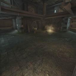
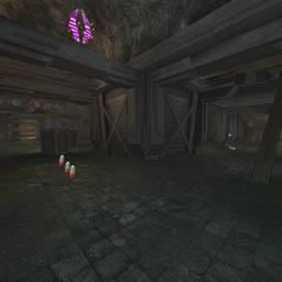
It improved, nice map for just having started with mapping. Lighting is better too and the strong black light contrast adds to the style but you still haven't fixed all problems with it, on a couple of spot there is still light coming from apperantly nowhere :)
|
JuggaloKyle
03-07-2005 10:50 AM MST | Rating: 7.5 | |
very good map. the flow is really nice for Death Match, and the bots dont studder one bit. the maps atmosphere is really good, the whole cave theme hasnt really been done alot. good job *thumbs up*
|
darth_weasel
03-07-2005 01:31 PM MST | |
Like was said, considering it's your second map it's well done, lighting is still a little bland, but yeah big improvement
|
Manticore
03-11-2005 03:36 AM MST | Rating: 7 | |
Generally a well made map that plays well. Good 1/1 layout. Worth a look........
|
D-7
03-12-2005 03:27 AM MST | Rating: 6.5 | |
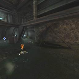
Looks almost like a Hourences map... Somewhere between Argel, Rrajigar (spelling?...) and Rankin.
But DAMN it's tight! No space for jumping, dodging, nothing. The ceiling at the DDamage is sooo low I need to consider pushing 'C' if I don't want to get blocked.
Visuals: 8
Gameplay: 5.5 (because of scale, otherwise it'd be a laughing 8)
|
cUnNiNg_StUnTs
03-12-2005 01:14 PM MST | Rating: 8 | |
good stuff!
It'd be near perfect if not for a few dead ends. Very well thought out and pretty too. :o)
|
nELs0n
03-15-2005 01:03 PM MST | |
heyhey!
thanks for your comments and the great rating guys!!!
i'm really glad you like this one!
currently i'm working on a theme and basic layout for my next map - hope that one will be done a bit faster than amnidios ^^
thx again and have fun!
|
zaped
03-26-2005 02:21 PM MST | Rating: 8 | |
Youre lighting is very good. It creates a nice atmosphere. The layout looks great.
Awesome dude - make more!
|
Fuzzy Logic
03-27-2005 07:19 AM MST | Rating: 8.5 | |
Although the map looks good, where it really stands out is in the layout. Flow is excellent making gameplay fast and furious...which is what the game is all about.
|
{o|]o}
03-28-2005 07:21 AM MST | Rating: 6 | |
Was ok.
Nice running about shooting ppl etc etc....um.....6
|
scirmast
06-04-2005 07:47 PM MDT | Rating: 7 | |
My little review will mainly cncentrate on the bad parts in this map, but this does not mean it is all bad.
OK, first of all, the visuals are good. I didn't have a big change to enjoy the high details too much as I tested it with an old computer, but I can tell that it looks pretty.
The main downfall of the map is the layout, the most crucial part in a map. It consist entirely of rooms, corridors and ramps. And on top of that, corners are 90 degrees. Very little Z-axis involved. The only truly good part is the shield that lies on a plank. But hey, it's the authors second map for 2k4, so I understand.
Another little thing wrong with the map is that Bio Rifle and Lightning Gun are left out. I understand that lightning gun does not fit to the level, but Bio Rifle surely does. And every respected dueling map has to have a lightning gun. Maybe I just didn't find those?
As a final nitpick the lift raising sound is too long for the small lifts, but it's not a big deal.
Nelson, you got a good talent. Just for the next map, try to think of a more complex layout than this one. Look at Rankin: it is full of complex designs which makes it unique and allows for some good manoeuvres to be executed.
As a conclusion, a nicely done map that has some serious problems with the layout. I hope we see some quality stuff from the author in the future.
|
CursedSoul1
06-06-2005 07:30 AM MDT | Rating: 7 | |
good flow in layout,
nice structures and atmosphere.
nothing besides the layout is really special,
but its good.
very tight, looks good.
|
sAYur!
07-05-2005 06:46 AM MDT | Rating: 8.5 | |
I realy like this map! It looks good and it has a nice gameplay.
I'm realy looking forward to your next map ;)
|
Turns2Ashes
07-05-2005 11:19 AM MDT | Rating: 7 | |
I love how this map looks but the layout of the weapons and the lack of a 100a really brings gameplay down for me. The few weapons there are sit too close together, and where's my lightning gun? :(
|