|
|
|
 |
|
 |
 |
 |
 |
| DM-Stratofortress | | | Map Info |
| | | | File Name | dm-stratofortress.zip | | Author | Mislav | | Gametype | UT Deathmatch | | Date Added | 01-31-2005 | | File Version | 1.00 | | File Size | 878 kb | | Player Count | 2-10 | | Map Description | None | | Review Rating | 4.5 | | User Rating | 6.5 | | Overall Rating | 5.5 |
|
|  | | | | Review |
|
DM-Stratofortress (UT99)
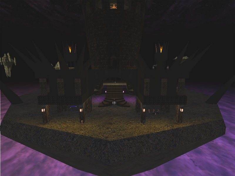
A map that one would believe to be inspired by DM-Barricade, we have a castle-ish structure floating on rock in space map. Not so good as the obvious inspiration, it seems like some interesting ideas not meeting there potential.
AWE: 1.5
Textures are fairly well aligned. Mostly brown ground, brown stone walls, brown metal, really the only color to the map is donated by light. The textures certainly fit the theme but they're all too monochromatic and don't really distinguish the different areas very well.
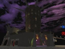
The lighting is a bot wonky. The first problem is the lack of light sources for a few choice spaces, for example the green light that shines on the wall under the ramp at the 100a. Another problem has to do with light sources casting the correct color light, and then surrounded by a colored light for which there is no source, for example, the chandelier in the tower casting white light but surrounded by red light. The lighting outside is a little dim and ambient and the torches don't really seam to be affecting the quality/quantity of light outside. The flames have the same problem.
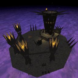
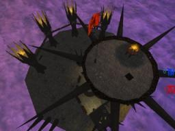
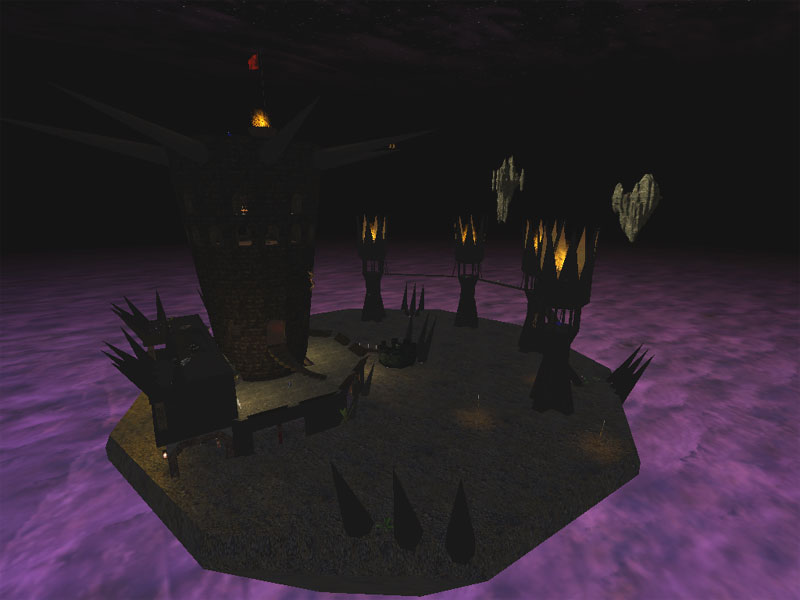
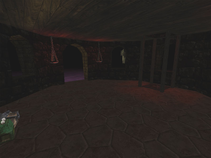
The overall architecture is suspect as well. There are stairs on the outside of the tower leading up to doors that lack any realistic support. Windows are a little on the small side, the inside tower rooms are small, cramped, and lack artistic geometry as they're pretty much just subtracted cylindars. The small platform/ledges in back of the tower that support the flak cannon and rocket launcher really don't seem like they belong with the rest of the structures. The two best architectural features are the top of the tower and its spikes which seem like a precursor to CTF-Citadel from UT2003, and the ring of small towers and bridges joining them. Overall, it feels incomplete in general.
From the monochromatic texture pallette, to the unsourced lighting issues as well as mystery colors, to the unfinished architecture the whole map seems like it had a good beginning but the author just didn't really know how to finish it up - didn't know how to polish it.
BUILD: 2.0
Despite the graphical problems, the overall construction is fairly good. The BSP work is solid and no HOMs were detected. The emitters looked convincing enough for UT99 and did a little to 'livening' up the map a bit. The teleporters worked well overall but the bots seemed to prefer jumping off the top rather than using the teleporter back down. Finally, the sounds were, again like the AWE aspect, seemingly unfinished. The flames had a good sound attached to them and a good radius. The lifts worked well and had a good sound attached that ended at the correct spot. However, the larger area ambient sounds need more work. The ground area has a decent wind sound, the higher, inside tower area had a slightly more intense wind sound, and then the top of the tower had a more intense wind sound. Now, varying the intensity of the wind sounds was good to do and is a step in the right direction. However, the wind sound inside the tower is a bit too loud - almost like the room is completely open with wind going right through it. What would have been better is to place those sounds just outside the windows. That way, one still hears the sounds inside the room, but as you approach a window, it gets louder like the wind is whistling by outside the tower and not in the room with you. Also, some more varied ambient sound would have been appreciated outside on the ground because that area is pretty much the same wherever you go.
In general the build is good in terms of the technical side of the area but improvement is need in terms of using these technical skills to bring nuances into the map - like in the case of the sound.
CAST: 1.0
The gameplay here has several problems overall. First, the large ground area afford little to no cover for quite a large space. The spikes poking out of the ground that sometimes harbor weapons or health are nice and I would have liked to see them propagated more throughout the large open area. The mini-towers connected by bridges are not used by the bots, which means that they never grab the shield belt nor any of the weapons up there. They are also much to narrow leaving no room to dodge and also limiting their z-axis use. The doorways in the towers that join the bridges together have a big problem in that the step, or somethig at floor level, is too high so that you have to jump to get onto the bridges. I got stuck whenever I tried to run the bridges unless I jumped. The stairs accessing the 100a from the ground floor are too narrow and are barely lit so it's amazingly difficult to see them. The two curved sets of stairs accessing the lower tower level where the lift is are too narrow and require too much attention to navigate them. The windows used to jump onto the platforms housing the flak cannon and rocket launcher are too narrow as well, again, taking too much attention away from gameplay. The second tower level where you access the second lift is too small for the flak cannon. I went up there several times and was almost immediately owned by the bot that always seemed stuck on that level. And when I finally conquered it, I owned that area until the bouncing flak from my own weapon finally took my health to zero. The lifts themselves are also too tight and hard to use unless you take your attention away from fragging. This means that using them as a means to escape the bots is futile as you'll invariably get stuck and be very exposed to fire. The top of the tower is probably the best place on the map to fight as well as according you access to the Damage Amp and the redeemer. Seeing as how you need to be quite careful to grab either one out on the tips of the spikes, they're proximiy is not as much of a problem as one would expect. Still, they really should be seperated more.
The bots tended to get stuck at certain areas, like in the middle tower flak room, or on top of the tower and so it was quite easy to spam the bottom of the tower and rack up a lot of kills, or play the center field because these two areas were pretty much where you'd always find the bots. The last problem with the map is that there are two flak cannons and two rocket launchers. This is unecessary on a map this size.
In general the layout of the map hinders gameplay quite a lot and the places where the bots and the player get stuck and the minitower/bridge area that they don't use just make it worse.
Stratofortress generally just seems like an interesting idea that is completely unpolished. Some interesting architecture combined with simplistic forms, a simplistic texture plallette, borked lighting, bots that get stuck and don't use areas effectively, wonky item placement, and areas that are too narrow all combine to make this somewhat of a dissappointment. The author certainly knows how to use the editor, now he has to polish up his overall design skills. |
| |
| | | | Map Comments |
| Nahand
01-31-2005 05:19 PM MST | | ... well, it sure is a "fortress" in the stratosphere... kinda reminded me Orion's Barricade...
| Evil Snack
01-31-2005 06:51 PM MST | | No more Tron?
| Lok
01-31-2005 08:15 PM MST | Rating: 5 | | well ...me too thats map reminded me the orion's barricade but anyway i dont care ...
the island is very sample and the fortress too , more detail can be good ... the layout is very sample like this map.
| GTD-Carthage
02-01-2005 03:44 AM MST | Rating: 7.5 | | Lok, it's "simple", not "sample". :)
Lots of curved and diagonal surfaces and the creepy architecture looks a bit facinating. Lighting feels too simple outside though.
|

|
|
 |
 |
 |
 |
|
 |
|