|
|
|
 |
|
 |
 |
 |
 |
| DM-TronArena | | | Map Info |
| | | | File Name | dm-tronarena.zip | | Author | Mislav | | Gametype | UT Deathmatch | | Date Added | 01-01-2005 | | File Version | 1.00 | | File Size | 973 kb | | Player Count | 4-12 | | Map Description | None | | Review Rating | 5 | | User Rating | 7.5 | | Overall Rating | 6.0 |
|
|  | | | | Review |
|
DM-TronArena (UT99)
Honestly I only vaguely remember the film despite my age but I am hard pressed to watch a film more than once. I do recall enough to make sense of Tron maps, art style, games, and jokes. What we have here is a half-way decent attempt to install Tron into Unreal.
AWE: 1.5
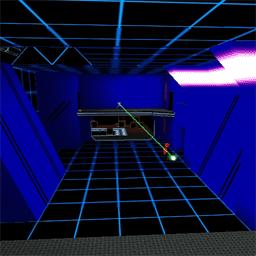
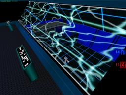
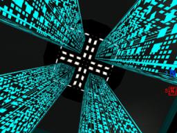
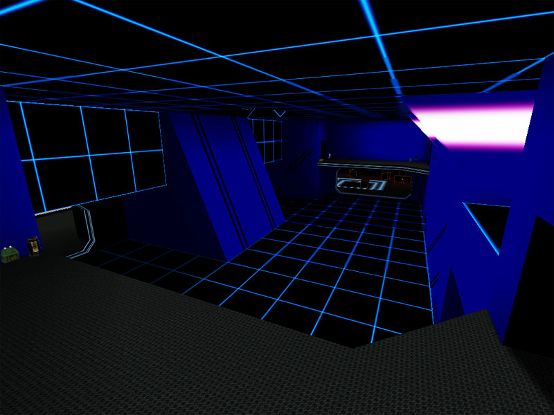
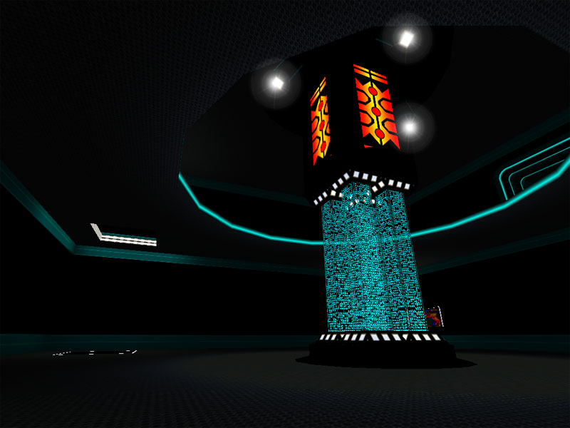
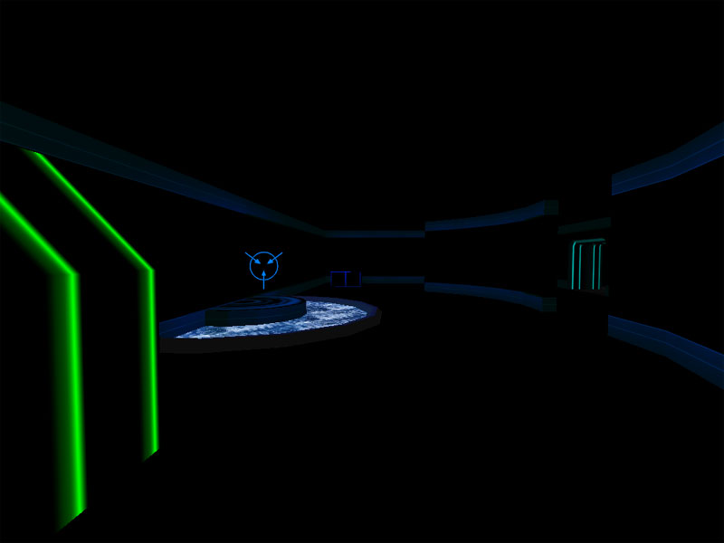
Of course we are introduced to new textures with this map. There really shouldnât be anything other than custom textures. Well, theyâre here and work pretty well overall. Everything is well applied and I couldnât really find any misalignments. Granted theyâd be really easy to spot using this theme. Geometry was surprisingly well trimmed as well â I would have considered that a challenge with this theme but the author pulled it off well. As for the actual texture choices and how he applied them to the different areas â well, Iâm not so sure his method was uite as planned out. There are certain rooms that are all one color, and other rooms that are mostly just blue but there are other color accents within them. I would have expected to either go one way or the other â having the mix seems a little inconsistent to me.
The lighting â because itâs Tron â is pretty much all rather ambient lit. Iâm not sure if the author did this on purpose, or whether it was because of the way light would interact with these textures, but although lighting like this would kill the rating in a regular UT map, the theme here supports it. Sometimes, however, it seems like different ambient light brightness values were used.
As for the architecture, well, based on the lack of âmeshesâ and other ordinary details like trim that usually would stand out or away from the basic structural geometry, it seems like a very very beginner map in terms of detail work. Taking the theme into account, one realizes itâs not a beginner map but itâs a little difficult to tell this on a cursory run through it. The architecture is blocky and basic, but then it should be. There are some nicely rounded areas and these stand out the most in terms of form.
Overall, the texturing, lighting, and architecture all suffer somewhat from the theme. Iâm not sure myself what to suggest to remedy this but I get the impression this could be much better than whatâs presented here. Iâd say itâs a good start, but it doesnât seem complete.
BUILD: 2.0
The map is built quite competently. The BSP all works together well as do the decorations added to it. The movers work fine but donât seem to have a support to them nor sound, both of which always irk me. The teleporter works fine but I never saw a bot use it. The big complaint here is the complete lack of ambient sound. I would have expected some humming, or computer noises, or maybe a custom sound or two from the movie/game(s). Thereâs nothing.
So overall my one complaint really is that itâs a silent map. Otherwise itâs build well and whatâs supposed to work, works.
CAST: 1.5
The gameplay is fun enough but nothing special. Thereâs obligatory z-axis but really just between âlevel 1â and âlevel 2â. An upstairs and downstairs. A more varied z-axis is sorely lacking here. The layout is a bit random without any clear purpose. More like a series of rooms and a little bit of R-C-R. The weapon layout is better although still a bit wonky. The rocket launcher I thought was fairly nicely placed in a smallish room with an opening onto the largest room. However the rest of it just seemed average.
One big problem was the massive player count which gave a default of 8 players. 8 players was too much for the map in that the bots tend to favor the central large room and it quickly becomes a series of races for the rocket launcher or all-out spam fest. I would hesitate to see 12 players in this.
Another problem was that either there wasnât enough health in the map in general, or there wasnât enough to support the upper limits of the player count. I had a very difficult time locating any when I was down on health.
In general, the gameplay was a disappointing in terms of layout, z-axis, and central area spamminess. The map does not have bad gameplay, per se â just nothing really special.
To put it all together this is a Tron map that kind of missed the target. The visual aspect looks like Tron but it lacks polish. The gameplay is lackluster and could use more work. In general â just an average map with a somewhat new theme that could have been more.
|
| |
| | | | Map Comments |
| Evil Snack
01-02-2005 05:49 PM MST | Rating: 7.5 | | Well, I must say that I was somewhat dissapointed. But thats really just because it wasn't as big as the first one. (Well, it's an arena)
The random piles of ammo in almost every corner was kind of confusing but useful.
Overall I thought this map was very good. (That Sound Dampner really brought back some good memories of Unreal :) )
By The Way: You spelled "Security" wrong :)
I REALLY love the great new textures. Keep it up!
| Monday
04-01-2005 01:39 PM MST | | Another Tron map but based on an old 286 maybe.
Could have been more colourful.
No rating as I already have 4 good Tron-type maps.
|

|
|
 |
 |
 |
 |
|
 |
|