|
|
|
 |
|
 |
 |
 |
 |
| DM-Recrem Kram | | | Map Info |
| | | | File Name | dm-recrem_kram.zip | | Author | yournan | | Gametype | UT2k4 Deathmatch | | Date Added | 12-17-2004 | | File Version | 1.00 | | File Size | 3.07 mb | | Player Count | 4 - 6 | | Map Description | None | | Review Rating | 6.5 | | User Rating | 6.5 | | Overall Rating | 6.5 |
|
|  | | | | Review |
|
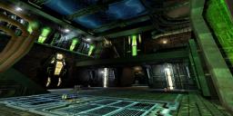
DM-Recrem Kram (UT2004)
Itâs nice to see the Skarjj have been busy. A nice little Skarrj-themed map, its gameplay is reminiscent of 1on1-crash and similar maps. Decent theme, decent gameplay, well-built â itâs one youâll want to try
AWE: 2.5
The lighting here is pretty good overall. Itâs got a fairly nice mixture of light and shadow and no-where is too dark, nor too bright. The shadow work stays close to the walls and doorways which is nice but it would have been nicer to expand them out into the main play area. The colors are predominantly green and white implemented with a good mix between the two. The colors pass back and forth often â no area is just white nor just green and while the green lighting certains seems favored throughout, nowhere does it really seem overused. When mixed with the shadows, the lighting is of pretty good quality.
The coronas are a good size and color and do not take over the screen. Theyâre very well implemented.
The textures are well-chosen and fit in very well with the overall theme. There were no obvious misalignments and also a decent variety. Everything was pretty well trimmed through the map except for the lift shaft. The skybox does look nice but could have benefited from movement.
The architecture was a little basic â harkening back more towards UT99 than UT2K4. Perhaps this was intentional to fit with the Skarjj theme but the architecture coud have been a little more complicated. The static meshes that highlight the walls and ceilings are very well-chosen and implemented and really help bring the theme home.
Overall, the lighting is above average and a little more shadow work would have completed it. The texturing was well chosen and well implemented and the architecture was a little simplistic but the static meshes added to it really round it out well.
BUILD: 2.5
The map is well contructed. The BSP work is, as mentioned before, a little simplistic but competently put together. The map was zoned well, and the static meshes were added with thought and precision with good blocking volumes around it to ensure no player stickiness.
The lift was a reasonable speed and had a decent sound attached to it, as did the jumppad. I do think the jumppad was a little too strong on the boost but that could be personal taste.
One downside was the sound. There were plenty of ambient sounds around the map but they were monotonous and really only sounded like two. One for the steam, and one for general ambiance. Some more variety in sounds and more location-based sound would have been appreciated.
In sum, itâs well-built with the only downside being a monotonous soundscape.
CAST: 2.0
The gameplay here is almost more like a 1on1 map that the small/medium map the default playerload suggests. The two-level gameplay, weapon layout, and size all suggest a more intimate arena that would work well for 1on1.
The z-axis here is basic but functional. Most of it consists of a floor area and then surrounding ledges from which you can bombard the floor level. A more layered z-axis would have been appreciated with an intermediate height difference between the two major levels. There is a little bit of this near/through the doorways, however more would have been appreciated.
As a result, youâll find yourself fighting in mostly 3 planes â flat on the floor, flat on the upper platforms, or down into the lower area.
The weapon layout is good and the placement of the Damage Amp is very nice. A little challenge to get to but almost immediately rewarding.
The bots went pretty much everywhere and grabbed the amp so no real complaints there. With the default player count, it can get a little spammy and thereâs never a moment when youâre all alone.
Overall the gameplay is satisfying if a bit basic. More z-axis variety really would have made this stand out better.
Put together, the map is above average but nothing really stands out as anything particularly special. The theme is decidedly Skarjj and although itâs nice to see it again, and see it competently done, thereâs nothing new. The lighting, texturing, and architecture all lend themselves to the theme well. As for the gameplay, itâs above average as well and tastes like 1on1-Crash. But itâs missing the multi-level variety of Crash and so leaves one wanting more.
Worthy of a download for all but the most picky, Iâm keeping this one on my HD.
|
| |
| | | | Map Comments |
| G.Lecter
01-22-2005 03:19 PM MST | Rating: 7 | | Visuals: The visuals & lighting are OK, sometimes a bit simple & geometrical...
Framerates: FPS are excellent, I've played some maps in Mothership theme and this is the only that runs smooth.
Layout: The layout is very good for DM, but quite simple too. I miss more jups, tricks, different kind of Z-axis...
Item placement: It's OK.
Bots: I have not seen anything weird with bots, they played a good match. I think the playercount is too high, less bots would play better.
Why the map has not any Level Preview???
Edit: Not sure, but I think the preview does not work because there is a space in the mapname...
| souldividersjosz
01-23-2005 01:49 PM MST | Rating: 7 | | Yournan's original work is better than his remakes IMHO, and yes why no matseq?
EDIT: AV scarrj'd himself again with a spelling mistake! Hope you don't get stcuk on your way out :P
| yournan
02-08-2005 11:29 AM MST | | g lecter thanks for your feedback again, much appeciated;)the fps is one of the best i've ever managed ot come up with, the load of antiportals did well.in terms of layout again it was meant for 1on1, sorta crash style but it turned out bigger than i wanted. hmmm sorry about the level preview, i'm 99% sure the one i have has got the level preview
sjosz weird, checking my copy.You think my own work is better than re-makes?
MsM
**they pronunce skarrj as scar. All it is, is a slighty j. The spelling i've takne from is from unreal 2 & ut2k4.
**C.S, sorry mate i do agree. i was trying a new technique of copying existnig textures in the map, making map creation a lot quicker, the textures looked aligned:(, sorry guys next time i do that i will align them again.**
| Kaithofis
01-22-2005 10:30 PM MST | | Ehm, Arcadia
It's spelled Skaarj, even in Unreal II, so it must be true ;)
| Ice-Dancer
01-22-2005 04:10 PM MST | | there are various spellings of it if i remember correctly, in Unreal II, they seem to pronounce it "Scare"
Its all good :)
Loved the review Arcadia
| T0mbr41d3r
02-02-2005 12:47 PM MST | Rating: 5.5 | | Really seen a lot of this kinda maps, too much even.
| cUnNiNg_StUnTs
02-06-2005 10:25 AM MST | Rating: 7 | | It is a good map but considering who the author is misalignment of textures is not able to over look. It's almost like he was speed mapping. Don't get me wrong I love all his work so far but it doesn't mean he can pull a Metallica St. Anger on us. :D
| JuggaloKyle
02-18-2005 06:54 AM MST | Rating: 7 | | quote from Sjosz "Hope you don't get stcuk on your way out"
oh man, if people only knew how funny that is. im still laughing lol. anyways, the map is really good MsM.
|

|
|
 |
 |
 |
 |
|
 |
|