|
|
|
 |
|
 |
 |
 |
 |
| CTF-Coldwater | | | Map Info |
| | | | File Name | ctf-coldwater.zip | | Author | s1Co | | Gametype | UT Capture the Flag | | Date Added | 12-06-2004 | | File Version | 1.00 | | File Size | 872 kb | | Player Count | 4-10 | | Map Description | None | | Review Rating | 5 | | User Rating | 6 | | Overall Rating | 6.0 |
|
|  | | | | Review |
|
CTF-Coldwater (UT)
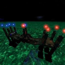
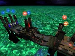
A tight little CTF map situated on some sort of off-shore platform with not another thing in sight. Composed of a series of ramps on a rectangular floorplan this map offers some z-axis, basically 1 route to the flag, and a very green ocean.
AWE:1.5
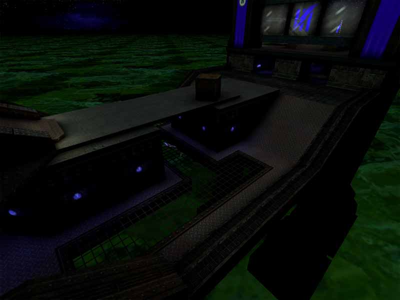
The lighting here is hit and miss. Most of the red and blue lighting is more oversaturated than I prefer. I'm always of the opinion that red and blue team base lighting should be saturated enough to clearly define the side of the map/direction but not look like the bulbs are made of cobalt or ruby. Taking some of the saturation away from these lights would have produced a better effect. The other lighting in the map was plain white or dull yellow. This was better but since the surounding ocean is green I would have expected a greenish tint to the white lights. However, between the lights it's quite dark. If one is inside the flag bases or the center area, the areas are quite dark and difficult to see in. The lights should have had a larger radius to extend the pools of light so that they overlap better. Finally, the coronas at the top of each of the flag areas are a little too oversized and also shine through the flags hanging from the center point of the map.
The surrounding ocean is ugly and repetitive. I respect the author's choice in trying to make an ocean that's a little different, but the repetitiveness of the texture used really kind of hurts the effect. The platform texturing is generally pretty well done. There's decent trim and misalignments weren't immediately apparent. However I must question the author's choice of textures because 90% of them consist of rusty brown/red metal or grey metal. I understand that it's suppossed to be a ocean-weathered metal structure in the sea but some variation, particularly inside, would have been appreciated. As it is, you have the same color pallette throughout the map and it tends to wash out the level a bit.
In terms of architecture, its decently shaped but nothing's really striking or stands out. It's certainly a platform on the ocean but what kind? There's no machinery to indicate an oil platform. There are a few crates here and there but that doesn't really suggest anything. Perhaps it was built simply for CTF?
Overall, some average lighting that's a little too dark, some texturing that is bland and all runs together, and some decent architecture that doesn't really suggest a distinct location make this map a little drab. Some better variation and a more clear definition of the placement of the map would really have helped clarify the theme.
BUILD: 2.0
The BSP work here is simplistic overall but solid. The most complcated work was done in the center area with nicely shaped wall struts on the inside. Everywhere else is basically just basic rectangles and ramps. I didn't really encounter any bad BSP work.
The sounds leave a lot to be desired. There's a spinning fan with an associated sound but the speed of the fan doesn't match the speed of the fan. Otherwise I didn't really hear anything. Adding more ambiant sounds around the map would really have helped out. Perhaps a wind sound, or two, for the outdoor areas. A machine hum for the inside, a crackling sound for the emitters at each base, these little touches really help make the map come alive.
Framerates were basically okay. Looking at the center area will cause you to dip a little but it's pretty manageable overall.
Overall its solidly built with the only real complaint would be that there isn't enough sound.
CAST: 1.5
The gameplay has some of the required basics but never really shines at any point. The first detriment you'll face is the darkness - expecially inside.
The next challenge you'll need to overcome is that each of the flag bases have only one entrance/exit unless you have the jump boots which are located one in each base. The boots provide an easy exit over the glass wall and, if you can refrain from jumping long enough, you can jump up on the top of the center portion to grab the double-damage and also to snipe. However, one must be in a flag base to grab this tool and if you do not have it, escaping the base with the flag becomes a little too challenging for my taste. A second exit would have been much appreciated. Another problem with the layout is that there's really only one path from flag to flag. At times you have a chance to go right or left but it's mostly a choice of going around a crate, or a pillar, or a block of map that, 10 steps later, places you back in the center. Saying this map has a left route and a right route is really stretching it. This means that you pretty much always know where the flag runner either is, or is going to be.
The ramps lend a moderate amount of z-axis to the map but it's limited overall. It creates an illusion of z-axis variety throughout the map so for the most part you'll either be fighting on level ground, or uphill/downhill on a ramp. Very few times was I getting the 'drop' on a bot.
The weapon layout was satisfactory although I do question the author's choice to place the minigun and flak at symmetrically opposite sides of the flag base up on beams, but place the flak ammo next to the minigun and the minigun ammo next to the flak. Either this was a placement oversight, or the author didn't want the holder of the weapon hoarding the ammo for it.
The reccomended player count is 4 - 10 so I played at the average of 7. I think this was a little too much considering the 1 exit (withut jumpboots) from the opposing team's flag base. It was all to easy to tag the flag runner either on the way in or on the way out when I had 3 bots on my team. I would say somewhere between 4 to 6 would be better.
To sum it all up, this map makes a decent effort at challenging CTF play but is hampered visually, audibly, and in terms of gameplay. The textures are drab, the lighting uninspired and at times overstaturated, there's no clear indication of location, and there's not enough sound to flesh out the map. The z-axis is hit and miss and the limited access to the flag base and straight-shot route hurt the gameplay a little too much. Despite the solid construction and mostly nicely layed out weapons there's just too much missing to really make this map stad out from the pack. If you're a CTF freak, I would reccomend checking this one out. I think it could work pretty well for instagib. If you're looking for the next big thing, then pass this one by. |
| |
| | | | Map Comments |
| C Duke
12-08-2004 04:05 PM MST | Rating: 6 | | I quite like this map it's nice and simple like CTF-Face but without the snipers (I hate UT campers :D). Here's a couple of suggestions...
The background looks strange especially the water I would of thought an icy blue would of worked better. Also make sure the struts go through the water, I don't think you need to use a sky box.
The top area with the flag is very restricted on escape routes maybe a back or front exit would make it easier.
Overall a reasonable map. Well done.
EDIT: I'd be interested in what a reviewer has to say about this map.
|

|
|
 |
 |
 |
 |
|
 |
|