|
|
|
 |
|
 |
 |
 |
 |
| DM-Olden | | | Map Info |
| | | | File Name | dm-olden.zip | | Author | quillion | | Gametype | UT Deathmatch | | Date Added | 12-02-2004 | | File Version | 1.00 | | File Size | 725 kb | | Player Count | 2-4 | | Map Description |
Map requires Hourences texture pack to run.
Get it here
http://nalicity.beyondunreal.com/map_hub.
php?mid=7937
Sorry for not adding to mylevel but,
my editor simply wouldnt
export them. Only god knows why. | | Review Rating | 6 | | User Rating | 7.5 | | Overall Rating | 7.0 |
|
|  | | | | Review |
| | Reviewer | Mister_Prophet | Awe Score: | 2.0/3 | | Date | 12-02-2004 | Build Score: | 2.5/3 | | Review Schema | Cast Score: | 1.5/3 | | User Point: | +1 | | Overall Score: | 7.0/10 |
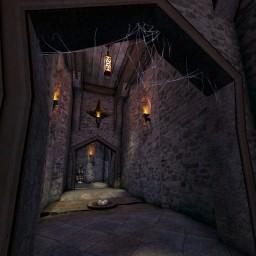
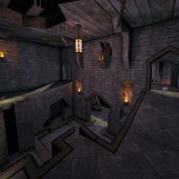
DM-Olden is a step up in terms of visual thematic execution for mapper Quillion since the last map he sent my way. Employing (but not included in the zip mind you) the urban texture set given to the community recently by Hourences, Olden uses the pack in a way used similar by Frieza's DM-Dinashar; Battered and ancient.
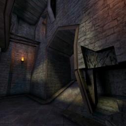
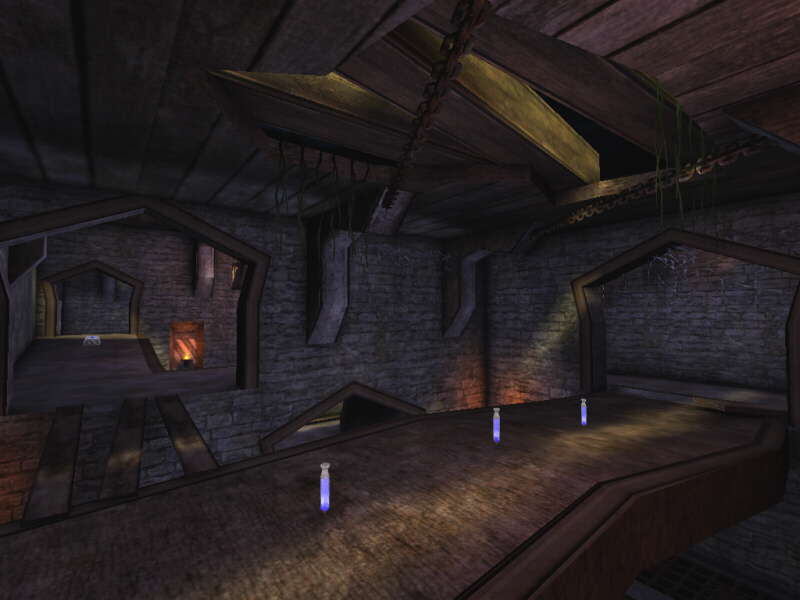
Unlike Dinashar, and this is Olden's primary fault, is the uninspired layout.This is not to say that Olden's gameplay will not bring comfort to a player's balls, but it isn't the most original framework for a Death Match arena. Basically we have a two floored environment that has the upper side looking down on the central , lower side with lifts and ramps giving upward mobility. Imagine the main area of DM-Imago only repeated twice and without the side areas. Despite this average layout, fun can be had. Item placement is palpable although power-up placement is a bit questionable. Only the Damage Amp and Thighpads are in real risk territory, but the shieldbelt was sort of placed along a pathway. This brings me to another complaint, the map just doesn't have a single landmark. This effects item placement since the choices are limited and it effects stimulation since the map risks being repetitive and every area appears to be the same. Even still, I'd be lying if I said I didn't have a good time. There are some obstructions that could really hinder flow, such as an oddly placed plank that looks like it should be climb-able but ends up being a potential death trap. Bots perform fine and playability is not a problem. Though, and I only tried this out of curiosity, I used the jump boots to jump out of the roof. Mappers should be blocking open ceilings, it's a cardinal mapping rule that...I....just made up. But seriously, make sure players can't leave the battle area.
Visually, the map looks good. Alot of this can be explained by the texture choices but the author has done some nice brushwork to make the place look run down. Cracks on the walls, plants creeping between bricks, lots and lots of loose planks and crumbled supports. I noticed Quillion has a habit of keeping his chambers somewhat box-like, some 2d-shaping or vertex editing would really make those subtractions sexier. The Only real problem with the visuals is that they don't carve out a truly original layout. The location has class but no style. It's got swell one-liners but it can't spit any game. It's got a nice rack but no personality. You could take these same subtractions and put tech detail that looks just as good. What Quillion needs is a sense of location. He's proved he can make the trimmings of a theme, but the design of the place has to match.
The Prophet's Verdict: My review might sound negative, but this really can be a fun map. With the help of some awesome textures the place looks sweet too. Only bad things is lack of original design/layout and possible floor obstructions (though I never got sandwiched).
To the Author: You still need to work on location. Your maps tend to be a generic subtractions filled wiht thematic detail. This certainly isn't bad, but you have much more skill than what is needed to present even the slightest presence of location. You are easily capable of pulling this off. Try to avoid setting your maps up in "Box + Box + Box" order and try to make shapes that have a better likeness to your themes. Look to the following maps for Reference: DM-Dinashar and DM-LastCrusader3. See how those maps use location to provide a believable theme. |
| |
| | | | Map Comments |
| Derdak2rot
12-02-2004 04:09 PM MST | Rating: 7.5 | | Mmmhh!!! very nice map ! with good texturing and lighning . good theme with nice details . but in my opinion , the layout need more work and the placement of some weapons ( like the flak ) are not well appropriate . but i like the feeling of this map !
| Koveras
12-02-2004 06:36 PM MST | | didn't we play this map already under its former name Dinashar? :P
couldn't resist Quillion, had to say it :P
| quillion
12-09-2004 03:19 PM MST | | I knew someone would say that! Actually, this map was half finished when that was map was released. I thought about not releasing it, but what the hell:P
[edit] RedFist, zoning in a map this small, was not needed. FPS is fine and steady
within the map. The thing about the health is negligible, since 1 mesh would not harm FPS
to that degree. Quad, i guess you mean the damage amp? Well the bots get it easy and so can humans, with
simple jumpboot usage. The texture download was unavoidable, since UED would just crash when ever i tried to export anything, so adding into the map was unfortunately, (as far as i know) impossible to do.
Thanks for your comment though.
[EDIT2] RedFist, some maps that are run from the desktop, can cause the jerky-ness you say. Are you runing it from UT MAPS, then starting the game or clicking map icon on the desktop?
| redfist
12-10-2004 11:15 AM MST | Rating: 6 | | I dooooono...............those screenshots are looking to good for one of your maps,hmm
What you got a teacher helping you,looks real good man,I will like to see this one,catcha on the flipside.
Ok,map is good for fighting,the floor texture and the wall texture need bigger color change to enhance "3d" look ,all kinda looks like the same texture,light purple map in general sort of.
Also I feel the herky jerkey motion,so I checked in the editor,sure enough NO ZONING,also when you have a mesh (health) it can be seen from waay accros the other end of map.Move meshes to not be seen from long distances,will be better for FPS alot !!!
Quad is too hard to get,bot pathing seems good,Tiz a worthy map for fighting,and your best map yet.
And a big prob as you know is the textures not being in there,considering it's a 10 meg file.
ADD
Yep small map,don't zone it then,Everybody is a know it all these days.But I picked it off right away without looking in the editor.
Oh Well........................
I knew someone would say that,Mr proph,whatever...Lets put it this way,I can run maps with way more to it,along with size effects etc etc,so why don't it happen in them? hmm?
People really should listen to me,I spent more of my life fooling around on a computer than anything else,specialy unrealed geez.
But everybody is a know it all,have it your way.
No no nono other levels DO NOT act up,tell me why this one does,well I know why.and it's NOT my system,I'd bet million bucks if I had the money.
ADD
I am going to zone it and a few other things,but i wont send it here,any email i can send it after i redo it.?
Well I am WRONG would of lost a million bucks,somthing with win2000 and paging file I believe,BUT !! I did zone it and put all the textures in "MyLvel" and the quad is not hard to get I was trying to jump from the sides to get it.
| Vertigo
12-03-2004 06:42 AM MST | | sshots look good. i'll try it later :)
| ChromeBallz
12-10-2004 02:31 PM MST | Rating: 7 | | People seem to refrain from taking notice of Quillion's maps... Which is too bad.
[edit]Crappy performance my [censored]. I just tested this map on my IDT WinChip 180 MHz with a VooDoo2, and it runs smoothly at 25 fps.
Seriously, getting perfomance problems on this map means you have a very, very, very, very crappy pc.
If you're whining about it, then why are you the only one with problems?
for that matter, on my normal pc it runs smoothly with 200 to 400 fps constantly.
| Mister_Prophet
12-09-2004 03:00 PM MST | | If you get performance stuttering problems in THIS map than you need to get a rig that wasn't mass produced back in the dark ages.
Red Fist: You can say you have as much experience as you want, but the bottom line is that if you get performance problems on a map as small and casually detailed as this then your comp sucks. This map could have passed peformance tests comparable to the stock maps released with UT.
EDIT: I don't see how this map can cause problems that hevier maps do not. The fact that one zone is used shouldn't really be a problem, I've seen more detailed 1 zone maps pull it off. Of course, mappers should use multiple zones regardless of size. But still, if my aged PC can handle it...
| cobra6
12-10-2004 11:46 PM MST | Rating: 7.5 | | Great job man.
| AJSchiavoni
02-25-2005 09:43 PM MST | Rating: 7 | | very nice... keep it up
| Vatcilli zeitchef
07-15-2005 08:15 AM MDT | Rating: 10 | | Wonderfull, Really wonderfull.
This map is certainly one of the
best maps I ever saw,
When I look at this it makes me look twice,
no four times as bad.
nice work.
_________Edit__________
Don't go thinking I always rate this high I just see it looks this good and my work on the editor always becomes buggy (bsp cuts and stuff like that).
|

|
|
 |
 |
 |
 |
|
 |
|