|
|
|
 |
|
 |
 |
 |
 |
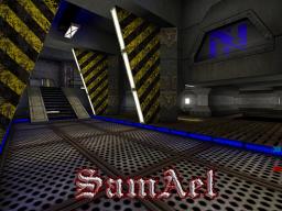
| CTF-Rendez-vousV1 | | | Map Info |
| | | | File Name | ctf-rendez-vous.zip | | Author | SamAeL | | Gametype | UT Capture the Flag | | Date Added | 12-01-2004 | | File Version | 1.00 | | File Size | 1.14 mb | | Player Count | 4 - 10 | | Map Description | This map is a kind of tribute to Unreal one. I take some idea in many maps (like DM-Fith) but i take a lot of time to make it. I realy like the playing in this map, they are many steps you can dodge on it to jump on the upper lvl and a lot of differents atmosphere(big rooms, small passages etc.)...annyway see by yourself.
This map require the texture package SGtech1 (in the bonus pack 4)
...sorry for my bad english. | | Review Rating | 6 | | User Rating | 5 | | Overall Rating | 5.0 |
|
|  | | | | Review |
|
CTF-Rendez-vous (UT)
In French, Rendez-Vous is a meeting or get-together at a more or less specific place. This map lets the two teams 'Rendez-Vous' in an industrial Skarjj base. Filled with the standard grey industrial theme accented by interesting architecture, the gameplay is basic but satisfies.
AWE: 1.5
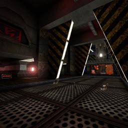
The overall theme is clear but not fleshed out as much as it could have been. It's certainly industrial, and there are a few obligatory textures/Flat Screen panels that indicate the Skarjj, but other than that it's just another industrial map.
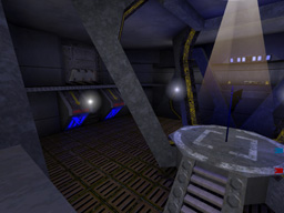
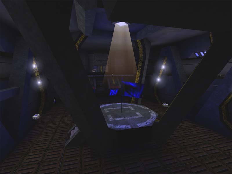
The lighting in general is good. Nothing's over lit nor under lit, and there is a little bit of shadow work in the central area. But the flag rooms and some side corridors are a little ambient lit. It could have used some better lighting variation there. The colors are decent throughout, although I think the red and blue lights are a touch too saturated. But not too badly. The only big lighting problem I take issue with is the lighting for the teleport doorway. One side has a pink/purple light, and then there's a distinct line, and the lighting is white. This breaks the illusion that the portal is a regular doorway, which I think was the author's intention. All aspects of the teleporter do work in creating this illusion, except for the lighting.
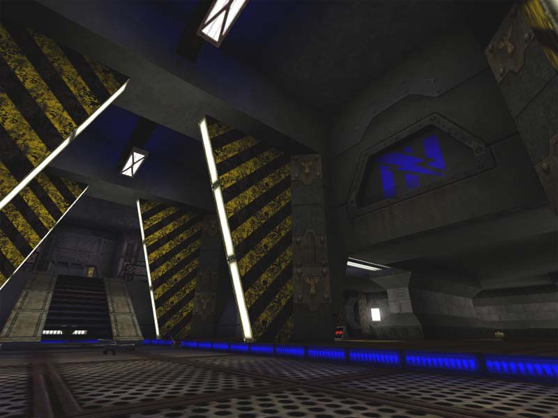
The texturing is well-aligned throughout the map. Although the somewhat standard grey textures are used on the wall, floor, and ceiling, it's rendered non-repetitive by the breaks caused by the architectural theme. Which is a welcome relief. The map is also trimmed well and the accent textures are used to good effect. I would have liked to see more textures relating to the Skarjj theme.
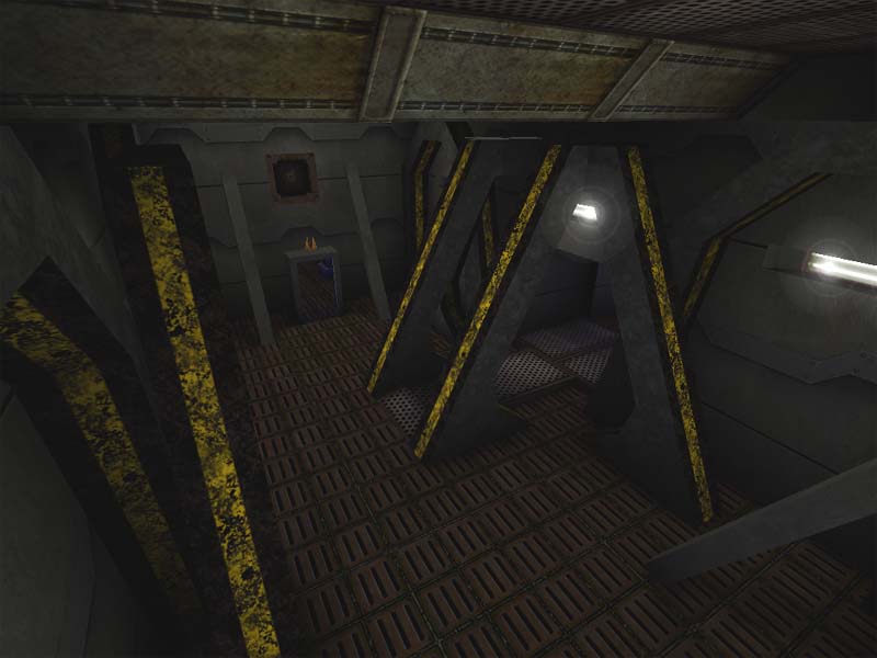
The architecture really stands out here with the long, slanted, floor to ceiling supports. Most of the map has subtle BSP recesses and some curves, but for me, these supports really stick in my mind. The architecture does help the theme a bit but I think more could have been done to represent the Skarjj aspect of it.
The combination of the lighting, textures, and architecture do imply the idea of an industrial Skarjj setting. But the lackluster texture choices, inconsistent lighting quality, and excellent architecture, just donât pull off the whole idea.
BUILD: 2.5
The build here is really quite nice. No HOMs that I could find despite the nicely complicated brush work. The doors have a good trigger radius and a sound is attached to them that fits very well.
The author did make use of some teleporters to connect two areas that are actually quite close to each other. The end effect does make it seem like the two areas are truely connected and it's just a regular doorway, however the lighting on either side does not match up at all making them look a little off.
The ambient sounds could have used more work. There are a few that do aid the theme, and they have a decent radius and volume, but there really should be more filling out the map.
Finally, the author chose to add in a âskyboxâ on the bottom level in the down direction. It moves, thank you for that, but Iâm not sure why itâs on the bottom. Is the base on a spaceship? Is it hanging off the bottom of a planet? I think the author should have placed it, or made it viewable, from all directions or giving some more thought to explaining it better in the theme/story.
Overall, the map is quite well built. A few more touches with the teleporter lighting, added sound, and a better thought-out skybox would have made it perfect.
CAST: 2.0
The gameplay here is somewhat basic but definitely fun. Thereâs one main route to the flags but getting back is a little more interesting. There are two entrances to each flag room, an upper and a lower, but the upper entrance/exit is only accessible from the floor/flag level by a lift in the rear of the flag room. This means that thereâs one quick exit on the floor level that does not use the central corridor/path, or a frantic run to the lift in the back, and then all the way around the room to the upper story doorway where one would then get access to the quick central corridor. A nice layout complication.
However, the rest of it is pretty basic. The bots will flock to the center path 90% of the time only using the side paths when theyâre after the invisibility or chasing a capper.
The architecture does have a gameplay drawback. There are two places where it cam impede movement. The first is in the flagbases where the lower doorway is. If you miss the narrow opening you will get caught on either of the side protuberances. And you cannot âslideâ off it to the side. You must back up and try again. When holding the falg this is a big danger. The other location is on the upper level where there are several slating supports. The bots sometimes get hung up on them and have a little difficulty maneuvering around them.
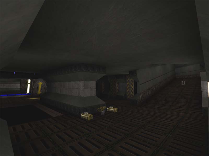
The pickup layout is a bit bizarre. I think that two invisibilities are a bit much for the map, especially since they are located in positions that are too easy to get to â on the floor in side paths. Also, the damage amps â two of them â are accessible only by Xloc, but they should have been hidden better, especially since there are two of them. In addition, the two armors are too close to each other although they are situated nicely under the stairs in the center area. On the upper level narrow corridors that line each side of the central area, there are way too many health vials. ½ or even ¼ the amount would be much better â although I do think that the shock rifle is well placed up there.
Overall, with the borked pickup layout and the botsâ tendancy to use the center path, the gameplay suffers a little. Despite the creative flag room entrance/exit setup, the rest of the map is a little basic in terms of gameplay for the bots. With humans, it would probably play much better.
This CTF Rendez-vous is a pleasant place to meet your mates online for a few CTF matches. Itâs architecture and gameplay would make a fun time online for the CTF fanatics out there. But if youâre going it solo against the bots, this map is a little of a disappointment. A download for the CTF addicts out there, but not much else for the rest of us.
|
| |
| | | | Map Comments |
| SoH_Ghost3021
12-02-2004 10:18 AM MST | | you can request a review by hitting that yellow button inbetween our comments and your desc of the map....just fyi. i have to look at this later, i am very busy right now..
edit: yah, the reviews can realy hit you hard sometimes,....but sometimes, they like your theme, and that in itself gives you more of a chance of a good score... just a random thought
| John DiFool
12-01-2004 12:11 PM MST | Rating: 3.5 | | I'd imagine (knowing the standards here) that this map
would probably get around:
Awe 2.0
Build 1.0
Cast 1.0
So between 3.5 and 4.5, depending on the reviewer's
individual tastes...
Awe is the best part of the map-good textures and
ambient sounds.
The build is low because, to be frank, the corridors are
too narrow, making Spam the order of the day. Plus
there's a weird invisible warp zone, where you THINK
you are heading away from your flag room (through the
door which says "Armory"), but you end up IN the flag
room-that kind of stuff doesn't help-I'm a firm
believer in What You See is What You Get.
And personally I don't like maps which are cramped all
around, no open spaces to catch your breath, so my
score is 3.5. Your bots work well tho.
| Derdak2rot
12-01-2004 03:18 PM MST | Rating: 5 | | Not bad , good theme and lighning , but the layout and architecture need more improvements !! but it's a good work for the second . continue comme ca , gars !!
| Kantham
12-14-2004 04:40 PM MST | | ouais , je doit avouer que c'est un bon depart
tout le monde part a quelque part ...
la premiere map que jai faite est tellement a chier que .........
| GenMoKai
12-21-2004 02:42 AM MST | Rating: 6 | | In english PLZ i dont get a think of that stupid france
| CursedSoul1
12-22-2004 02:59 AM MST | | no samael,
its very rude if you dont talk a language in a public space that not everybody can understand.
| CyMek
01-08-2005 06:48 PM MST | | Maybe they didn't want you to understand it?
Personallly, I enjoyed this map a whole lot, but it could have been much better. It looked killer, but the gameplay suffered from the narrow halls and cenfusing warp zone info. THe pickups also seemed somewhat excessve, but for some reason not overly bad. I will be looking for more of your work later on. Try to make all of your halls at least as wide as the one with the invisibility in this one though. Otherwise people can just take out any weapon and unleash a can of whoopass.
| Sicko Teddy
01-09-2005 03:05 PM MST | | The name reminds me of Jean Jar music- RendeVous.(:
|

|
|
 |
 |
 |
 |
|
 |
|