|
|
|
 |
|
 |
 |
 |
 |
| DM-2on2-Chizra | | | Map Info |
| | | | File Name | dm-2on2-chizra.zip | | Author | SoH_Ghost3021 | | Gametype | UT2k4 Deathmatch | | Date Added | 11-12-2004 | | File Version | 2.00 | | File Size | 6.87 mb | | Player Count | 4 - 6 | | Map Description | After the Skaarj were finaly chased from NaPali, the Terrans began to set up mining facilitys to harvest the Tyradium on the planet. To stop themselves from becoming enslaved again, the Nali decided to build another section of the Chizra Nali Water God Temple just for the Tournaments. They worked long and hard to bring some of the most hazardous areas you will ever fight in.
Version 2 features:
Fixed SOME collision problems, there are still a few in the water-room's corridor.
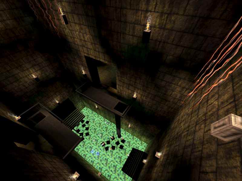
Added volemetric fog to lava room, bottom room, and water room, various other effects and sounds for almost everything that has an emitter. Although it takes more cpu power, it looks way better.
Removed some excess ammo.
Brightend up map in general.
Fixed deathtime when falling off of shield room's scafold.
Various other bugs and fixes | | Review Rating | 5 | | User Rating | 5 | | Overall Rating | 5 |
|
|  | | | | Review |
|
DM-2-on-2-Chizra (UT2004)
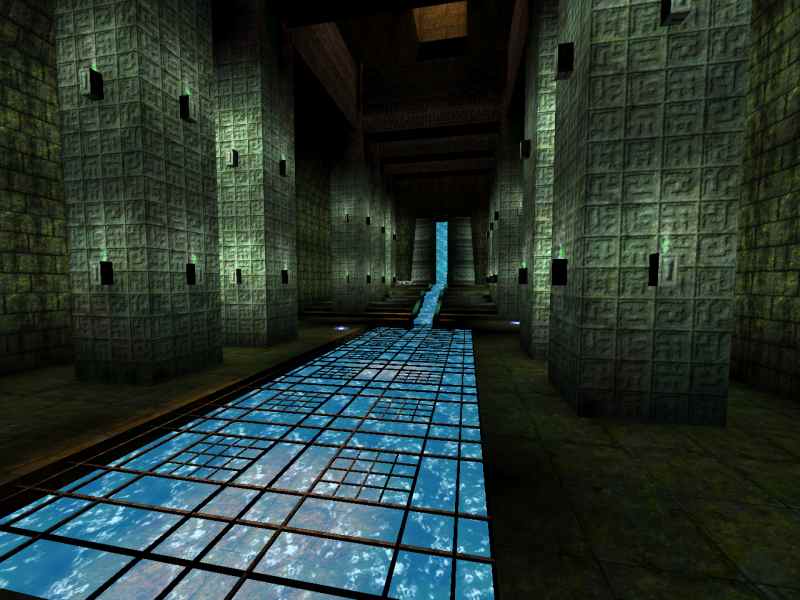
If youâve played the original Unreal this will surely remind you of the Nali Water Temple. The solid, block-like construction, the atmosphere, and the layout is all reminiscent of Unrealâs Chizra. Custom textures and music from Unreal are both present and really aid the feel that youâre back on Na Pali. However, like most of the original Unreal maps, they were designed for Single-Player action with strategically placed opponents. In UT2004, the maps, like this one, just donât lend themselves to the Deathmatch gameplay that is the standard now.
AWE: 2.0
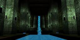
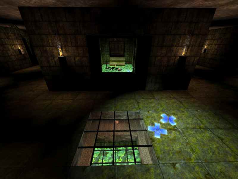
The atmosphere of the map directly transports you back to Na Pali when firing up the map. The author got the textures, lighting, and geometry of the rooms spot-on for a trip back into memory. But there are some sorely lacking points to address here. Despite the custom textures from Unreal being aligned well, and being placed well, there are a few places where they donât look right. The skybox has a double cloud layer that speeds across the sky too fast and both layers are the same texture going in the same direction. It looks odd up there and seems like timeâs moving too fast. The water textures leave a lot to be desired. Theyâre blue, and have ripples (in the texture, not from movement), and theyâre moving downhill, but thatâs about it. Thereâs no fluidsurfaceinfo in the actual Water Temple Room and the water just sits there motionless. The âflowingâ water looks like what it is â a flat animated texture. No sense of depth or surface variation. And there are no emitters for splashing water at the base of the waterfall. This all hurts the impression that this is a water temple.
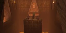
The lighting is very good where itâs present. I say this because if you move away from a light-source, youâre plunged into darkness. And this is one of my two main complaints about the map. It way too dark. The light sources are torches â which look good, maybe a little slow-moving, a combo of emitter and light that really look nice and cast âunrealâistic light with a nice color. There are even some green torches in another room with a nice green light thatâs not overly saturated. An ambient greenish glow comes from the stagnant/vegetative pools of water in various sections of the level and thereâs one place where the author has a slow pulsing blue glowing light originating from a 25 health pick up. However, if youâre not in the radius of any of these lights, youâre lost. The first time I played I couldnât see the bots unless they were next to a torch or in the water, I couldnât see the entrance to corridors, I didnât see half of the level when I first played. I only found out about the rest of the level when I opened the editor.
The blocky geometry is both spot-on and also a detriment. As games have progressed we gamers have really gotten used to curves and more intricate walls/corridors/floors/ceilings.
The geometry here harkens back to the old Unreal with large square/rectangular geometry and simple, eight-sided columns/shafts. This does make one feel like youâre back in Unreal but it also detracts from the map in terms of overall design. I think more complicated geometry would have made this âpopâ a lot more without taking away from the original Unreal theme.
Overall an excellent attempt at re-creating Unreal atmosphere in UT2004 with some major flaws. The lighting was vastly insufficient and the textures could have used some more work. The level geometry was a little too true to Unreal and some ambient sounds would have really rounded out the atmosphere.
Build: 2.0
Added together the map is well-built in general. All the brushes fit together well, everythingâs zoned off very well, and the FPSs dragged only a little in the Water Temple Room. There were some nice touches but there were many collision problems which eventually made the gameplay a little difficult to get around. One of the nice touches was the ladders that reach up from a central pool of water choked with plants to two overhanging corridor exits up above. The ladder volumes worked well and added an extra avenue of escape to the only other two entrance/exits.
The elevators were really nice â rounded platforms on a pole that slowly rotate as they go up an down. They move along at a slow pace but it was just right â not too slow. On the other hand, the triggered doors were entirely too slow. I recall from Unreal that the were slow but they really should have been sped up for this map. I sat there practicing bot-baiting while it slow lowered into the ground. As for sound, there is none. Adding sound would have really completed the vision of the Nali Temple and itâs just too bad there is none. The music, on the other hand, ported from Unreal, really adds a lot and really took me back always in my memory. Nice touch.
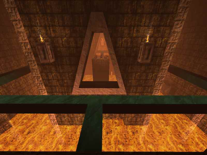
The zones were excellently set up and really helped the FPS. The only time I experienced a real slow-down was in the Water Temple Room but even here it wasnât too bad. One downside was that the Fire area was fogged but when exiting/entering the zone the fog appears and disppears suddenly.
Also, in the Water Temple Room was a curiosity. The author used AS/ONS road pathnodes for the bots behind all the pillars. In the rest of the room, heâd used regular pathnodes. Finally, all the pickups â weapons, health, adrenaline, superpickups, were all lying down. This looked good overall except for the Keg of Health, which just looked odd, and the SuperShield which was lying down, not on the floor, but in mid-air. And there was a surprising amount of ammo placed next to each. Another big complaint I have is with the collision. All the torch holders had no collision optimization at all. I was getting stuck all over them, all over the map and this was very annoying. There was one other collision problem â at the ramp leading down to the Water Temple Room if you open the door, dodge-jump through and into the corridor, thereâs something that blocks your jump and drops you on the ramp. Running/walking is no problem but if youâre above head-height, itâs a problem. The bots did a pretty good job overall but they tended to congregate in and around the green water room with the Bio-Rifle in it. The build is nicely done in general. No major FPS drag, well zoned, just the collision really needed a lot of work.
CAST: 1.0
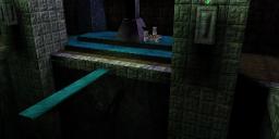
Unfortunately, the map really fails in terms of gameplay. First, as I mentioned earlier, the map originally wasnât designed for UT2004 gameplay and it really shows in terms of lots of flat corridors/rooms and extremely thin walkways to places like the SuperShield, Keg of Health, and especially the rocket launcher/lava room. Thereâs not much z-axis to work with â mostly in the elevator shafts and the central green water room. Other than that there are a few ramped corridors. The weapon placement was fine â nothing special, nothing bad, and the bots seemed to know how to get everything. A human player would be at a loss, however, because some of the corridors leading other weapons are way too dark to really find. The darkness hurts this level a lot. Most of the time I couldnât see my opponents at all and when I did it was fleeting as they ran past a light. I have my brightness/gamma set to default, perhaps the author maxed his out and therefore he could see fine on his rig. The thin walkways were a terror to use in UT2004 and only precision dodge-jumpers would survive long enough to really make use of them and if they did, their opponents would die not by their hand but by falling off. Speaking of falling off, thereâs an amazingly long drop under the supershield. Iâve never fallen so far from a purposeful level design which leads me to complain about it because it took that much longer before I could respawn.
Between the level design not having been intended for UT2004, the collision issues around the torches, and the darkness, this just does not make for fun gameplay.
To sum it all up, itâs a very competently built Unreal remake that stays too true to Unreal to make it fun. Collision issues and darkness complicate gameplay and the overall design hurts UT2004 gameplay. The atmosphere really harkens back to Unreal and fond memories of my time spent on Na Pali but there is too much wrong to make me want to keep this on my hard drive. Good ambiance despite a few fatal flaws, if youâre a huge fan of the original Unreal, download this and check it out. If youâre hoping for a good UT2004 DM experience set in the original Unreal, then you can pass this one by.
|
| |
| | | | Map Comments |
| SoH_Ghost3021
03-23-2005 11:13 PM MST | | thanks for the input, everyone, thou its annoying to have people arguing in the comment box...just fyi
thanks for the review, Arcadia! :)
I have....just made a revelation....
It occurs to me....
Looking around NC's map stock lately, look at what i have found:
1. People screenshot rate.
2. People comment rate. (everyone hates that room so i write down that i hate that room 2)
3. People 1/2 the time dont even download. :o
4. People's comments dont aid in the construction of the map :s.
5. My comment can bash your comment.
6. ALOT of people try to 'balance the score'.
7. People will slam the author personaly. Not the map, but the author.
Screw you all, i'm leaving NC. thank you for suggesting i go to UP, they actualy tryed to help me make one of my more recent maps (NC will never see).
Thanks to all who tryed to support me, thanks to all that gave advice on my map, screw all who just feel like doing the 7 above. :)
BTW v.3 will never be released, not if this is the kind of shit im going to get. No, my feelings arent hurt, im just dissapointed in the 'oh so mature' crowds that scream NOOB if you show one sign of anger.
Until major changes are made to NC, cya! :)
| SilverHairDevil
11-04-2004 09:16 PM MST | | I love unreal 1 remakes..let's see how this one is...
| Manticore
11-05-2004 04:30 PM MST | Rating: 4.5 | | From what I can remember of the original this is a fairly decent remake showing that the mapper has skills with the editor.
For deathmatch purposes it was never going to be any good for gameplay, in my opinion...
| cUnNiNg_StUnTs
11-07-2004 11:39 AM MST | Rating: 5 | | The map is extremely dark and you spawn on some beam of which if you fall off you will fall to your death. When you do finally make it to the main room it's extremely dark and poorly lit. It's also kind of boxy, the object of porting any map from older games to UT2004 is to make them look better, otherwise just continue to play the original. The graphics look like UT would so play the original in UT.
| CursedSoul1
11-17-2004 12:13 PM MST | | pff texture porting a pain?
nahh totally not.
nice 2nd map, but its just an ut map for 2k4, and thats bad.
good luck on your next maps :)
:tup:
and i hate "maps that should ONLY be improved from being on a newer engine,using the so called "blocky brushes" and id hate "using the original textures" even more, unless they are redone for 2k4.
and sohghost, if your feelings are hurt, and you start screaming that Morphias should make a **** map is the most noobish thing you can do.
The point is, to listen to even the hardest critics and use them in your advantage.
its ut2k4, not ut, dont come whining when we totally trash the map, its 2k4 we expect 2k4 grafics and gameplay, not old ut/quake grafics.
if you want those, stick with the real game.
If you want to make maps for this game, map for this game, dont come with lame ports or 'old ut' style excuses.
thats my 2 cents.
| NozzeM
11-09-2004 07:32 AM MST | | It looks really bland and the tech used is over 6 years old. I don't understand how something like this gets even a 5.0
It's just a port with some lights thrown around to me.
Creating an unreal themed map with the ut2k4 engine is very possible. It just requires skill and dedication and not copying some textures and bsp.
| redfist
11-09-2004 12:16 PM MST | Rating: 6.5 | | It's a real good thing the map DOES'NT look like an messed up,over modified,totaly wrong looking from Unreal.
A map should ONLY be improved from being on a newer engine,using the so called "blocky brushes" is a good thing,using the original textures is also a good thing.
If you were to use meshes for making smooth pillars or other brushes with high polycount wich couldnt be used for unreal but use the same textures would also be a good improvment.
But don't let people make you think just because it's not "ut2004" piled full of crap meshes is the way to go.
The lighting issue and mover speeds and botpathing are far more important than pleasing all the new kiddies out there.
You should mess around more with sutle things the new engine offers to redo an old map,not make it all geeked up just for the sake of making an old map into somthing it wasn't in the first place.hell just make a new map then.
| Gargorias
11-18-2004 10:50 PM MST | Rating: 0 | | Well this is not UT99 and that is where this map belongs. Sorry! but I didn't like this one little bit. Way too dark and and old type blocky mapping that doesn't go too well with the current high detail bots and weaponry and doesn't meet my minumum requirements for detail level even on UT99.
EDIT: RayZidane - and why not?
EDIT AGAIN: SoH_Ghost3021 - no! my oppinion is not biased I gave this level a zero because it is poorly constucted, way to dark, lacks any decent detail, is way to cramped and the texturing is horrible. How about we discuss this in the forums?
OH BOY! ANOTHER EDIT: I really should just let this go but then comes along NSRules. Sorry buddy but I am pretty sure Morphias has released several UT99 and 2K3 levels and as for 2K4 I believe he is the creator of the mod ProjectUT. You better shut up before you put your foot in it and I take this level over to the Atari Forums to see just what the general UT gaming community think! As for you SoH_Ghost3021 if you really want to improve your level design skills then perhaps you need to try getting into BETA testing or asking people with more experience for some help or tips instead of just ragging them.
| RayZidane
11-14-2004 01:55 PM MST | | don't post a 0 then.....
| Morphias
11-24-2004 11:26 AM MST | | EDIT: Sorry had to remove my post, didn't realize I was commenting on a 14 year olds map. I think the aurthor needs to add a few more years to his life before posting any more maps.
Whats a 14 year old playing a MA+ game anyway?
NSRules: PLEASE STATE WHERE I SAID 14 YEAR OLDS CAN'T MAKE MAPS? I was playing this game (U1, UT99 to UT2K4) when you were only 9, I think I have a little more experience and knowledge then any 14 year old.
Since your the one throwing insults around:
/INSULT/
Your comments is what shouldn't be here. Go and play in your sand pit. Only a noob would give this a 10, sorry that would be insulting noobs.
/INSULT/
DarKGamer: We did tell this mapper his faults and he got a little offensive, so our anger was flamed by the author, and I think he understands more now, which is good, unlike NSRules.
Nothing more form me on this, it no longer interests me.
| NSRules
11-19-2004 07:13 PM MST | Rating: 10 | | Morphias, I love how you like to flame other people with your comments. I am just as old as SoH here, so I take offense to you saying we can't make maps. I also want to know where you get off saying a well displayed map like this is bad? Please, maybe by looking at this map you can learn to make your own. On another factor any teenager, kid, students, whatever you wifeless men call us can buy any "Mature" rating game with adult agreement.Soh this map has severe detail, definately a shocker seeing your previous maps, just kidding. Good idea taking people's advice in the second version love the volumetric fog. and the triggers on the doors awesome. Hope your making a new map soon(playing the same map over and over again gets boring.
EDIT: Maybe I will, but not over this, they are way too critical.
Edit:So,Gargorias taking the wifeless men crack to heart huh? Anyways get over it. Nalicity was made for constructive critisism, not saying a map made to look like a 99 remake doesn't belong here.
| DarKGamer
11-19-2004 09:33 PM MST | Rating: 8 | | Ok, I myself am starting to get sick of NaliCity altogether. The useless bashing of maps and mappers, especially good maps and mappers has to stop. This was meant as a community to tell mapper what needs to be improved and how to do it, not to just say "the lighting sucks, you suck, do us a favour and stop mapping!" We need to get a hold of ourselves and stop basing scores on what others think. I have seen it too many times, "Im now giving this a zero to drag the map down, even though others are giving it sevens or eights, cuz I believe it sucks!" This seriously has to stop!
Now just to keep from violating the rules any further, I think this is a pretty well done remake of a classic Unreal map. Btw, this isnt a UT99 remake, it's classic Unreal. I like it alot.
| Super-Moose
11-20-2004 06:00 AM MST | Rating: 5 | | It's a nicely made map.
It has great atmosphere and some nice lighting.
It was just never designed to be played in ut2004.
It could have helped to scale it up a bit though.
ps. It.
| ChromeBallz
12-13-2004 08:06 PM MST | Rating: 2 | | Remakes, as i always say, are nice and all, if they are made right. CTF-NyLeve2 for ut2k3 is probably the best remade unreal 1 level ever, even with it's flaws, it shows how it CAN be done and how unreal 1 would have looked with unreal 2004 graphics without losing it's feel. (check http://nalicity.beyondunreal.com/map_hub.php?mid=6124, and play it, don't look at the screenies.... wrong ones taken and unsharp)
Why are people so happy in copying the map over? What makes it a good ut2k4 map? Don;t start about how difficult it is to 'port' the map, or redo the textures... That's plain bullshit. It may be difficult, but THAT DOES NOT make a good map!!!
The biggest thing that's wrong with this map, eventually, is trying to port a singleplayer map from an older game to a multiplayer map from another game. Doesn't anyone see this?
Remaking a map from another, or an older game, is a lofty goal, but remember to make it for the game you're making it for. This sounds incredibly stupid and simple, but why do people ignore or forget this all the time?
edit: SoH_Ghost, still, look at CTF-NyLeve2, and look at what you could do with this level. I'm sure you get the point i was trying to make.
| Evilboone
01-09-2005 05:30 PM MST | | I'm not gonna rate this one because I couldn't play it
(something to do with a scripted trigger)would crash UT2004
| RJGexplode
01-10-2005 01:29 PM MST | | i liked the original of this map, and i generally like conversions to the new game, keeps the game going and good maps going, if you know what i mean
and for those that think age has anything to do with mapping, they are wrong, a younger mind absorbs things quickly, therefore, you start mapping young, its easier, and you will generally end up a lot better than people that start later on in life
and yes, i agree that NC just seems to be "my comment can bash your comment up" thesedays
| T0mbr41d3r
02-02-2005 10:20 AM MST | Rating: 3 | | Nice extra's build into the map, but its too dark, too tight, too small, bad gameplay, odd stuff happening, bad choice of weapons, sorry I can go on further but I'll stop here.
|
This map cannot be commented on.
|
|
 |
 |
 |
 |
|
 |
|