|
|
|
 |
|
 |
 |
 |
 |
| CTF-Vector | | | Map Info |
| | | | File Name | ctf-vectorv_2.zip | | Author | Kantham | | Gametype | UT2k4 Capture The Flag | | Date Added | 10-06-2004 | | File Version | 2.00 | | File Size | 9.47 mb | | Player Count | Unknown | | Map Description | My first CTF map ever. | | Review Rating | 4.5 | | User Rating | 7.5 | | Overall Rating | 5.5 |
|
|  | | | | Review |
| | Reviewer | AMmayhem | Awe Score: | 1.5/3 | | Date | 11-18-2004 | Build Score: | 1.5/3 | | Review Schema | Cast Score: | 1.5/3 | | User Point: | +1 | | Overall Score: | 5.5/10 |
AWE: 1.5
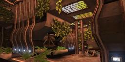
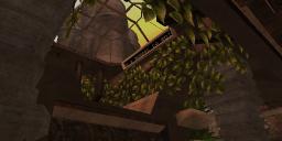
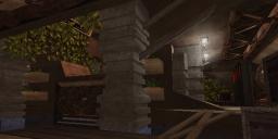
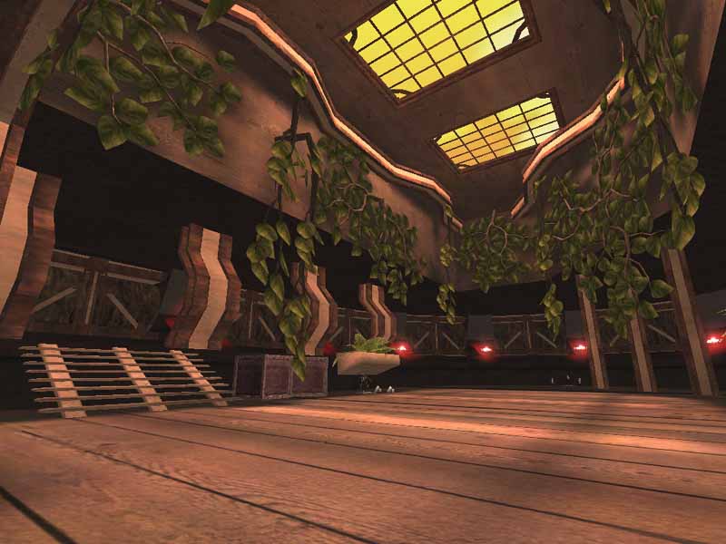
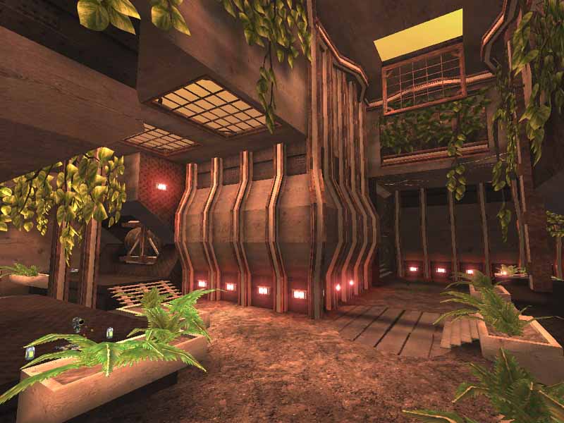
CTF-Vector certainly has a different look to it. It's like a large arboreal warehouse with flags on each end. Visually, it's not too bad, but then not too good either. The author uses static meshes seen in 1-on-1-Idoma, (which the author credits), which look good themselves, but one is just used way too reptitively. Lining the walls in the two large rooms that make up most of the map. The BSP shell is done well to setup the mesh usage, so meshes aren't relied upon for the entire design.
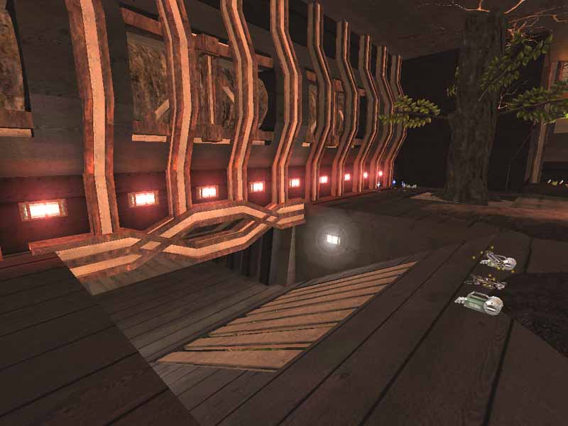
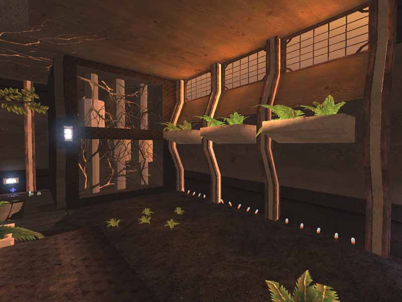
Lighting however looks a little funny. You've got the static meshes which are lit up well, but the BSP walls in between are dark and too much of a contrast from the other. You can really see it in the fifth pic to your right. The skylights provide decent bright lighting from the sky, which provides the most lighting from a source you'll see. The lights on the walls don't add much effect to the lighting itself, they more or less just signify which side of the map you're on. Zonelighting fills in the rest of the map, leaving you wondering where the source is. The zonelight isn't too overdone, but still looks a little hoaky.
BUILD: 1.5
Like I mentioned earlier, there's a lot to the BSP structure, though nothing extravagent in it's brushwork. Certainly would've liked to have seen more meshes made by the author, to keep things a bit more unique; like back in UT everyone pretty much had to do their own brushwork for good visuals. One thing the map does have is ambience. It's like walking through a forest with all the birds singing away as if people aren't blasting each other to chunks. The birds just won't work soley themselves though, and there are some mechanical hums, as well as the pumps you see in action. Then there's the skybox. Which looks like a box with a texture with whisps of different shades of yellow. Music selection is not a bad song, I don't think it quite fits the theme right on, but it's good nonetheless.
CAST: 1.5
Hits and misses in the cast. No issues with the bots, they didn't miss anything. Flow needs some work. First thing you'll notice, is the map is freaken long. I think an entire match could qualify for a marathon. After that, I felt the center room slowed the pace down. The jump pads work well, but when jumping down to the other side, you could end up in the water, then have to swim for a second or two. Now you could go around, but who takes the longer route? Also the flagrooms were a bit odd. The only ways to the raised level is either the steps or translocate (or if you're a masochist, there's always a hammer jump). Of course you can't x-loc with the flag usually, so that leaves only the option of using the steps, which can be too predictable.
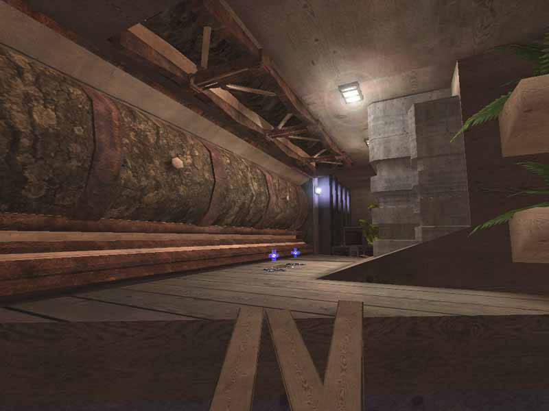
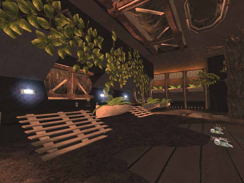
Item placement is overdone in areas. Especially with the health vials and adrenailne. Just take a gander at screenie #6, three rows of five adrenaline pickups, that's 30 adrenaline points. Which oddly enough, answers yes to the question of whether spam can give you an adrenaline boost. As for the rest, weapon placement isn't too bad, except for the choice of adding the grenade launcher, and the lightning gun and minigun might be a bit too close. Then there's the string of 3 health chargers in a row. Which brings a near dead man back to a good fighting chance.
SCORE: 4.5
If it weren't for a few of the issues, it could go to a 5.5 possibly, but just didn't quite add up. A fair effort from a mapper who shows the willingness to keep pushing on in the editor. Which is a good thing, and hopefully we'll see some maps that shine cranked out in the future. |
| |
| | | | Map Comments |
| julian141
10-25-2004 12:46 PM MDT | Rating: 8.5 | | Great map - and YES Kanthan, i downloaded the map, and YES i played on it, and YES i thought it was worthey of a 8.5. So stop moaning.
| slaskan
12-05-2004 05:42 AM MST | Rating: 8 | | aah nice good theme like DM-de-ironic hehe u DO like ATB
| Shao
10-04-2004 08:08 PM MDT | Rating: 8 | | awesome.....
| Manticore
10-05-2004 03:48 AM MDT | Rating: 6.5 | | A decent layout which could have used a bigger default player load considering the amount of health and adrenalin laying around and the overall scale of the map. Some of the visuals seem a bit unrefined, such as the water, but that's my opinion.
| theepiphany
10-06-2004 06:32 PM MDT | Rating: 9 | | i think this is your best work yet, keep it up
| hawkwind
10-06-2004 06:42 PM MDT | Rating: 6 | | did a fine job, being new to the editor. its all very lush and open, but , maybe i'm mistake, there's only one entrance to the flagroom?
spread the wealth around a bit for health and adrenaline pick ups. 3, 25 health pickups in a row is not only un-necessary, but detracts from the beauty of the place. put them like flowers, here and there. get rid of the ONS weapons. in this tight space, they have no place.
how do you do that wonderful splash thing when a player falls into the water in the middle room? in 3rd person, looks wonderful! the middle area of this map is very good, but the flag room is a very nice looking death trap. if the flag room had the same "flow" as the rest of the map, this would be much better.
| ragnar0k
12-01-2004 01:21 AM MST | Rating: 6 | | This map has nice eye candy to go with. But what makes up in visuals lacks in gameplay and item placement. Sh*tloads of adrenalin and health vials were lying on the floor.
Nice music though ;)
| Kantham
12-04-2004 02:49 PM MST | | sweet ,
my first reviwed map ,
im glad you liked it , this encourage me to continue
| RayZidane
02-07-2005 09:57 PM MST | Rating: 7 | | Yeah!!! KanTham gogogo!!!
| G.Lecter
02-08-2005 01:32 PM MST | Rating: 5 | | Ops... I forgot commenting this one...
I do not agree with people this time:
- The visuals look nice, but sometimes are too dark & repeatitive. There is a good ambience with sounds.
- The layout is very simple with only a bit z-axis, and a huge straight path (splitted in 2 sometimes). There are very few choices and only one door to the flagroom. After running a lot of time, a camper could be camping next to the door to kill me easily. In the bases, I got confused trying to return the flag with a doublejump, but it is not possible, the only way to return the flag is using the stairs (OK, or the shieldgun). In my opinion, placing water in the center room was not a good choice.
- I also did not like the item placement, some pickups are placed in sticky places.
- Bots play well, I did not see if the map has pathed the translocatorjumps...
- Custom music, OK, but I did not like it very much.
I agree completely with the review, but I can't give a 4.5, the map has work on it, so I give average score... 5
|

|
|
 |
 |
 |
 |
|
 |
|