|
|
|
 |
|
 |
 |
 |
 |
| DM-Lockjaw | | | Map Info |
| | | | File Name | dm-lockjawv2.zip | | Author | AJSchiavoni | | Gametype | UT Deathmatch | | Date Added | 10-20-2004 | | File Version | 2.00 | | File Size | 287 kb | | Player Count | 4 - 8 | | Map Description | My best as of now so enjoy!
| | Review Rating | 6 | | User Rating | 6 | | Overall Rating | 6 |
|
|  | | | | Review |
|
What? Another Prophet review? So soon? You ask yourself how can it be? Has hell finally frozen over? Did my mom put more pills in my cheerios than usual? No no reader, I just have another special requested review for you, a Deathmach romp through multi-floored tech goodness.
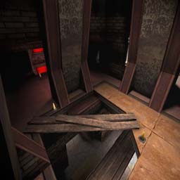
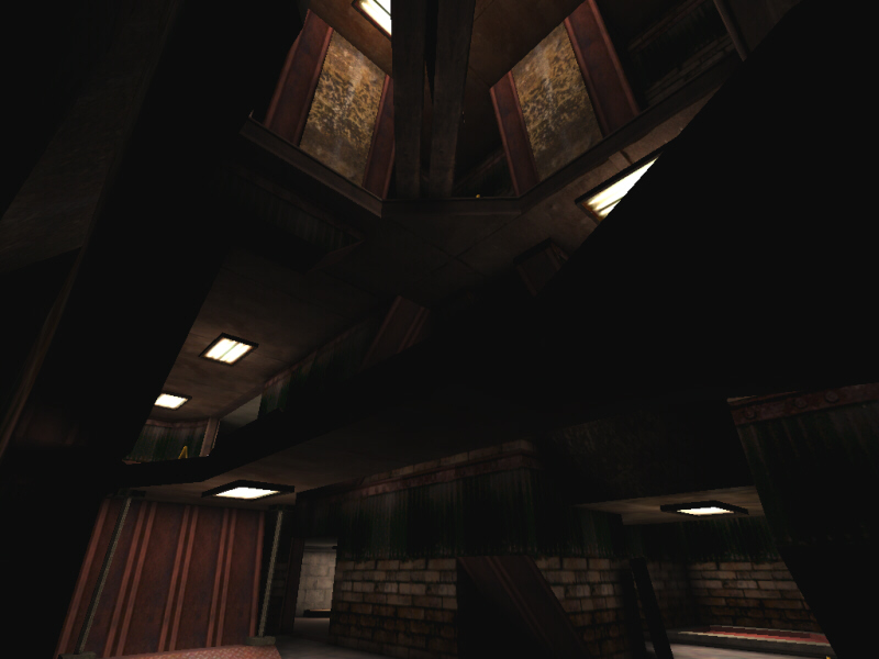
Ok enough BS, on to the review. DM-Lockjaw boasts a texture scheme that reminds me of DM-Conveyor, only the treads and large assembly line furnace machines have been replaced with a tighter environment and the place has more of a depot approach to it. Design looks very "by the numbers" in that quickmap scenario that looks ok, sports solid playability, and provides fun gameplay. The movement between floors is pretty fast, making z-axis pumped in the surprise department. Items are mostly placed in good locations though I would have made the damage amp a little harder to nab. Bots navigate and do their part. Flow would be ace too but a few spots have some obstructions that could cause an snag. Some crates are placed in some alcoves, one of which has a pair of jump boots placed in a very tight little spot you have to go around a box to get. Doesn't seem like the best place for the boots. Also an uplifted structure hides a lone rocket pack, also an risk not worth the effort. Aside from that the map is hot stuff in the gameplay front.
I would say the lighting can be too dark for some people, alot of shadowy spots where they aren't needed. Wasn't bad for me personally (have you seen DM-Imago?) but some systems may have some visibility issues. Only real vault the map has is its thematic developement. It is just a little uninteresting. Don't get me wrong, there is enough architecture to balance out the basic bits and it doesn't look bad at all. Just very generic, aside from a few wooden planks, crates, and red lights, this really is just your average tech map. I know it is hard to make a tech map stand out, most pro mappers can't even do it. Lockjaw looks fine, and I suspect the author's next map will have a much more interesting theme going on.
The Prophet's Verdict: Short map that plays fast and furious despite some odd item placements and minor flow obstructions. Visually nice, it shows you its rack but no south of the border for you eye candy types. Above average gameplay with slightly average looks and a good design balance to keep the build score in between.
Note to the Author: I'm trying to get into the habit of leaving comments here for authors who are showing signs of talent. This map is pretty good, though the things I mentioned that needed work should be a priority in your next map. Try to make sure that all items go in spots that make sense, for the most part you did ok with this in Lockjaw. Also, power-ups are the items you're generally gonna want to put in the risky positions. And lastly, making a fresh theme is hard nowadays since everything has been done. People generally expect more and while this map looks fine, little details can make an environment seem more interesting. Keep up the good work. |
| |
| | | | Map Comments |
| AJSchiavoni
10-24-2004 10:06 PM MDT | | V2 enjoy
Thank you, both for the reviews, Prophet & Quillion.
EDIT:: NOTE: I have addressed the issues talked about in both reviews: But im not planning on resubmitting a fixed version only because many people have already downloaded it, and not everyone has a High Speed Broadband connection, IMO its unfair.
I have started another map, for ut 2004 about a month ago its taking some time but im planning on posting it on the forums in a few weeks for testing. Other than that, i appreciate the time you guys spent reviewing the map both prophet and quillion.
| Shao
10-22-2004 07:15 PM MDT | Rating: 7.5 | | yeah I do enjoy this map!! Is pretty fun!
Good work man!
| quillion
10-23-2004 11:36 PM MDT | Rating: 7.5 | | The map is (imo) very nice looking.
The lighting is done well and it provides plenty of atmosphere for the environment. At first it may seem a little too dark, but i don't think this affects the play at all, as you tend not to notice it, while your
running the map. One thing i would say was a little bad, where you have some water and wooden boards, i would add more lighting to that area.
I think it would've been better to see the detail
within that one area. Overall the lighting
is applied, very well.
Architecture in this map is very uniform and traditional. Don't get me wrong, it all looks well
made and solid enough, but apart from the central walkway it does look standard. Then again it certainly doesn't look boring, if you get what i mean.
There is one part i would like to point out to the author. You have, below the armour a small ramp
that has two poles stood upon it (supports).
Well, there is a problem with that. When playing your map, you can on occasions, get stuck between that small ramp and the wall which runs parallel to it, maybe a fix?
Some other faults i did notice are minor ones and some are just personal taste. The first one being the lifts, They have no means of propulsion! I always think this looks strange in maps, itâs not a big issue, though it would be nice to see.
There is also some ammo (mini) that's is not placed
correctly, it's buried into the floor.
The item placement is fine too, but i would have liked
the weapons and ammo, to be more 'together' sometimes, but again i think that's just my preference. I would 100% remove the chainsaw from the map, i don't think it's needed at all and to be honest, it looks completely out of place. In a map this small, would you ever use it?
The game play in this map is amazing!! It's very tight and extremely fast; you don't get a moment to breathe. Noise after noise, is all you hear as your foe picks up an item of some kind. This makes you feel like they're right next to you, making you panic.
You simply don't know what is coming, from corner to corner, this adds to the 'panic' feel of the game play. bGameplayownage=True, its that simple!
A few minor points, but nothing to kill the map, (Well, apart from the small ramp issue). I would say 'download this map and keep it'. Great game play, nice looking and very well made. He said 'My best so far' he wasn't wrong there.
| Manticore
10-26-2004 02:51 AM MDT | Rating: 7.5 | | Here's a map that illustrates that good things do come in small packages. The look and lighting are decent in the now familiar AJS style, and the gameplay makes it worth a download. Excellant bot pathing....
| redfist
11-03-2004 10:18 PM MST | Rating: 3.5 | | Nope no way,map is dull,hallwayed to death,z axis is all bound up,
Map needs center area more open,it needs better visual cues to know ware your at when playing
Keep in mind I like hallwayed maps but this one is constraining.
| Sir Xavius
01-09-2006 03:01 PM MST | Rating: 5 | | Tight and furious. Don't play with more than 6 bots or you'll never be able to catch a break. I'll keep this in my Small Maps rotation.
|

|
|
 |
 |
 |
 |
|
 |
|