|
|
|
 |
|
 |
 |
 |
 |
| DM-1on1-Nano | | | Map Info |
| | | | File Name | nano-pack_final.zip | | Author | Swanky, Tosek & Doc | | Gametype | UT Deathmatch | | Date Added | 09-15-2004 | | File Version | 2.00 | | File Size | 4.95 mb | | Player Count | 1on1 | | Map Description | One map in two versions.
This is the fixed Final Version; all skybox problems should be fixed. | | Review Rating | 6 | | User Rating | 7.5 | | Overall Rating | 7.0 |
|
|  | | | | Review |
| | Reviewer | Nahand | Awe Score: | 2.5/3 | | Date | 09-18-2004 | Build Score: | 2.0/3 | | Review Schema | Cast Score: | 1.5/3 | | User Point: | +1 | | Overall Score: | 7.0/10 |
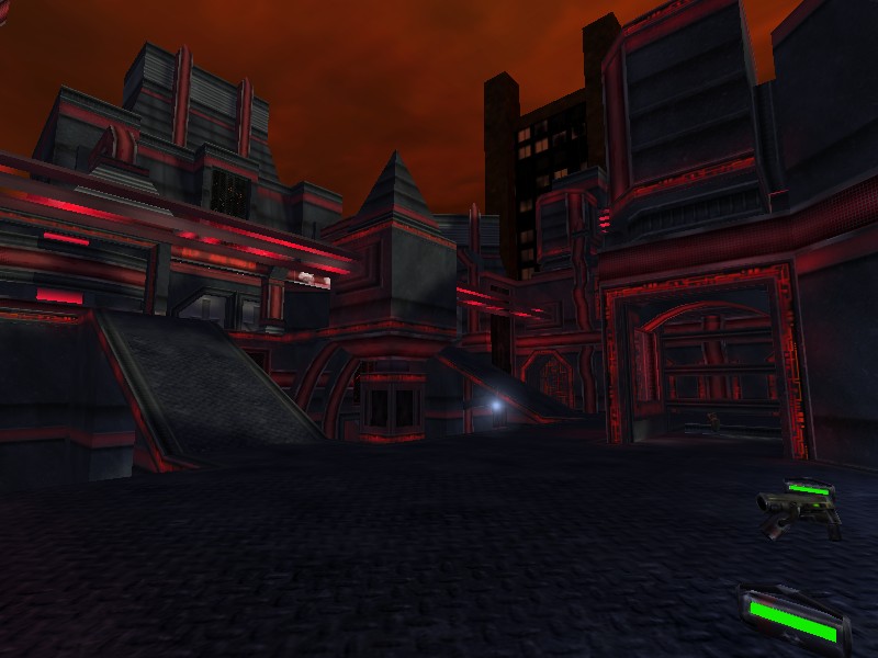
Nano. A mesure implying microscopic scale gives name to not one but two 1on1 maps.
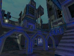
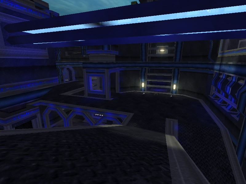
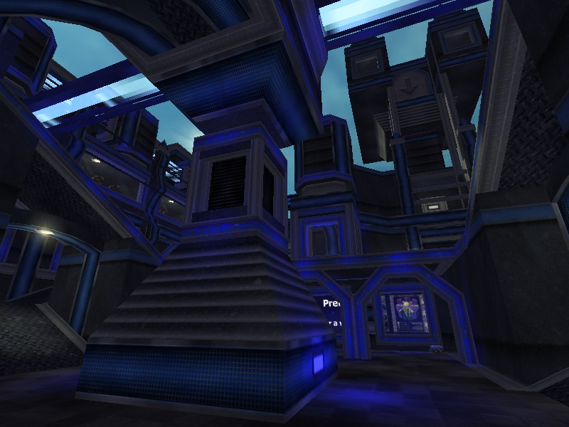
They are essencially the exact same map except for the color scheme of textures - one red, and the other blue (personally, my eyes feel comfortable with the red one nevertheless) - and so i'll review the two as one.
AWE: 2.5
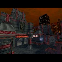
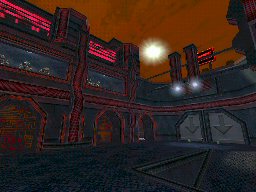
Visuals are boosted by the custom textures, that shine throughout the whole map(s), even if the map(s) itself isn't all that big or complex. According to the author,
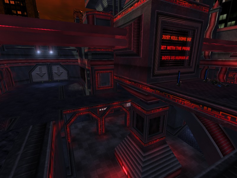
this is supposed to be some sort of futuristic shopping mall. The "people" watching are Unreal creatures. Some pointed out they're "out-of-place" - then again, this is "Unreal" and i guess it can't hurt thinking like a Star Wars-like universe where other "people" are in fact from other species. Other textures (some with text) serve as the advertising complement, like found in malls nowadays, but it felt
sparsely used. Maybe some wacky brand advertisements (and in more quantity) would have helped better to carry that "stuffed" mall environment.
Lighting felt funny, almost unnoticed, while the textures (again) seemed to "give" all the light/color needed for the map(s). The main reason for this is that most of the map just looked lit in some way, while not exactly having light on it.
Swanky must have thought the "natural" source of light (that sun/whatever) would do the trick, but IMHO it didn't quite got it. The result is that when you stare at most of the map, it kinda looks monotone grey-ish. He did use white and red/blue lights, and where he did it, there is some kind of visual diferentiation. The problem was that not being applied more all around the map.
The layout is somewhat simple as basic architecture goes, with some symmetric-ish parts, and basic cuts, but then there's some detail architecture to even things a spot. Actually, it's this "deco" archi (along with, you guessed it, textures) that catch you to a otherwise just-slightly-above-average geometry as a whole. This decorative part is a big plus on the visuals here, and adds some identity to the build, even if sometimes somewhat generic.
BUILD: 2
Well, for one, despite Swanky's best efforts, this final uploading still presented a sky black bug in the red map, as well as in the "closed" elevator pit, though it appears very hardly, when looking straight up from one imprecise place on the map.
And on the blue version, one of the small three "pinacles" (one near elevator area) is BSP-cutted on a side.
The sound in Nano(s) is tech-like - beeps here and there, near terminals/screens - as well as the sounds of the idled critters. Music is UT standard (c'mon!), but according to the README, there was to be a custom soundtrack that never made it :/.
CAST: 1.5
The map is small. The combat was limited but enjoyable - the architecture helped a bit at times. One "thing" with it is that the map is also open, and with the polys for visuals, sometimes they passed the 500 mark.
On the other hand there's items and their placement. The weapon placement itself didn't cause me much trouble, but they all have 2 ammo packs near them. This is not that nice given this is a 1on1, and also given the open structure of Nano(s). Not only could someone pickup all ammo for one weapon, he could then move fast and own the place, given its small size, and collect weapons and ammo. The ammo for a certain weapon only exists near that weapon. Also of note is the Bio Rifle.
So, i got this situation where i run around owning a [masterful] BOT about 10 frags to 1! Even not having my favorite weapon (Flak Cannon), the Bio Rifle suited my needs perfectly, as i could spam the BOT all i wanted, and it only stopped when my last resort weapon was a Shock Rifle :/. Human opposition should take care of that.
As such, the flow can be twitched, and the gameplay biased, but it all depends really of the skill (or lack of) of your opponent. A very annoying detail when
playing against humans will be not going for the up-most part of the map (effectively outside of the playing field), and thus cheating. Some blocking brushes could have stopped short this exploit that surely will be used by honor-less players :(.
Overall, Nano(s) is a pretty decent map, sized for 1on1 and no more. The gameplay can be enjoyable, but the best value here IMO is the visual stand-out, that also happens to come in two flavours.
Worth a download to check ;). |
| |
| | | | Map Comments |
| MasterZelgadis
07-14-2004 07:00 PM MDT | Rating: 9 | | Well, another GREAT work done by Swanky and Doc. Another map with great architecture, lighting, item placement and botpathing. Just everything works well.
Although the map is very small in my opinion (that's why it got only a 9), it is a lot of fun playing it.
A map, more than worthy to be your final map.
A must-have-download
-Zel-
| unXceptable
07-15-2004 10:56 AM MDT | Rating: 8 | | I like more the blue-colored version :) ; but nevertheless, in both versions the too symetric structure, these strange comment textures 0_o and the sounds placed with too high volume and too small radius disturb me. Well, you get an 8 'cause i like the style of these maps very much!
| SeeD
07-15-2004 04:24 PM MDT | Rating: 6 | | Your usual Swanky's map.
Lighting colours are boring though this time there's the theme excuse.
Yes, there are too many unecessary message "si teh funnay joek" panels that really don't help with the atmosphere. And what's with the f*cking krall?! They're totally outta place.. if at least they had a neat sci-fi skin or some crap of that kind. The Mercs are acceptable.
Architectonically (?) speaking it's not bad but it isn't excellent either. It works. Too bad the level feels like a single room with stuff inside. You could have used those doors/gates and made some interior corridors.
You really should try to build bigger levels and use more solid colour combos/contrasts. I think you really are in control of the editor so you should be capable of something much better. Good work to you.
| EvilSwanky
09-19-2004 03:49 AM MDT | | You want bigger maps? Play my SwaVo series!
What about the text textures? Never seen such banners in Shoppingmalls? If I made entrances, it would have been the rcr syndrome... it's small and it's not everyones way of playing a 1on1 arena... That's all I can say to that...
Too bad that I can't improve the architecture much more because I already used about 850 brushes and the polycount is about 400 in average...
Oh, alright then :) There are two version, because there were a lot of people who didn't like the red version but the blue one and vice versa.
XepptizZ - Why should I? It up to you... I put it in, because the map needed to have some shadow contrasts - have a closer look, and you will see them clearly. :)
EDIT: Thanks for the review, Nahand. ;) You can download the music planned for the map on my homepage www.swanky.de.vu
| Manticore
07-16-2004 08:22 PM MDT | Rating: 5.5 | | Classic arena with good z-axis and some catching eye candy. The blue version appears more atmospheric in my opinion.
Swanky: It's not a bad rating. Five is average. These arenas are nothing more than above average (slightly). "Classic" in this case means the type of map has been around as it follows a certain style of map design. This map suffers if anything from too many advertising banners which don't do anything for the visuals in my opinion. Also, I don't really see the need for delivering the same map in two different colour schemes.
| )Hidra(
09-15-2004 01:39 PM MDT | | *sigh*
im sad i can't play ut99 again
| XepptizZ
09-15-2004 04:00 PM MDT | Rating: 7 | | Yo EvilSwankey, welcome back. I prefer the red version, but the piercing white sun has to go. It's like a nice gloomy cityscape in the evening and then, BOOM a bright white weird thing. If you don't mind I'm gonna set the flag "unlit" off so it will blend in.
| redfist
09-19-2004 03:14 PM MDT | Rating: 8.5 | | Definitly a style there,and is nice for gaming action,didnt look but i think it has darkgreen detail texture on those wall inset areas,with the color of the maps is has a good effect,allways wondered of a good way to use that texture.I know,uh huh you were doing a ctf and thought DM red + blue 2 maps for the price of one hehe.And the sighns don't seem to mess it up,adds to break up the scene,and is a good visual cue and they do animate.I would of done somthing like have the glass break,and have krolls self destruct,for one more nook to get in,but tiz cool the way it is.
Actualy,this author knows whats up.not all this so called mesh this mesh that bagh,
Chrome,,,,,because you don't need meshes to have a good map ut04 or UT
| Shao
09-18-2004 01:19 PM MDT | | why not Hidra?
| slaskan
09-19-2004 12:41 PM MDT | | AERGGH :@ i would love to test this map but my ut99 is out of order :'(
| ChromeBallz
09-19-2004 03:10 PM MDT | Rating: 6 | | redfist, as far as i know, there are no meshes in ut99. Why do you bring that point up here?
| quillion
09-20-2004 08:07 AM MDT | | I still dont know if i like this map. Its one of those that plays and looks good but, gets on your nerves very quickly..i'll just say it owns for the first 5 mins..that should cover it, i think:s
| Kantham
09-21-2004 03:12 AM MDT | | this looks awesome
| koeckchen
10-02-2004 12:24 PM MDT | Rating: 7.5 | | Very nice but also very small map.
Nice work with nice Details and a good architecture. But i think, even for a 1on1 it is to small. Another aspect for my rating of "only" 7.5 is that there isn't any diversification in texturing...
|

|
|
 |
 |
 |
 |
|
 |
|