|
|
|
 |
|
 |
 |
 |
 |
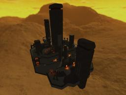
| DM-Scorpion | | | Map Info |
| | | | File Name | dm-scorpion.zip | | Author | Nahand | | Gametype | UT Deathmatch | | Date Added | 07-05-2004 | | File Version | 1.00 | | File Size | 905 kb | | Player Count | 4-8 | | Map Description | An air platform-styled map. I know most UT players don't appreciate it, but i do.
Anyway, this was an old map that i wanted to get out of the way. Take a look at README file for further info.
I know it's a crappy map, especially about the layout and gameplay. :p | | Review Rating | -- | | User Rating | 6 | | Overall Rating | -- |
|
|  | | | | Review |
| No review currently available for this map.
Click here to request a review of this map.
| | | | Map Comments |
| Torn_Agressor
07-05-2004 10:49 AM MDT | Rating: 6 | | nice little map with a somewhat orignal feel to it, probably because not much people use utech textures :P
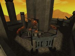
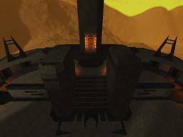
i liked the design, and architecture the author used bsp to make prettay shapes into the walls, like shapes and light fittings, nice arches which actually have shape to them
often though i walk around and see fancy deco and architecture, then i turn a corner and its plain and boring, and then i walk around and see a bit of deco..etc
more decoration ;) we need eyecandy! :P
the map although the architecture was nice...the lighting looks boring, the skybox is ok, yellow desert skybox..but the entire map is somewhat flooded by white light...ok it looks slightly yellow..but it doesnt look like the light is coming from the skybox..it makes the map looks out of place and seperate from the skybox
there were very slight bsp problems, like walls going invisible when i went round some corners...but i only noticed it once
the bots played good, and they got around the level
and they kicked my ass a few times..however..bots own me so it could just be my lack of skill :P
fps was good, ran fast all the time
i cant say im too keen on the layout..for me it doesnt suit a deathmatch well, i think if the author made it bigger and turned it into a ctf it would be great...
imo a pretty good map, lighting definately needs to be fixed, and needs more visual elements
mabey turn into a nice ctf
| Nahand
07-17-2004 05:52 PM MDT | | ... it had thought before in making a CTF and DOM map 'based' on this one... problably, one day...
I know about the BSP and all the rest. Take a look at the README file...
Thanks for commenting!
EDIT: not merged? I must have slipped some...
Every tip taken into consideration, all ;) ...
| hype
07-05-2004 10:03 AM MDT | Rating: 7.5 | | You might think it's 'crappy' but I think it's pretty good. Great gameplay for maybe 2-6 players and very nice looking as well. It also runs smoothly on my crappy old machine! Nice work!
| milb
07-05-2004 11:51 AM MDT | Rating: 7 | | Hey that map looks nice! Maybe a little bit undetailded, but great theme! Those little detials look really good.
But the map has some probs:
1. Not enough Z-Axis fighting, I was a bored after some minutes playing!
2. Trim! Sometimes ther is trim, sometimes thereâs no trim! WTH??? For example the stairs! Why is there no trim???
3. The Lighting! Ok, it looks good. But at least you could choos HighShadowDetail!!! The sunlight looks to white! Your sunlight should have LE Cylinder! And you could use some variations of the orange!
4. The Brushes! WTH are they not merged??? All those brushes from the shapeED, why are they not merged? The lighting will be better and the polycount will be lower
5. Your map ist to static. No lighteffect ( ecept the jumppads, I think they look worng, but I canât say why ), no other effects!
But itâs a good map! Like Swanky would say: âOK Map!â. I give a 7!
| XepptizZ
07-05-2004 02:32 PM MDT | Rating: 7 | | It was pretty nice. Milb is right on the most points, but leaving out light effects make a map feel deserted and dry wich fits the sandy theme like a glove. Nice archi, bland texturing creates an above half good look. But it sure needs a *hell* lot more Z-Axis.
BTW I experienced it solely as a solid DM with no CTF feel in it while DOM could once suit it as for most DM's.
GreetZ XepptizZ
| Rob
08-23-2004 05:44 PM MDT | Rating: 6.5 | | Yes, it's crappy :p
Not uninteresting with bots though.
|

|
|
 |
 |
 |
 |
|
 |
|