|
|
|
 |
|
 |
 |
 |
 |
| CTF-Harmonized | | | Map Info |
| | | | File Name | ctf-harmonized.zip | | Author | quillion | | Gametype | UT Capture the Flag | | Date Added | 06-30-2004 | | File Version | 1.00 | | File Size | 550 kb | | Player Count | 4-6 | | Map Description | just a likkle map made for 2v2
enjoy!
please rate fairly and give constuctive comments:) i wanna get better, ty | | Review Rating | 2.5 | | User Rating | 3 | | Overall Rating | 2.5 |
|
|  | | | | Review |
| | Reviewer | Ironblayde | Awe Score: | 0.5/3 | | Date | 07-06-2004 | Build Score: | 1.0/3 | | Review Schema | Cast Score: | 1.0/3 | | User Point: | 0 | | Overall Score: | 2.5/10 |
AWE: 0.5
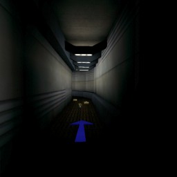
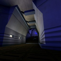
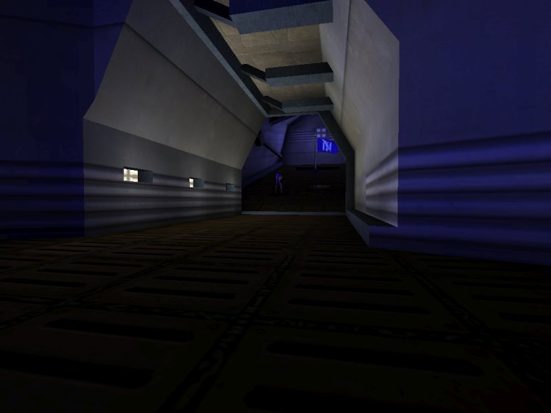
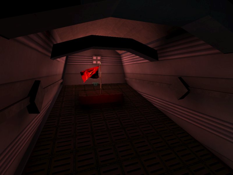
Here we have a small map that is minimalist in execution even by the standards of the days when Unreal Tournament was in its infancy. The numerous curved hallways and arched ceilings in the flag rooms effectively rescue the map from the boxy appearance so often associated with such simplistic maps, yet it has so little in the way of trim and ornamentation that its poly count never breaks into the triple digits.
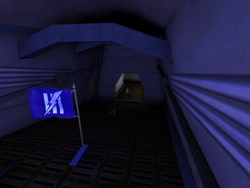
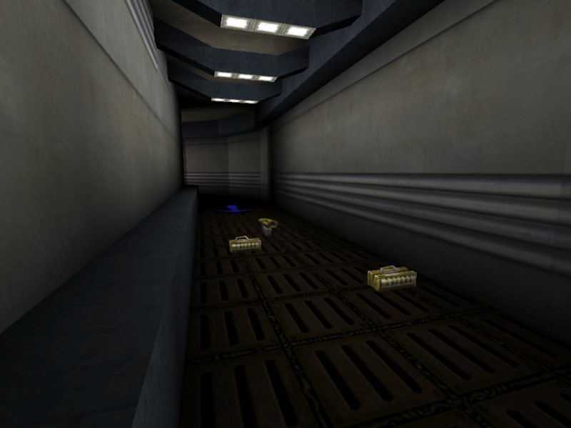
There are a number of awkward-looking steps to be found most anywhere that one hallway joins another. Given how they were constructed, I'm not entirely sure whether their inclusion was accidental, as a consequence of odd brushwork; or intentional, as an attempt to break up the large, unadorned floors. A bit of both, perhaps. Raised segments in between rooms can work well for that purpose, but to be effective in terms of both gameplay and appearance, they should be kept very close to the ground, and made at least twice as wide as they are tall. The segments in this map are much too tall; if they were any higher, you wouldn't be able to pass over them without jumping. This gives the appearance of a door that's been carved in the middle of a wall for some unfathomable reason, rather than a standard doorway with a bit of decoration in it. I do like a few of the other architectural features, like the overhead beams in many hallways and in the flag rooms, but mostly the map has an odd look to it. Some places, for example, have long, narrow rectangular slits cut in the ceiling. I have no idea what they're supposed to be.
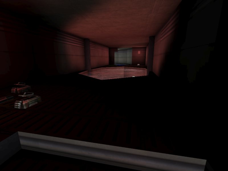
For texturing, the author has turned to the familiar UTTech packages, as well as SGTech1, which is part of Bonus Pack 4, so you'll need to have that installed before you can play. I'm not crazy about the wall textures, and the one used for the ceiling seems like a somewhat incongruous choice, but they work well enough for their purposes. The textures on the floors and ceilings are all aligned correctly, but the author hasn't done anything to try lining up the textures on the walls. In most cases this oversight isn't too conspicuous since the primary wall texture is composed of horizontal lines, but it can be ugly where one hallway meets another and the wall textures aren't panned to the same height, or in the flag rooms where there are angled walls.
The lighting is what really spoils the map's appearance, however. Like so many other beginning mappers, the author has fallen prey to the idea that lights should either be pure white or oversaturated team colors, when in fact they should almost all be somewhere in between. The lighting is all properly sourced, which is a point in the map's favor, but the overall composition is garish and unappealing. To the author: try working with mid-range saturation values, and light radii more appropriate for the corresponding fixtures.
BUILD: 1.0
Although most of the brushes seem to line up with one another reasonably well, there are some pretty strange things to be found in the author's brushwork. First, the grid has been totally neglected. Second, quite a few of the brushes are needlessly complex given their functions; in some cases I'm not sure how the author went about creating them. There are numerous instances of coplanar polygons that should be merged, but are not. Finally, aside from the two pools of water, the map has not been zoned at all. The impact on performance of these last two items is negligible given the map's simplicity, but the former introduces additional lighting and texture alignment errors, and the latter means that there aren't any location names that you can use to see where your team members are. All of these mistakes become significantly more serious as a map increases in size, so it's probably good that the author started with something simple.
Bot performance in this map is quite strange. In the editor, the pathing looks to be functional, albeit mediocre. There are some excess nodes, a couple of paths missing, and no DefensePoints or AlternatePaths. In the game, however, the bots do considerably worse than you'd think. Particularly, they seem to be very confused about how to attack the enemy base. I noticed this right away in my first test game, as I had ordered both of the bots on my team to attack, and instead they were doing nothing but running around our half of the map collecting pickups. Once in awhile one of them would attack, or an enemy bot would make a halfhearted attempt on our flag, but for the most part they preferred to keep to themselves. To see if it was really as bad as I thought it was, I set up a 3v3 Godlike botmatch, then went off to make myself some stroganoff and watch a few episodes of The Simpsons. When I got back, almost ninety minutes had passed, and the score was still tied at zero. Needless to say, this map is useless for offline play.
One last point: I would have liked to hear more ambient sounds included. There are a few, for the standing water and a handful of pulsing lights, but the vast majority of the map is silent.
CAST: 1.0
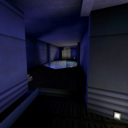
Normally I prefer huge CTF maps with tons of routes and lots of places to hide, but it's fun to play a smaller map once in awhile. After all, it's easier to round up four players for a game than it is to find sixteen. For what it is, the map isn't too bad. One definite point in its favor is that despite its small size, there are multiple paths to take between the bases, and it's more than just a deathmatch that happens to include flags. The two sides are linked by three passages that don't connect near the center of the map; you need to be relatively close to one of the flags before you can switch from one to another.
Unfortunately, the vast majority of the map's area consists of tight corridors. There isn't a whole lot of room to dodge enemy fire, particularly from the Flak Cannon and the Rocket Launcher since there's splash damage to worry about. You'd better have one of those two weapons when you go after the flag; anything else and you might not be able to discharge enough ammo to kill someone before you get blown to pieces in one of those tight hallways. The layout is also completely flat, aside from the flag rooms, where the floors slope up as you approach the flags. The flag rooms also have a curious inconsistency in them: the red flag sits on a small raised platform, whereas the blue flag does not. As far as I can tell, this is the only part of the map that isn't symmetrical. It's a small thing, a minor annoyance for blue since you can't jump up onto the platform unless you're right next to it, given the slope of the floor.
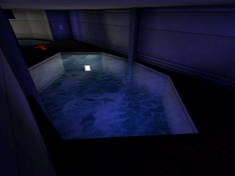
The three curving halls that link the bases run side by side along the map's length and are similar in features and length, except for one thing. Unlike the one in the center, the two outer hallways are each spanned by a relatively small tank of water. Aside from looking decidedly out of place, they're not a particularly welcome addition to the flow of the map. Nobody wants to stop and go swimming while running the flag; it leaves you too vulnerable, if only for a brief moment. You can avoid the water if you hug the wall and make a careful jump around a pillar barring your way, but I preferred to simply avoid the outer hallways altogether.
Placement of weapons and items is all right. The author hasn't indulged in excess; each team has a modest arsenal fitting for the size of the map, consisting of a Rocket Launcher, Flak Cannon, Minigun, Pulse Gun, and Shock Rifle. As I said, though, the first two are the only ones I ever bothered to use. There's also an appropriate number of health pickups â a few of them probably could have been removed, but it's no big deal â and a Body Armor behind each flag. PlayerStarts are set up nicely as well, divided between forward and defensive positions within the base, so you can catch up to a flag carrier if you're quick.
FINAL SCORE: 2.5
If you're crazy about compact CTF maps good for two- or three-man teams, you might want to give this one a try, but I suspect that most people won't find it worth keeping. Aside from its seriously flawed visuals and poor bot support, the layout is just too cramped to be much fun. One can only be ripped apart by the Flak Cannon so many times before it grows tiresome. Now that I think of it, this might make a decent map for InstaGib, so IG players might want to give it a spin as well. To the author: work on those technical problems for next time, and watch that lighting especially. |
| |
| | | | Map Comments |
| XepptizZ
06-30-2004 06:26 PM MDT | Rating: 4 | | Sorry, the texture use is bland and repetitive. The architechture is a bit basic and doesn't feel very connected with it's surroundings. It lacks z-axis, and a theme.
Use more trims, interesting snd more textures. Architechture is a bit harder to aquire, you need to be able to know when it looks good.
| IVANGRAPHICS
07-01-2004 03:34 AM MDT | | Basic but well playble layout is good thing :)
| quillion
07-25-2004 05:53 AM MDT | | everything in this map was ment, from the steps to everything else:D
However not seeing it in a while and playing it i agree the lighting is terrible. tbh, i think i thought
more about flow than looks and those bots i simply
couldn't get em to work so i gave up lol (hangs head)
/me must do better;D
[EDIT] i know, i know!! this map is crap:P
My other one is much better, i promise;)
| Manticore
07-16-2004 04:47 AM MDT | Rating: 4 | | The layout is the best thing about this map except for the flagroom which is only accessible via a pretty testing chokepoint. Visually the maps is lacking........
| cobra6
07-25-2004 01:50 AM MDT | Rating: 0.5 | | I agree whit the review. Not a very good map.
| RayZidane
10-31-2004 09:09 PM MST | Rating: 3.5 | | why the fuck did you give a 0.5......
|

|
|
 |
 |
 |
 |
|
 |
|