|
|
|
 |
|
 |
 |
 |
 |
| DM-M2-EgyptianHellX | | | Map Info |
| | | | File Name | dm-m2-egyptianhellx.zip | | Author | MichaelM | | Gametype | UT2k4 Deathmatch | | Date Added | 06-19-2004 | | File Version | 1.00 | | File Size | 11.73 mb | | Player Count | 2-10 | | Map Description | This is a finished version but there will be one more version for MSU | | Review Rating | 2 | | User Rating | 5 | | Overall Rating | 3.0 |
|
|  | | | | Review |
| | Reviewer | Ironblayde | Awe Score: | 1.0/3 | | Date | 06-23-2004 | Build Score: | 0.5/3 | | Review Schema | Cast Score: | 0.5/3 | | User Point: | +1 | | Overall Score: | 3.0/10 |
AWE: 1.0
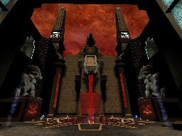
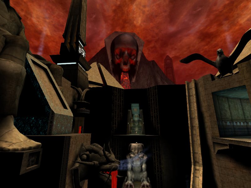
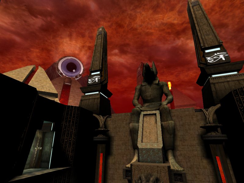
Just another map in the tired Egyptian theme, you might think at first... until you look up and see sheets of fire rolling across the sky, and what looks like a colossal rendition of Vic Rattlehead spewing a river of molten rock from its maw. A new spin on an old theme is always good to see, but unfortunately the Egypt-meets-hell look isn't carried off nearly as well or as thoroughly as it could have been. Aside from the skybox, and occasional skulls and lava pits indoors, this map doesn't distinguish itself too much from the countless other Egyptian maps that other authors have turned out. Furthermore, regardless of whether you feel the architecture is unique or not, it's poorly constructed. It's blocky and unrefined, with overused statues and other meshes scattered about gracelessly, often overlapping with BSP geometry in unnatural ways.
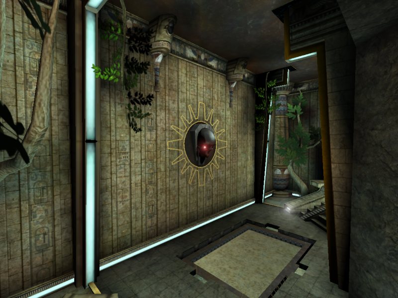
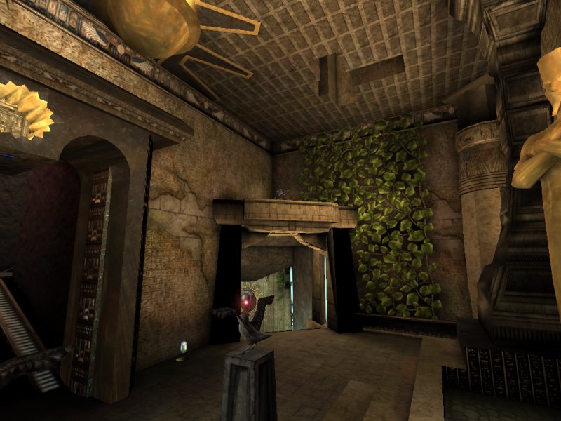
There are quite a few inconsistencies that do their part to ruin the atmosphere as well. One room in the map has trees growing out of the rocky ground, vines hanging from the ceiling, and walls carpeted with leaves. What happened to the theme of fire and brimstone? I guess even Satan needs to get in touch with nature once in awhile. The sun looks out of place as well... at least I assume it's supposed to be the sun; I don't know what else it could be. It hangs in the sky pure and white against the backdrop of a fiery sky. Something isn't quite right there. Also, it's located in the navigable region of the map, not the skybox, so it clearly appears to be suspended a few meters above the map's ceiling. Finally, one of the pyramids outside is topped with an enormous eyeball, a truly ludicrous sight. Something like the Eye of Sauron would have looked great out there, but this is a human eyeball in proportion and in coloring (it's totally unlit), and it looks laughable.
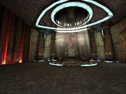
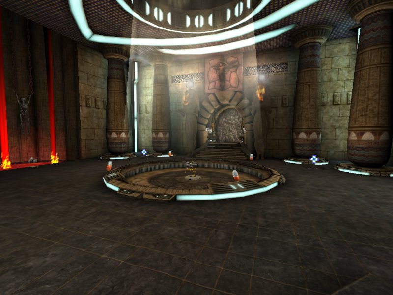
The lighting is not very good; much of it is provided by lights that sit in the air and are not associated with any visible source. Aside from some hallways that are tinted a medium blue, and the obvious reds of the lava pits, most of the map is blanketed with a very pale orange that doesn't do anything to reproduce the air of menace that you'd expect to find in the abode of the damned. Lighting is a very important part of defining atmosphere, but in this map, the color scheme is so benign that I often forgot I was supposed to be wandering through a vision of hell. There are also a number of places where surfaces appear totally unlit, which is ugly to say the least. In many cases this is strictly due to poor light placement, but in others it's more of a build error, as I'll discuss in a bit.
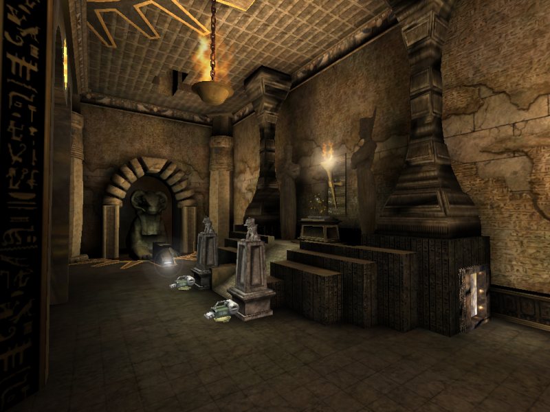
I strongly dislike the way that pickup bases were used in this map. First of all, for most of the weapons, the author has set the weapon base to be one of his custom meshes, which generally consist of basic architecture that looks like just another part of the floor. When I first saw this, I thought the author was doing it because he doesn't like weapon bases, or maybe thought they would look out of place in his map, which is fine. The Lightning Gun and Redeemer sit on Epic's standard weapon bases, though. Use them or don't use them, but at least be consistent. That's a minor thing. Health pickups use standard bases as well, but there's always a square carved out of the floor exactly the size of the base, one that's untrimmed and not aligned to the floor tiles. That's very ugly. My biggest problem here, though, is that the author decided that ammo bases were needed as well â an extremely odd choice considering how I originally thought he was trying to get away from the use of weapon bases â and so every ammo pickup sits on top of a brazier shrunken down to less than one percent of its usual volume. It looks as bad as it sounds, believe me.
Even the screenshot sequence, which should be a no-brainer, was horribly done; it skips abruptly on every transition. All in all, this is not an attractive map.
BUILD: 0.5
On the technical side of things, this map is a veritable train wreck. The author's brushwork is sloppy, and although it escapes BSP holes, there are plenty of places where you can see little gaps or protrusions where two brushes, or a brush and a static mesh, don't line up like they should. A considerably more significant problem arises from the fact that the author has often placed static meshes such that they pass through the walls of rooms or corridors into solid space, rather than taking the time to make sure they fit precisely. Specifically, this probably accounts for several instances of staircases that appear completely black. Static meshes use vertex lighting, and so if you've got all the vertices for a particular surface embedded in a wall, that surface won't be lit.
There is a considerable degree of overdraw in many places of this map, and performance can drop accordingly. It's not always obvious why, but there are some things I can pick out. First, although the author has divided the map into zones, there is one zone that's extremely large, because it comprises multiple non-adjacent rooms in the map, joined as one zone because they all open up into the sky. Because it's such a large region of the map, and is visible so often, zoning isn't sufficient by itself to occlude all that geometry. Yet no antiportals have been used. There's also a gross inefficiency to be found in the skybox. It contains an absurdly huge terrain (256x256), very little of which is actually used (and incidentally, that part that is used doesn't look that great), and the author failed to use the visibility tool to crop out the vast, unused region of it. Thus there are tens of thousands of terrain polys being drawn for no reason at all.
The bot pathing is incredibly bad, characterized by tremendous overuse of PathNodes and a conspicuous lack of almost everything else. Bots can't access the secret rooms, nor are they capable of using the various lifts in the map. In almost all cases, jumping paths have been either neglected completely or implemented incorrectly. The exception is the two jump pads in the map, which bots can use, but even in that case they don't take all possible routes. The final result of all these mistakes is a network littered with dead ends and disconnected regions. Two of the latter are especially striking. First, the entire upper floor of the map, which holds Jump Boots (more on that later) and the Super Shield Pack, is inaccessible to the bots. Second, the room with the Flak Cannon can only be exited by using a lift, so a bot who spawns down there is trapped there until he gets killed. Ironically, despite all these omissions, the network is actually far more complex than it should be, rather than less, due to the excessive number of nodes. This map is probably the worst example of cluttered PathNodes that I've ever seen, save for a few old UT maps in which UnrealEd automatically generated the network. Without re-pathing it I can only guess, but I'd say it has somewhere between four and eight times too many nodes. It's playable, but that's the best that can be said of it.
There are quite a few movers in the map, and most of them â specifically, all those used as lifts and secret doors â move agonizingly slowly. The lifts take three seconds to open or close, and pause for four or five seconds in between. So if you want to ascend on a lift that's in the raised position by default, you're in for a wait of ten or eleven seconds, which is an eternity in deathmatch terms. The doors to the secret rooms are just as bad; they take a full ten seconds to open.
Finally, there's the map's audio to consider. Usually I don't say a whole lot about this topic in my reviews, as I think it's uncommon to find a map where sound has been carried off remarkably well or remarkably poorly. This map, though, is crawling with ludicrous sound effects that trigger when you enter a lift, step on a certain part of the floor, pick up a certain weapon, or look at a bot cross-eyed. Most of them are laughs and screams that have painfully low sampling rates (8000 Hz) and sound like they came off a Spooky Sounds! audiocassette used to scare kindergarteners in ten-cent haunted houses. They do an effective job of mangling the atmosphere rather than aiding it. The music is decidedly odd as well. It gives the impression of having been written by someone who couldn't quite remember if he was supposed to be writing something for a graveyard or a circus, so threw in a little bit of each and drowned them both out with liberal excerpts from his trusty Spooky Sounds! collection.
CAST: 0.5
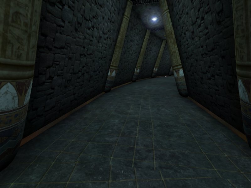
It's rare to find a map with so many visual and technical mistakes that still manages to play well, and you won't find one here. The layout is nothing more than a series of rooms with corridors connecting them, and none of the rooms are very good. Gameplay basically comes down to facing your opponents on a level surface while trying to avoid the various places where you can fall into lava pits, run into poorly placed statues or random protrusions from the ground, or get snagged on improperly used collision volumes or geometry that's simply been crafted with poor dimensions. That last was a particular irritant as I was playtesting this map. There are places where static meshes' collision volumes extend too far outside the actual geometry, such as on the pillars that the author has tilted and used as trim segments for some of his hallways. In some other instances, such as a series of cobwebs that span one corridor, collision should not have been used at all. It's a real pain to be flying across a room and suddenly be stopped cold by a cobweb. Finally, several places in the map are a pain to navigate simply due to the way they were made. The Minigun and Shock Rifle are awkwardly placed, and the rings surrounding the Assault Rifle and Rocket Launcher are annoying as well. It almost feels as though the author was trying to break the flow of the map wherever possible.
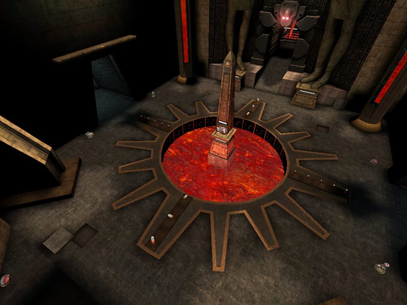
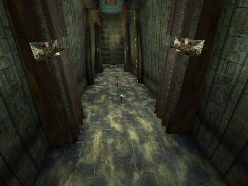
Two of the map's hallways have grated sections suspended above lava pits that open and drop you to your doom if you step on them, along with a ridiculous sound effect to complete the experience. Some people might appreciate this addition, but I don't. If it were controllable via a button somewhere so it could be used as a trap, that would be a different story. As it is now, though, it's just an overly large pit placed in an inconvenient location.
The author has made some very strange choices for pickups as well. There's a Mine Layer (which the bots can't reach) hidden in one room. I've seen this used in other deathmatch maps, and I don't particularly care for its inclusion, but it doesn't bother me too much. However, there's also an AVRiL hidden in one of the secret rooms. (The bots can't reach that either.) What a singularly useless addition to a deathmatch map. You get to wait ten seconds for that secret door to open so you can have the privilege of trying to use anti-vehicle rockets against people. Finally, there's a pair of Jump Boots on the upper floor of the map, yet another place the bots won't go. I can't imagine why they were included. The only uses I found for them were to reach the Mine Layer (not worth it), and to get to places in the map that shouldn't be accessible, namely outside in the map's unfinished area.
The whole map simply has an unpolished feel to it. The basic layout, the placement and choices of ammo and weapons, the spawn point locations; all of it seems to exist without any predetermined design. I won't say that the author didn't plan it out beforehand, since he may have, but it doesn't have the consistency that a coherent plan normally lends to a map. Add all of this to the significant gameplay problems already introduced in the past two sections â the slow movers, the poor optimization, and the lousy botplay â and you have a map that you'll likely be sick of before you finish so much as one game in it. I certainly was.
FINAL SCORE: 2.0
I'm truly baffled at some of the user scores this map has drawn. I have a hard enough time imagining someone getting much enjoyment out of it at all, much less giving it a score that labels it as very close to perfection. Make no mistake: this is a truly awful map, deeply flawed in almost every way. |
| |
| | | | Map Comments |
| Wizzel
06-20-2004 03:22 PM MDT | Rating: 0 | | Your story sucks about as much ass as your map does...Yeah don't waste time posting sh*t like this...
| MichaelM
09-20-2004 12:20 AM MDT | | I'll make a final version (SE) with changes and I will make it much better, much more finished. Thanks for the feedback. I know that I should have beta tested this, but I was a noob then and did not think of it. The final version will be beta tested before release.
| Sicko Teddy
06-25-2004 12:46 PM MDT | Rating: 9 | | EDIT;
Hey Michael man-
Right now I am working on a ONS level. It is called ONS-VIKING_SETTLEMENTS. I started to make my level on the terrain from ONS-DRIA, but it's coming out new and unrecognizable. Now I am making a cruel decisions between lush green looks and FPS. Stay tooned!
I love levels with traps and secrets. I know there are many other people like that, so - "JOIN US" :)
The story is fun this time. I find it a little humorous (no offence) . The improvements are improved!
Wizzel- are you drunk? and how could you post a word- "ASS" ???? Did admin miss it? or you hacked the language filter?
EDIT- OOH I see. I remember when I wrought the word- assault it was turned into ***ault. That is good (not always but good)
| X22887
06-21-2004 10:27 PM MDT | Rating: 9 | | I never have read a level's story... and I'm not about to start, but your map looks nice, egyptian is a bit overdone, but whatver. I'll give it a 9 because as Clinton says I can!
| Ironblayde
06-23-2004 12:58 AM MDT | | Sicko: The language filter has been disabled, because people were tired of it censoring words like asset or embarrassing that had an "offensive" word as a substring.
MichaelM: You got it, though I have to wonder if you'll thank me for it. :) I'm sorry, but this map has a ton of very rough edges that need to be worked out.
| Innominate
06-25-2004 03:26 PM MDT | | LMAO X22887 that was one funny comment, I've read the story and all I have to say was it's kind of lame but on the other hand not that bad, sry MichaelM.
Anyways I just wanted to comment because of X22887's comment. I didn't DL/Play the map because I'm not a big fan of DM and especially BIG size DM maps. The story has potential, try make it sound better and more interesting. GL in the MSU, lol I would give you a 10 just to tick Ironblayde off but on second thought that wouldn't be right lol.
| sandorski
07-08-2004 12:31 AM MDT | Rating: 8 | | I liked the first one and this seems to be even better. Good map!
Recommended download.
| redfist
09-19-2004 11:59 AM MDT | | I guess I should download it,but the screenies are lookon alot like the one in the game is it osirus?
i'll check it out later
| slaskan
09-19-2004 12:37 PM MDT | Rating: 3 | | i dont like the sounds, i dont like the lihting, i do like the sky in the skybox, i dont like the sounds, i dont like that u fall right in the lava when spawning at som places :@ this map doesnt seem finnished
| Hitman
09-19-2004 01:22 PM MDT | Rating: 4 | | im gonna give you a 4 because it does appear as though you put some time into the map. But i dont like it. The trap doors and noises are really annoying. Sometimes to many static meshes can be a bad thing hint hint. Also the plants that grew in Hell just didnt make sense to me. The skybox was really cool. I didnt like the game play, it felt like i always had my back to a wall or was running into something or falling into something. A stupid trap door is a nice way to ruin a good killing spree. Like the reviewer said, if it was a controlled trap door that would have been fun.
| nomadman
09-19-2004 08:06 PM MDT | Rating: 1.5 | | unpolished.
|

|
|
 |
 |
 |
 |
|
 |
|