|
|
|
 |
|
 |
 |
 |
 |
| DM-LiquidRising | | | Map Info |
| | | | File Name | dm-liquidrising.zip | | Author | Falcon Zero | | Gametype | UT Deathmatch | | Date Added | 06-19-2004 | | File Version | 1.00 | | File Size | 1004 kb | | Player Count | 4-12 | | Map Description | Frag it out in an original water works themed arena. This is my second mapping outing in UT so I hope you all enjoy it. | | Review Rating | 6 | | User Rating | 7 | | Overall Rating | 7.0 |
|
|  | | | | Review |
|
DM-LiquidRising (UT99)
A little bit of a misnomer, seeing as thereâs not much liquid accessible to the player, although we see it outside, the map is not a bad jaunt through a water works plant high upon a mountain. Huh? Waterworks on top of a mountain? Well, letâs see nowâ¦
AWE: 2.0
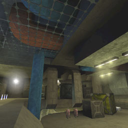
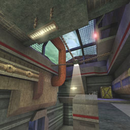
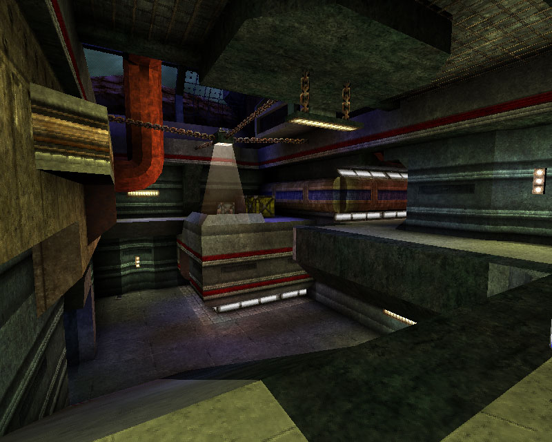
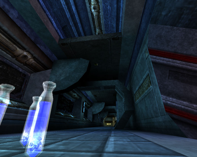
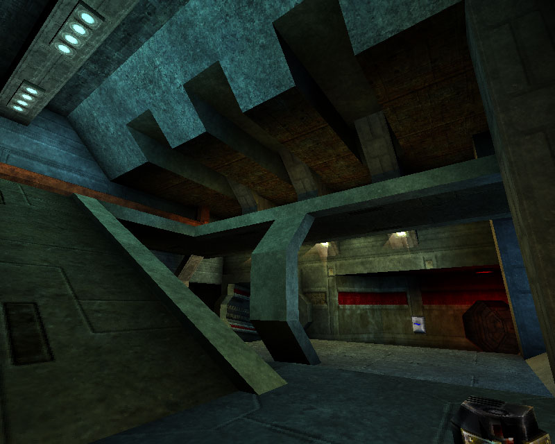
The map looks fairly well put together overall. The author put a lot of time into the textureing and alignments and it mostly pays off. Very few misalignments â certainly nothing thatâll break your concentration - and quite the myriad of textures â or so it seems. Composed primarily of various metallic and pipe textures the overall effect is of a semi-industrial locale. Outside the windows one gets the idea that the facility is surrounded by water. I donât really get the feel that itâs on top of a mountain.
The lighting is fairly good overall. Some of the radii could have been turned down a little to enhance the hotspotting thatâs there but is muted. As a result some of the areas feel a bit ambient lit. Also, a few of the light colors conflict with the textureing. For example a hallway with a red stripe texture has red lighting running down it. A very similar hallway with the same texture containing the red stripe has a blue light running down it. As for the color use in general, it seems a little haphazard but holds up overall.
The architecture is nicely complicated and contains angled supports throughout the facility. The author states in the readme that this is his second map and that he practiced with the 2D shape editor and vertex editing and it shows nicely. There were a few places where the corridor shape definitions end abruptly at the ends of the corridors whereas they would have looked better if they angled back into the wall rather than ending at a 90° angle. In general the architecture gives the feel of a facility of some sort, and itâs well constructed, but it doesnât support the water theme as much as I get the impression it could.
In general the awe isnât so bad. The textures are nicely varied and applied well, the lighting could use a little more work, and the architecture is nice but doesnât support the theme as well as it could have.
BUILD: 2.0
The BSP work is nicely complicated and much effort has been put into it. A fair number of brushes donât sit on the grid however these are largely curves so⦠But there are no discernable HOMs to distract you. The lifts all work well and make appropriate sounds, as do the doors. However the map is not zoned to its full potential thus creating a bit of an FPS drag in places there need not be. The ambient sounds here are well conceived and reach through pretty much the entire facility. Some locational, some more general, itâs a pity there are no triggered sounds to round out the aural map.
In general itâs really just the zoning and ambient sound that bring down the score here.
CAST: 2.0
The gameplay here is a pretty good overall. Thereâs the requisite z-axis and some risk reward spaces that work fairly well â like the shield belt area. However there are some problems as well. First, most of the map is tight. The map is quite R-C-R and the âCâs are narrow and tight in general. Some of this might be okay in general but itâs overdone here. Second, some of the weapons are placed up on boxes. If a player canât run by it and pick it up, the flow is slowed and no one likes that â especially in a DM map. Also, the rocket launcher is placed at the back of a horizontal tube. No one should be punished so drastically for wanting an RL! To add to the awkwardness, the tube actually extends vertically up, above the RL, and then horizontally leads back out to another part of the map. The problem here is that the damage amp is floating half-way up the vertical part of the tube. In terms of risk/reward and the tube, itâs good for the damage amp. Adding the RL into the mix is just not nice. A strong weapon like the RL should not be placed in such close proximity to the damage amp, nor in such tight circumstances. Also, the bots were not pathed to the damage amp so unless you play this online, youâll be the only one ever getting it.
In general thereâs a fair amount of good DM gameplay here. The map favors non-hitscan weapons too much with its narrow plentiful corridors, and some of the weapons are a bit of a challenge to grab. Other than those complaints itâs quite nice.
Put all together the texture work is good despite the lack of trim, the lighting lacks some definition and sometimes the colors look a bit off, and the architecture is nice but doesnât support the theme as well as it could have. The construction was pretty good as is the gameplay. In general not a great map, but far from a dud â especially considering itâs an authorâs second piece of work. DM lovers will want to give it a go, but it isnât a map for everyone.
|
| |
| | | | Map Comments |
| XepptizZ
06-19-2004 09:10 AM MDT | Rating: 7 | | It's a fairly well map for once, considering the crap wich is pooring in recently.
There are enough pipes and water sounds to make the title fitting the map. it's a very dens map, very tight.
Very good connectivety.
The archi feels like a very upgraded deck-16][. wich is as good as it is bad, becuase though deck-16][ surely is a good map it is also very oldscool.
The skybox seems to be made in a hurry to gat the map done.
Overall a nice map, but next time try something bald and new so we can be amazed once more.:)
| Manticore
06-19-2004 08:53 PM MDT | Rating: 7 | | Colourful map with good z-axis for 1/1 or 2/2.
|

|
|
 |
 |
 |
 |
|
 |
|