|
|
|
 |
|
 |
 |
 |
 |
| DM-1on1-Marble | | | Map Info |
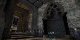
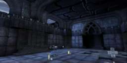
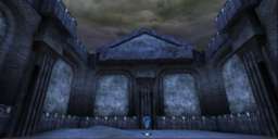
| | | | File Name | dm-1on1-marble.zip | | Author | CodenniumRed | | Gametype | UT2k4 Deathmatch | | Date Added | 05-14-2004 | | File Version | 1.00 | | File Size | 1.51 mb | | Player Count | 2-3 | | Map Description | I made this level to look like it was carved out of a layred earth, though I tried to not appear too repetitive with the 'layering.' The lighting could have been better, and the room with terrain was a bit rushed, but that was because I wanted to have my first ever released map (not that I haven't half-made many maps before!), so I can work on my next one. :) | | Review Rating | -- | | User Rating | 7 | | Overall Rating | -- |
|
|  | | | | Review |
| No review currently available for this map.
Click here to request a review of this map.
| | | | Map Comments |
| sandorski
05-14-2004 11:06 PM MDT | Rating: 6 | | Pretty good map. The layout and amount of power ups doesn't seem made for 1on1, but that could just be me.
sm_cool: it's just you man! :D Seriously though, yup, it's something to do with this site, from what I've heard.
| Manticore
05-14-2004 06:48 AM MDT | Rating: 7 | | Possibly too big for 1/1 but pretty well laid out.
Solid textural and architectural look with that "oldskool" look (if your skool happens to be that Q game). The lighting is a bit average.....
Really like what you've done with the liquid texture, it looks a bit like molten metal; mecurial.
| Sm_the_Cool
05-14-2004 04:10 PM MDT | Rating: 8 | | The layout is good the theme is done well throughout the map and it has the feel of a Gothic type mini tower type place. It works pretty fast placed with 4 players not too much not too little. I think the author put good effort into making this 1on1.
Is it just me or does it seem like the color was made blue in the screenshot?
| nightshadow
05-14-2004 10:59 PM MDT | Rating: 7 | | i like the layout and style. good for 2 on 2 team deathmatch. could have used better lighting, but it's ok. good map :)
| OLDMAN(CO30)
05-15-2004 06:52 PM MDT | Rating: 7 | | I liked the feel and look great job, but the plain walls needed dressed up a bit, maybe a shield or two, some lighted torches.
| T0mbr41d3r
10-17-2004 05:19 PM MDT | Rating: 7.5 | | Looks very good, nice gameplay aswell
| scirmast
11-07-2004 07:03 PM MST | Rating: 5.5 | | Good theme, but boring gameplay. The map suffers heavily from room-corridor-room syndrome. There are not too much Z-axis involved, anmd the layout is boring. Bots do provide a match though.
For the next map, work hard on the layout before even open UED. Make the gameplay full of X-axis. Then use a bit bigger set of textures and some cool meshes, and you'll be a respected mapper.
|

|
|
 |
 |
 |
 |
|
 |
|