|
|
|
 |
|
 |
 |
 |
 |
| DM-Ruined City | | | Map Info |
| | | | File Name | dm-ruined_city.zip | | Author | Phloxx | | Gametype | UT Deathmatch | | Date Added | 03-26-2004 | | File Version | 1.00 | | File Size | 2.42 mb | | Player Count | 3to6 | | Map Description | None | | Review Rating | 4 | | User Rating | 7 | | Overall Rating | 5.0 |
|
|  | | | | Review |
| | Reviewer | AMmayhem | Awe Score: | 1.5/3 | | Date | 04-08-2004 | Build Score: | 1.5/3 | | Review Schema | Cast Score: | 1.0/3 | | User Point: | +1 | | Overall Score: | 5.0/10 |
AWE: 1.5
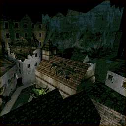
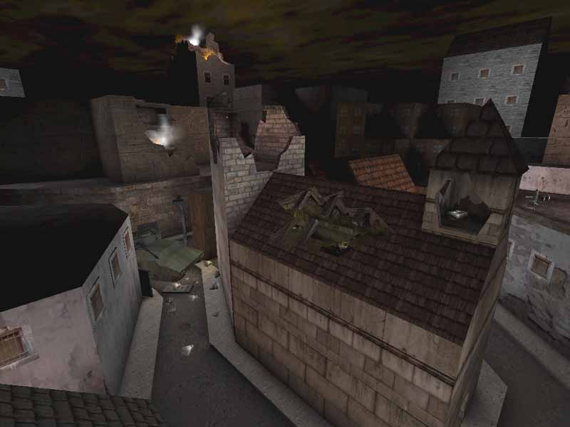
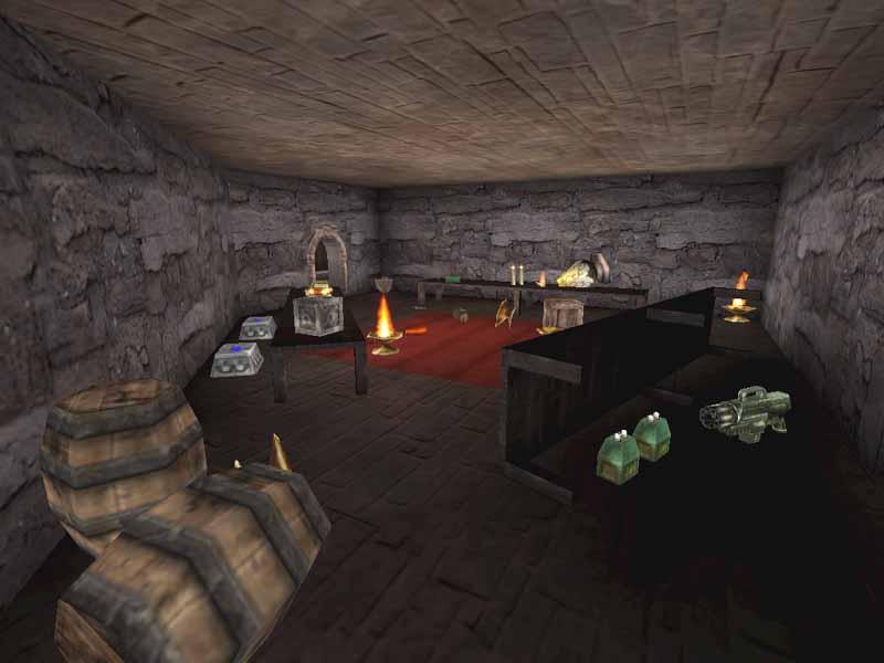
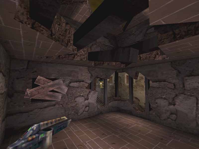
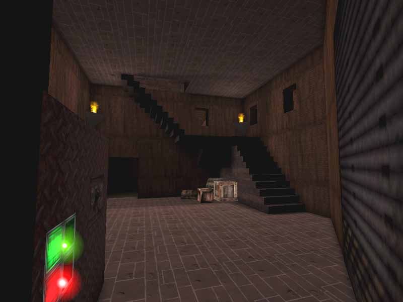
Low 1.5, some real work went into this map, it looks like it would be a map from Medal of Honor. Clearly the highest point is the busted up, crumbling ruins of the buildings. Some of which are used for ramps for getting to higher stories, giving you an advantage to shoot through various cracks and holes. However, while the outside architecture looks fairly cool, the insides are rather bland. Sure, actual buildings aren't really that impressive on the inside, but here it looks too cramped, everything is squashed in as far as stairwells and other stuff goes.
Texturing is a wide use of any and all building textures for, well, the buildings... A little more consistancy would look better, and some better architecture would throw off any resulting blandness. Alignments aren't quite perfect, only off by a few pixels, or tried matching up the wrong row of bricks. Just need to give it a little more attention, which I know can be painstaking.
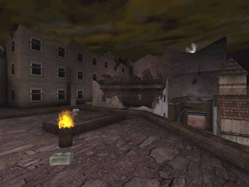
Lighting has a fiery orange glow to it, as many building are on fire, or there are barrels with nice flames out the top. However, the light emmitted from these have too large a radius for what light they should really provide. One barrel lights up a wall clear across the street. Other light comes from street lights positioned where light is needed, and is oversaturated too.
BUILD: 1.5
A few sounds liven the map up some. The main brush-work is the basic cube, which is boring, but add in the jagged edges of the ruined buildings, and things look a bit more interesting. The sky isn't much to look at either, too dark with the few lights that are on it.
CAST: 1
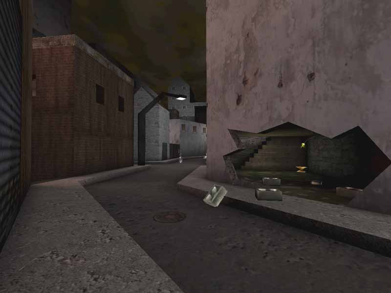
Didn't get any tingling feelings here from gameplay. Too small of areas for fighting, only real distance can be found down the streets, but just isn't enough. The flow has its snags with the small crampness of the buildings. There is opportunity for z-axis, but the streets aren't wide enough, forcing you to pretty much stand on the edge of the buildings and look straight down. Too tedious really for UT. Item placement is varied, and usually difficult to get to.
SCORE: 4
Looks interesting, and is an improvement from the author's first map, but won't really blow your skirt up. |
| |
| | | | Map Comments |
| Tommy boy
03-26-2004 01:24 PM MST | Rating: 9 | | whoooooooow great map dude really great
i just love what you did with it an the textures are great
teh lighting could be a little better but for the other things WEEELL DOONEE!!!!!!
| Ironblayde
03-27-2004 06:10 AM MST | Rating: 5 | | My first impression upon firing up this map is that it looks pretty damned good. The author went to some trouble to recreate his ruined city, and it shows. Buildings have holes and shattered rooftops where they've been bombed, debris lies strewn about everywhere, and a great many fires still burn. The attention to detail is very good. Animated flame textures are used in many places, and usually used well. Planks placed between rooftops creak when you walk over them. A good number of items lying in buildings are destructable. There's even an impressive-looking tank sitting in the middle of one street.
The textures are mixed from a number of different sets (notably UT and Slums), including a custom set that comes with the map, and the author's choices are good ones. Disappointingly, however, and also surprisingly given the attention to detail elsewhere, it seems the author has only made a cursory attempt at texture alignment. There are alignment mistakes everywhere, and it takes away from the immersion factor somewhat if you tend to notice such things, as I do.
One disadvantage of the architecture is that the polycount is pretty high -- often over 300 or 400, and on the rooftops, once in awhile over 600 -- and when you combine that with fires everywhere that contain flickering lights and smoke generators, plus opponents throwing flak in your face, your framerate is likely to take a beating.
Weapon placement is good, and the bots seem to navigate their way through the map well. They go for all the powerups, of which there are plenty to be found, including the damage amplifier.
The sad part is that when we come down to the most important aspect of any map -- gameplay -- the map left me feeling more frustrated than anything else. There are lots of tight quarters inside buildings; low ceilings; narrow, steep staircases; paths blocked off by chainlink fences; and the like. Despite what looks like a pretty well-constructed map, I often felt as if I were being given too few options as to where to go, as if the city were nowhere near as open as it looks.
Perhaps after more time in it I might get used to the layout enough to enjoy it more, but I simply don't like how crowded it gets, even just going through a dry run without enemies chasing me. If the author opened up the gameplay a bit, did some work on aligning his textures, and addressed the framerate problem somewhat, this would be a pretty good map. As it is, though, I probably won't be holding on to it.
| Cobra
03-27-2004 05:27 AM MST | Rating: 7 | | Ya I agreed super good looking map great job man!. plenty of very hard work in there. But like said above the game play well I think that it is much to narow,it is like you can't move any where. But great job again!.
| AMmayhem
04-08-2004 10:16 AM MDT | Rating: 4 | | The 1.5 awe score is a bit generous, but the overall 4 works.
The author is progressing, needs to open things up more for maneuverability and improve on architecture.
| Manticore
04-08-2004 10:35 PM MDT | Rating: 5 | | Interesting layout which is pretty tight so the whole map is loaded with choke points.
A big improvement on 1 on 1 Mortality and a reasonably fun time...
Visually interesting....
A mapper with some potential if this map is anything to go by.
After Ironblayde: yes, the atd is quite good...
| KosaPL
04-09-2004 07:00 PM MDT | Rating: 7 | | I gave 7 only because of superb outside look, inside the buildings ain't that as good as outside
| STB
04-10-2004 10:41 AM MDT | Rating: 10 | | .:outstanding:.
| Shadowlurker
04-11-2004 11:22 AM MDT | Rating: 3 | | Really doesnt look that good, and it has it's cramped gameplay is limited due to theme. The only way to improve the map as it is would be to make it look better, because you can't make a proportionally realistic map with good gameplay.
| Shao
04-11-2004 06:46 PM MDT | Rating: 5 | | agree....reviewer is right , author is progressing his map.
| youknowityougotit
04-14-2004 12:42 PM MDT | Rating: 10 | | Nie work
| outpt.co.uk
04-20-2004 03:36 PM MDT | | Something tells me that some of the comment posters aren't all different people... ;)
Keep mapping tho, you'll get better.
| Phloxx
04-20-2004 08:07 PM MDT | | Those are not my comments.
I would like people to please stop doing that and post a more serious score.
I appreciate everybody's opinions, thankyou.
| Nafla Radue
04-25-2004 07:15 PM MDT | | Am I the only one who noticed the random monsters in this basement area? I was rather confused.
|

|
|
 |
 |
 |
 |
|
 |
|