|
|
|
 |
|
 |
 |
 |
 |
| DM-1on1-Mortality | | | Map Info |
| | | | File Name | dm-1on1-mortality.zip | | Author | Phloxx | | Gametype | UT Deathmatch | | Date Added | 03-25-2004 | | File Version | 1.00 | | File Size | 295 kb | | Player Count | 2 | | Map Description | None | | Review Rating | 2 | | User Rating | 4 | | Overall Rating | 3.0 |
|
|  | | | | Review |
| | Reviewer | AMmayhem | Awe Score: | 1.0/3 | | Date | 03-31-2004 | Build Score: | 0.5/3 | | Review Schema | Cast Score: | 0.5/3 | | User Point: | +1 | | Overall Score: | 3.0/10 |
AWE: 1
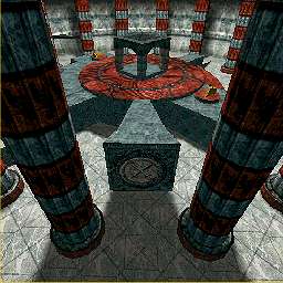
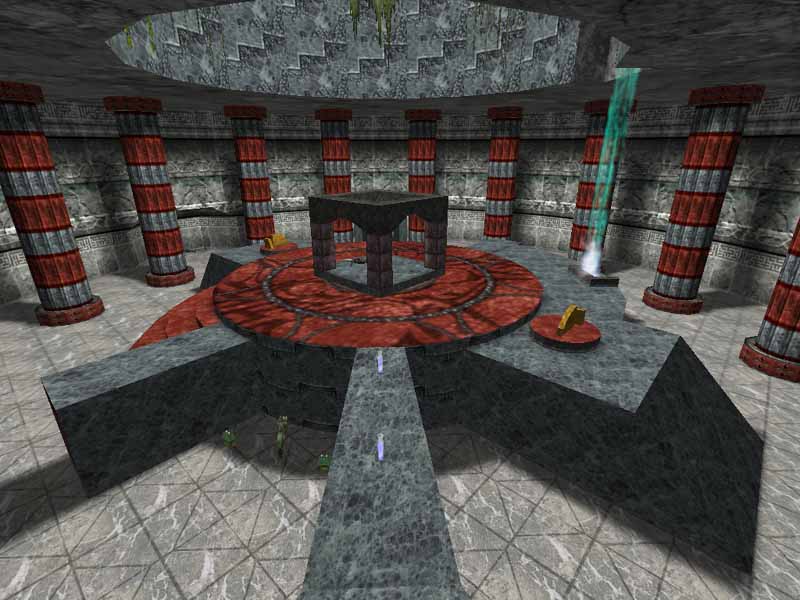
Numerous columns hold up this cylindrical battle arena. Not much else to this map, aside from another small room under the center structure. The small waterfall added a small amount of intrigue to the setting, but the rest of the place just doesn't work. And what's with those little red and yellow knob things?
Not much to lighting either. One light actor lights up most of the map, and it's located in the skylight, which does throw decent shadows from the columns, but is too white of lighting. As for the room down under, the lights are still a bit oversaturated and blah.
Texturing needs the most work. The coumns are too repetitive, and just downright ugly with the red and gray coloring. Alignments are needed everywhere. And on one note, dark fire textures don't work well for mist from waterfalls. ;-)
BUILD: 0.5
Not much to sounds here, quiet little flames, and the water flowing down. The skybox is nothing but a partly cloudy sky, not anything that you'll stare at for awhile.
CAST: 0.5
While the map is intended for 1 on 1, it still is too small. The columns get in the way of flow, and everywhere else leaves little space for maneuvering. There's little health, and a decent assortment of weapons.
SCORE: 2
Not enough space, and doesn't have much for looks. Better than a lot of other first time maps out there. The author's next map is more of an improvement, which we'll see soon. ;-) |
| |
| | | | Map Comments |
| Nafla Radue
03-27-2004 12:28 PM MST | Rating: 7 | | Thia map is pretty excellent. Dispite its small size, it didn't get boring immediately, which is saying something for me. Placement of weapons and healing was very good as well. The lighting is the best part, its done excellently. The only thing is that i can see this map getting boring eventually, but I guess thats kind of expected ofr its small size.
Good job.
| Ironblayde
03-31-2004 10:42 PM MST | Rating: 2 | | The review of this one is dead-on. I don't know how you can praise the lighting when the entire main room has only one Light in it, and it's set to pure white and full brightness. Yuck. As the reviewer said, DM-Ruined_City, the other map by this author, is quite an improvement over this one (though in my opinion, it suffers from the same too-tight gameplay in some respects).
| Phloxx
04-05-2004 06:12 PM MDT | | Hmmm... I appreciate the review but I'm surprised that I got such a low score. I encourage anyone into smaller maps to at least try this map and see what you think.
[Uh-Uh! Don't be frontin on my knobby things]
| Manticore
04-05-2004 08:16 AM MDT | Rating: 3 | | Ruined City is a better map....
Single room maps always run the risk of becoming boring really quickly no matter how interesting some of the stone textures are....
Yeh; what are those yellow and red knobby things?!
|

|
|
 |
 |
 |
 |
|
 |
|