|
|
|
 |
|
 |
 |
 |
 |
| ONS-Serration | | | Map Info |
| | | | File Name | ons-serrationv1.1.zip | | Author | Sabotage | | Gametype | UT2k4 Onslaught | | Date Added | 03-29-2004 | | File Version | 2.00 | | File Size | 3.1 mb | | Player Count | 0-16 | | Map Description | None | | Review Rating | 5 | | User Rating | 6 | | Overall Rating | 6.0 |
|
|  | | | | Review |
| | Reviewer | Luggage | Awe Score: | 1.5/3 | | Date | 03-25-2004 | Build Score: | 1.5/3 | | Review Schema | Cast Score: | 2.0/3 | | User Point: | +1 | | Overall Score: | 6.0/10 |
Note: This is a review of version 1.0 of the map.
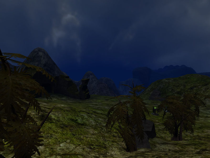
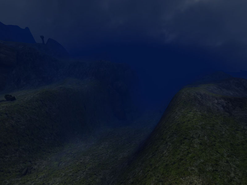
Unless I missed something, ONS-Serration is the second user-made Onslaught map released. This 5-node-map is set in a dark landscape with a wide canyon in the middle. It sports a point-symmetrical layout centered on a node at the bottom of the canyon, and two nodes on either side. Serration comes with 3 link setups... I prefer the "Top First" setup to the Default and "Torlan-style" ones, but be your own judge on that.
This is my first review, so please feel free to crit and help me improve the style of any future reviews! :)
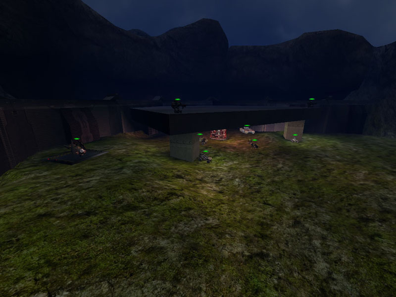
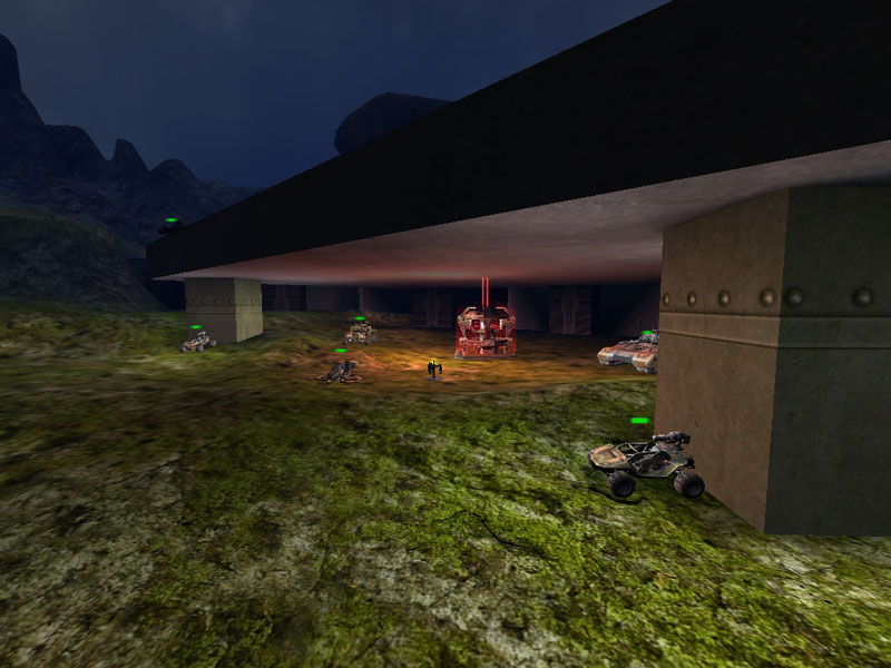
Serration is a very large map, featuring all vehicles except for the leviathan. There are 3 Raptors, 6 Mantas, 6 Scorpions, 2 Hellbenders and 5 Goliaths. Given the size of the map, a Leviathan would have fit easily.
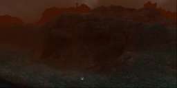
Now, onto the good and the bad! The first thing that struck me when I loaded this map was the intensive blue fog that lay over everything. The author has used a Projector to create a very nice panning cloud-cast shadow effect, so I assume that the atmosphere he tried to create was that of a cold, overcast, unfriendly evening, or similar. However, the blue fog is just too blue, I would recommend using a much less saturated tone next time - in my experience, what works best in such a setting is to start with grey of a suitable brightness, and subtly add color of the desired tone. Another bad touch is that the in-level fog doesn't always line up with the fog in the skybox. The colors have been adjusted accordingly, but in some places, especially when looking upwards one of the many hills, one can see the individual terrain tiles being occluded, resulting in an ugly jigsaw effect - this could have been avoided by using a fogring.
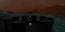
The second thing that got my attention was the lack of visual indication where the hell to go next. :) There are no roads, or treaden paths that show first-time players the way from node to node. Even if it was just a few torches, some kind of navigational aid would have been nice. Things like that also help define a map's flow, because even if players, unlike bots, actually aren't restricted to certain paths, their built-in human pathfinding routines urge them to follow paths if they lead in the general direction they want to go.
Serration is lit by two opposing white sunlights, keeping the whole map on the rather dark side... Even though I suppose this was intended, it doesn't work too well. You simply cannot create a dark setting in a believable manner without adding bright contrasts in places... If you don't, everything will be the same level of brightness, and look boring. On the other hand, if you interweave your overall dark lighting with bright spotlights, the dark areas will look even darker. Remember the saying "Without darkness, there wouldn't be any light"? The opposite applies here :) Man, if you're already using two opposing sunlights, why not have a bright and a dark one? Throw in a little color contrast, and your whole map suddenly looks a lot better.
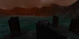
The power nodes are decorated with the meshes that were first featured in UT2003's DOM-Ruination, a well as a few trees from Torlan. Unfortunately, players can get stuck beneath some of the ruins, and the collision settings for the trees are set incorrectly: It's hardly physically correct if tank shells are stopped by a bunch of leaves. And what the hell are palm trees doing in a setting like this?
The bases around the power cores on the other hand are pretty uninspired: They basically consist of a large BSP roof held up by a bunch of pillars, two turrets on the roof that can be accessed via a teleporter, and all vehicles except for the Leviathan. The power core is visible from miles away, which makes defending it an impossibility once the opposing team has taken the last node. Which brings me to another point of criticism: Although some effort has been made to hide the nodes from each other, it is still pretty easy to snipe at them from far away. This is a definite no-no in Onslaught: Always make sure your nodes are well hidden from each other.
Botplay is acceptable... They work, but they're no geniuses. I've seen bots get trapped in a few snaggy spots, and taking nonsense detours. Some more attention here would have been nice.
On the audio side of things, there are no ambient sounds in this map. That's a shame, because in my opinion a few dynamic animal sounds, howling wind or the distant crack of thunder would have gone a long way in giving this level more atmosphere. However, the map's only ZoneInfo has a fitting EAX environment applied.
I can't say too much about performance since I recently upgraded my rig to an absolute killer mappin mega machine, but I did notice that no effort (apart from adding fog) was made to optimise this map. Right away, I can spot at least 4 areas that would have benefitted from antiportal usage, but there's none of that in this map.
Conclusion: ONS-Serration has potential, but lacks polish. |
| |
| | | | Map Comments |
| DeathLord Grimm
03-25-2004 01:41 PM MST | Rating: 8 | | Pretty good map, fun to play, and the middle node is definitely a good choke point, bases just need a little more work, and it would be very good map; Old decayed fortress might work, or maybe a completely new fortress since Liandri just found the place and made into an onslaught, just a couple of suggestions.
| Blueyes
03-25-2004 03:40 PM MST | Rating: 5 | | Screenshots are not very tempting...they are so dark!
| Sicko Teddy
03-28-2004 01:34 PM MST | | Why don't you put no score!?
AND WHY BOTHER COMMENTING , FIRST OF ALL???
Second of all, the colors are inverted (blue->red, green->blue.)
EDIT:
Don't worry, rFaker, I'm sure that there are many excellent mappers, who are working on their ONS maps now, and so they will get released a little later than the plane ones!! (so just be patient)
I will work on well polished ONS map, when my courses are over!
| Clobyn
04-12-2004 03:55 AM MDT | Rating: 6 | | It works, has terrain and a lot of blue. But, it's totally unpolished and I see no reason at all to play it again.
Edit: I've indeed been a bit too harsh on it. I've played it online a couple of days ago, and I had good fun. The terrain layout is very nice, as is the node set up, it's just that.... it's so unpolished. If the author would've spent more time on details and atmosphere it could have been a great map.
I've changed my rating from 4 to 6.
| rfaker
03-28-2004 06:13 AM MST | | I have a feeling we are about to see a rush of plain looking ONS maps with vast terrain and little else. Having said this, it's a good to see ONS maps being released. Come on guys, let's have some defining features and originality as well as speed of release?
| Luquado
03-28-2004 08:33 PM MST | Rating: 3 | | Should have stayed on the author's hard drive.
| <[DecoY]>
03-29-2004 08:07 AM MST | | Well...
It's dark, real dark...
I can't give it a score, since I'm not sure How to rate it...
but considering the speed at which it was released, I'd say it isn't very good...
btw,
hi Luq :)
| utvet
03-29-2004 07:50 PM MST | Rating: 7 | | I actually had fun with this one..gameplay was good...good fps..only one thing id like to see changed and that is brighten it up a tiny bit...raptors are kinda hard to navigate
| jbreaks2000
03-30-2004 05:58 PM MST | Rating: 6 | | not bad great fun but is that besaude onslught onws so much
| [WoD]Mephisto
04-02-2004 05:06 AM MST | Rating: 6 | | its not bad. it was actually fun to play. the center node is a good choke point where most of the action takes place. there are a few negative sides though: the map is a little too dark. i noticed i got shot a lot by a tank not knowing where the hell that tank came from. also, the skybox could use some more polish, since the culling effect of the distance fog was too visible. some areas would benefit of some more static meshes or foliage, since they were just too plain and boring, with lots of the same texture. fps was good overall, didnt notice any serious slowdowns.
if you pitch the brightness up just a little and fix the distance fog i'd give it a 7.
| brighteyes
04-04-2004 07:29 AM MDT | Rating: 7 | | (6.5) I think that people are being too hard on this map, which really is a good effort. The terrain is realistic and although it does lack detail and polish the gameplay certainly makes up for it. I'm keeping this one just because it's fun. (P.S check out the new bonus ONS maps; they are great!!)
| [CI.Loki]
04-09-2004 06:05 PM MDT | Rating: 6 | | Fun to play, but I think it needs some polish. Forts could use some work they are just too plain and open. Plays well and is nice and large for big scale battles. Something about the fog and lighting bugs me. Hope you keep working on it, it is a good idea for a map.
| SoH_Ghost3021
11-30-2004 03:28 PM MST | Rating: 7.5 | | what the heck...the user's screenshots are red, the review'ers are blue, and on my box, the maps fog is green! wtf..looks like the mapper is a sorta noob to terrain; no paths, no multiple layers(that i could see), but a bit of polishing and this would be a * * * * * map! ( thats 5stars, not a self-sensoring :) )
plz make a version2, and dont forget the anti-portals! :)
|

|
|
 |
 |
 |
 |
|
 |
|