|
|
|
 |
|
 |
 |
 |
 |
| DM-1on1-Systek | | | Map Info |
| | | | File Name | dm-1on1-systek.zip | | Author | Torn_Agressor | | Gametype | UT Deathmatch | | Date Added | 09-01-2003 | | File Version | 1.00 | | File Size | 911 kb | | Player Count | 2-4 | | Map Description | None | | Review Rating | 3.5 | | User Rating | 4 | | Overall Rating | 3.5 |
|
|  | | | | Review |
|
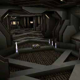
Systek carries a look that seems like it was directly inspired by this other mapper named Thomas 'Chameleon' Seufert, but this author is different. Holy hell is the inspiration quite clear, the map looks like a Chameleon map down to a T, it even shares the playability stutter.
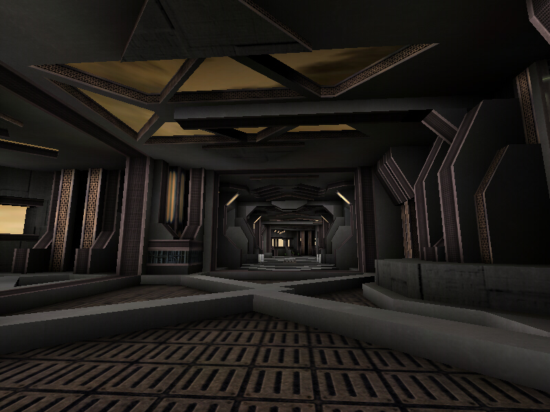
Visually, the place looks aboutâ¦er average Iâd sayâ¦the theme I wouldnât call original sinceâ¦well it is the same freakinâ looking map as any Chameleon workâ¦a sterile, gray spaceship environment with lots of pillars, pillars, ribbed floors, pillars, and windows looking out to an awfully crappy skybox. I do like the approach though, that isâ¦when Chameleon was doing itâ¦this one is abit too similar maybe, I dunno. There is plagiarism, and then there is imitationâ¦and this is the latter. The lighting is rather bland and lacks real presence, and as a 1 on 1 the place is about as exciting as Training Day for ut2k3â¦the style is about the same. I didnât like Training Day, and sorry to the author, I donât like it here. You have two rooms with spawnpoints and guns and they are connected by a central hall with health. One side has a minigun and shockrifle, the other the Pulse and ripper. You spawn in one room, hope the other guy doesnât spawn in the same room, nab a gun, and head toward wherever the other player is, kill them, go for health and avoid getting shot by the newly spawned opponent and go at it again. Iâll say this, the architecture, even if an imitation, is very well done for a 2nd map. If the author doubts his skills with architecture at this point, I suggest he download DM-Absolute Zero, which is also a 2nd map, so he can laugh his balls off until he feels better.
This makes gameplay very limited, there is only so much strategy you can pump into a map like this before it gets boring. At least the bots function well and the playability problem most people are bitching about does not seem to be present for me.
The Prophetâs Verdict: Great 2nd map by Torn Aggressor, most people still play with cubes for their second map and Torn could be heading somewhere if this really is his 2nd map. But as a functional map, and as a 1on1, it isnât too hot. The visuals have their up and downs, but the gameplay just gets stale quickly. My advice to Torn is to keep at it, and try working with a more unique theme cus dudeâ¦I was under the assumption this was a map by Chameleon until I opened the readme. Imitation helps everyone get his or her start, myself included, but eventually you need to find your own groove.
|
| |
| | | | Map Comments |
| Reciprocity
09-01-2003 09:37 PM MDT | Rating: 5 | | Imagine a figure-eight with a rod smack in the middle and you have systek. Be warned that this is a very small figure-eight. I personally find the 1on1 maps the most enjoyable but this map is too bland. You see that screenie up there? That's the appearance of the entire map. I think I may have seen a window or two but for the most part, that's it. I have an issue with the weapon placement. All the good ones were all concentrated at one end of the figure-eight and that made the gameplay uneven. I really didn't like those little beams in the middle of floor. They made aiming for me a pain. When you're deadlocked with an enemy and your trying to nail him in the head with a ripper blade, the last thing you need is a jolt up and down and up agian. Overall this map was: uninspired, not very pleasing to the eye, simple and not that fun. Reciprocity puts this little package at a 5.
| omnipolex
09-02-2003 11:05 PM MDT | Rating: 5 | | -From the screenshot and the previously noted comment I took it upon myself to try out this map. I don't generally play DM, and rating this wasn't very easy, but Systek has its good points, and its bad points. Texturing was very thorough and well-done. I enjoyed the overall look of the map but it is rather small, even for a one on one match. Weapon placement is awkward and doesn't quite fit the map very well. Also, the floor-mapping, although very nice and clean, was a bit over-the-top. It was hard to dodge, and the maps flow is methodical. Frag, wait, frag, wait. It's good in the sense that it's a quick fragging game, but the opponent doesn't have much time after respawning to collect weapons and ammunition without having to worry about getting killed within a second or two of startup.
-I'll be generous in giving a rating of 5, as I did enjoy the look of the map and the feel of it, but as for gameplay and the floor-mapping I believe more work can be done on this, such as creating a solid clear glass slate across the flooring as to provide for depth, but not the harshness of movement, and also the addition of rooms which follow the theme of the map, but also extend outwards in order to give each opponent a fair chance of gameplay.
| Torn_Agressor
09-03-2003 01:41 PM MDT | | thanks for the comments i will try to improve it when i get the time, good constructive criticism thanks for the suggestions :)
| theBAMNman
09-03-2003 10:45 PM MDT | Rating: 3 | | Well I must say, though they are repetitive, the visuals are great. They also threaten the fps with about 500 polys when looking down the main hall. And gameplay... sorry, it's just not there. At all. Expand what you have and then add at least one, preferrably two levels on top. And careful with the polys.
Btw, I don't know if you knew this, but this map is very similar to a UT2K3 map that came with the game that had a one-level figure eight layout. It also sucked.
| paranoid
09-04-2003 09:56 AM MDT | Rating: 5 | | Like theBAMNman said, the visuals are quite good, as far as the architecture is concerned anyway, the lighting is yuck though, it doesn't even feel like its lit. It would have really helped out with the texture use too, which is quite bland. but it is very neat and tidy. The little beam things on the floor weren't a very good choice, i got motion sickness ;) Perhaps you followed in chameleons footsteps too closely (hes the one who did ultimum isn't he?) anyway despite the solid construction it looks too bland and doesn't play well at all. . .
| ~shadow~
09-19-2003 03:03 PM MDT | Rating: 4 | | its annoying map!!!!!?!?!?
its look like a maze
and there is too many details
try to work less onyour maps
| Razor
09-23-2003 02:45 PM MDT | Rating: 2 | | This map is too small, you can sometime start too close to your enemy. There are a lot of details but they ruin the fighting area. and lighting sux too.
Nothing really good here.
| KaMi
09-23-2003 05:51 PM MDT | Rating: 5 | | Good effort, visuals are good but gameplay lacks z-axys game :)
| redfist
08-15-2004 01:55 AM MDT | | Now here is the right spirit of commennt land for Umreal mappage.....................................
Rock On
| Kantham
12-05-2004 10:55 PM MST | | yes , U'M'real mappage is this
|

|
|
 |
 |
 |
 |
|
 |
|