|
|
|
 |
|
 |
 |
 |
 |
| DM-1on1-Kenshin | | | Map Info |
| | | | File Name | dm-1on1-kenshin.zip | | Author | DeRailer | | Gametype | UT2k3 Deathmatch | | Date Added | 05-07-2003 | | File Version | 1.00 | | File Size | 7.7 mb | | Player Count | 2-4 | | Map Description | 4 players for botmatch, not recommended online. 2on2 still works for instant action because the bots to not make use of liftjumps at one corner of the map, neither do they move fast enough or time powerups. | | Review Rating | 7 | | User Rating | 7 | | Overall Rating | 7 |
|
|  | | | | Review |
|
Iâm glad I decided to play this one today. Last few months youâve seen little of me, and that is partly due to my continued aggravation with the UT2K3 mapping scene. I look at maps like Nirvana][ and wonder where the other âgreatâ ut2k3 maps are. About the time I played DM-Hardcore, I had the distinct feeling that the community had finally lost itâs mojo. I saw the flood of map ports and unplayable beauty and cube maps start fluttering in and I found myself playing more and more of UT1. This is the first UT2K3 DM map Iâve played in awhile that Iâve actually enjoyed.
Despite the 1on1 in the title, the author says you can have 2-4 people in this map. This is true, Kenshin is one of those larger-scaled 1 on 1 maps: Small enough for a fun 1on1 and big enough to support several. Derailer put more thought into the gameplay of the map than the visuals, but the result is a very functional and fun 1 on 1 battle arena.
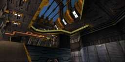
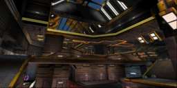
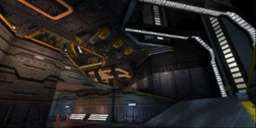
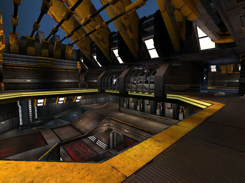
Now donât get me wrong, the map looks ok, although average. It appears to be a space-tech facility, a hybrid of those Utech epic maps of old and the new-age layout scheme made popular by mappers like Faceless, Akuma, David M, and Hourences. The stellar feel of this seemingly off-the-assembly-line theme made me nearly groan with its shockingly familiar first glance resemblance to CTF-Chrome. But as the seconds flew by and I found myself exploring more of the yellow-trimmed, orange-lit floorplan, I noticed things that made that oldskool spirit in me smirk and sigh with relief. The cunning use of windows is most notable. Remember those traditional UT maps that used glass floors, windows, and ceilings to give you a critical glimpse of a nearby section of the map? This map has got tons of that, and in every spot I noticed it was used in pivotal locations. There are entire rooms cut off from the map with windows on all sides (the playing ramps and catwalks cleverly fenced around them) that contain crates and other items of theme relevance. And these rooms have significance, you can see across and locate a potential target running to collect pickups on the other side, giving you the much needed 1 on 1 element of surprise. Derailer has definitely studied 1 on 1 technique in this map, because this is the most compelling 1 on1 map I think I have ever played on 2k3. The accessibility and location of the much used window gimmick makes the gameplay in this map stand out. If you donât get it, then try imagining the same map only with no windows. It would never work. Such a simple mapping strategy such as this gives this map the edge over many of these other âwannabeâ DM maps being made that ignore the essential mapping basics that have yet to fail us as gamers.
This map is fun. I found myself laughing with glee as I surprised Joe, my college friend, as we went head to head on this baby over the net. Item placement and weapon choices are all in check, the map has many differet levels, passages, ramps, and catwalks that all encompass the map with accordance to the items and cleverly placed windows. I have my gripes, and there arenât many, but they do make a notable difference. For starters, gameplay like this deserves a stronger theme. Like I said, the visuals are satisfactory, but plain. I read in the readme that Derailer was guided by Guilem Bedos as far as texture use was concerned (Gui, who is an ok mapper, has a habit of resorting to generic visuals instead of attempting to develop his maps with any form of originality). I wish Derailer had chosen a different theme for this map, but given the fact that he is still a fairly new mapper (as far as I know) I think he accomplished a very good product here.
The end result is a decent looking space-tech map with surprisingly intriguing gameplay.
Some things I wished were adjusted, such as the bots. Bots performed well enough and navigated the map ok (I didnât play with too many, maybe 2 at most) but they could have been more aware of their surroundings at times. I always got the drop on them, even on higher difficulties. And lift jumps, why not any? There were some lift locations in this map that would have been beautiful for lift jump action, but instead I bumped my head. Not really a big deal since many players are unaware of this popular trait, but I found myself missing it. I also would like to know what the HELL that sky is supposed to be. It appears that I am underwater, but bubbles or even those shark things from Oceanic would have been enough to convince me. Until I am proven otherwise, I say that this map is underwater.
The Prophetâs delighted Verdict: I am pleased to actually get to recommend a ut2k3 to you guys.
This map is good fun and slowdown and snagging is nonexistent (Or so I didnât notice). Some much needed 1 on 1 action for you hungry ut2k3 players. Theme may not thrill you eye candy seekers, and it does have the occasional A.I. inadequacy, but all in all it is a red brick in a nearly completely gray wall.
|
| |
| | | | Map Comments |
| dynamicaxiom
05-07-2003 06:00 PM MDT | Rating: 6 | | I was downloading the map for awhile. I realized that it is 7.7 megs zipped, roughly 25 megs unzipped. That is an insane ammount of file space for a 1 on 1 level. I stopped the download because it was taking way too long. women say it best....size matters.
it looks decent from the screenshots though.
| sinnical
05-07-2003 08:22 PM MDT | Rating: 8 | | Solid map all around :P
| Nilash
05-08-2003 07:29 AM MDT | Rating: 6 | | Too loaded with objects.
| Fuzzy Logic
05-08-2003 02:47 PM MDT | Rating: 7 | | Nice map. I enjoyed playing this one. Plenty of action all round.
| SirTahngarth
05-08-2003 03:39 PM MDT | Rating: 4 | | I havent played it yet, but why does the author call it DM-1on1 and then say in the map description to play it in a 4 player botmach and not play it online?
/me is puzzled...
| SealClubber
05-08-2003 05:03 PM MDT | Rating: 7 | | good DM map!
| 1/2LuNaTiC
05-09-2003 05:11 PM MDT | Rating: 7 | | Like it a lot. 4 is a bit much especially when you are playing Godlike bots. I found myself being kicked around frmo above behind and the front. Stick to 1on1 or mabye 2vs2 for a less hectic match. Map isnt in that factory theme like almost every map for UT2003. Instead it has an outer spacey feel I similar to some of my old favorite UT maps. Gameplay is very good here.
| Aggressor
07-05-2003 04:38 AM MDT | Rating: 7 | | Damnit, is NC going to post more reviews or what?
I like this map (it's a 7.5; is NC going to adjust the scoring schema?), but there are some inconveniences that keep the score from hitting the ceiling, namely choppy lifts, unused upper foor of the map and some other totally subjective things (this yellow collor doesen't suit me). Excellent effort.
| Doctor Nick
07-05-2003 07:19 AM MDT | Rating: 8 | | "Gui, who is an ok mapper"
haha. i think ok is a slight understatement
v good map.
| G.e.c.K.o.o
07-05-2003 10:45 AM MDT | Rating: 7 | | I've finally play your map, DeRailer ^^ And yes, it's a good 1on1 level. Even if u know that i'm not a progamer, i think i can say that.
I hope your next work will be played by all pro community ;)
Very good job here.
| zeromorph
07-06-2003 12:38 PM MDT | Rating: 8 | | Looks good.
Plays good.
It is good!
| Obi-Wan
07-07-2003 08:57 AM MDT | Rating: 7 | | just like dem good ol' 1on1 flow maps!!
| Bot40
07-15-2003 07:49 AM MDT | Rating: 7 | | "Gui, who is an ok mapper"
haha. i think ok is a slight understatement
--------------
Nah, gui makes a decent layout, but like proph said, his thematic execution is lacking. None of his maps really stand out to me.
Anyways, back to the map!
The layout was pretty decent, but imo, not that great for a 1on1. It's a pretty damn good layout for a ffa or a team dm, but to me, it didn't feel "structured" enough. A map should connect well and you should be able to get from any point to any other easily, but this map is a bit too open and whereas in a good 1on1, instead of comming to a particular point and having a choice of 2-3 routes, often in this map you're just in the open and about 5 corridors leading off to other open areas, this leaves you with the "well where the hell do I go next?" feeling.
Also, it's not great in a 1on1 when you see your opponent accross the other side of the map, then have to do 10 double dodges through open space to get to them. Like I said before, this sort of stuff can be ok for a team dm or a ffa, since you just look for another enemy or whatever, but for 1on1 it feels more like running around in a big open space rather than flowing your way round a well connected map.
There were a few other minor issues such as the glass surrounds for the lifts. Didn't have a problem getting on or off the lift normally, but I like to get on lifts backwards which is virtually impossible with the glass surrounds. They also gave some problems for the bots, I rarely saw my opponent on the top level other than when they spawned there.
Visually, the map was decent looking. I wasn't too keen on the yellow trim, it made the level look kinda cartoony imo. Also, the glass looked more plastic than anything, mainly because of the way the cubemap seems to wrap around 45 degree corners smoothly. That wouldn't happen in real life, the reflection would change sharply at the edge. That's more of an engine problem than anything I guess :
The sky...erm...no comment, seeing as I can't tell what the hell is going on with it...it's just...wrong O_o
In short, I don't think it makes a great 1on1 level. Infact, I probably won't be playing it as a 1on1 again, but it makes a nice ffa or teamdm. Would be nice to see the bot issues resolved, and a few other minor things and it would be a real winner, but I still don't think a layout like this would work for 1on1.
Sorry if the comment seems a bit anal! It's still a great map that everyone should have, just I was expecting a lot more after reading the review. Just if you swear by moderatly tight 1on1s (alpu and such) then look elsewhere.
EDIT: Notice DM-Aristocracy, that has plenty of open areas but it's not over connected since there are only 3-4 ways to enter each area instead of a huge open space.
| DeRailer
07-07-2003 10:04 PM MDT | | Hey don't worry about posting criticism, I can take them and they are all extremely valuable to me.
The map style is a lot more rocket arena unlike your duel maps found in the 1on1 pack or orm. I personally felt it's suitable due to the the faster weapon switching and longer dodge distances. But I get what you're saying and I want to do something more "structured", as a matter of fact I am. :) This map is my first attempt(exclude my first map that's only for testing =P) at a ramp-to-ramp design and I'm learning as I go/play.
[edit]oh the skybox... I create that mesh in ued and just thought it's funny to use. :p
| Chrysaor
07-18-2003 02:05 AM MDT | Rating: 7 | | I don\'t really remember much of anything about the map, which is a bad thing, but I do remember that I liked the use of vivid colours well. Thanks for having the balls to use them.
| miscreant
12-04-2003 02:02 AM MST | Rating: 6 | | Hey DeRailer: Very good map. A Very good example of how a unique color scheme can bring new light to a standard scenario. Good balance, not overdone. works good. thanks, keep up the good work
|

|
|
 |
 |
 |
 |
|
 |
|