|
|
|
 |
|
 |
 |
 |
 |
| CTF-C4 | | | Map Info |
| | | | File Name | ctf-c4.zip | | Author | evilmonkey | | Gametype | UT Capture the Flag | | Date Added | 04-23-2003 | | File Version | 1.00 | | File Size | 401 kb | | Player Count | 4-10 | | Map Description | None | | Review Rating | 3 | | User Rating | 4 | | Overall Rating | 4.0 |
|
|  | | | | Review |
| | Reviewer | AMmayhem | Awe Score: | 1.0/3 | | Date | 01-09-2004 | Build Score: | 1.0/3 | | Review Schema | Cast Score: | 1.0/3 | | User Point: | +1 | | Overall Score: | 4.0/10 |
First off, I decided to do this review because the comments made me laugh. A "Screenshot Code of Conduct" is teh funnay. ;-D
AWE: 1
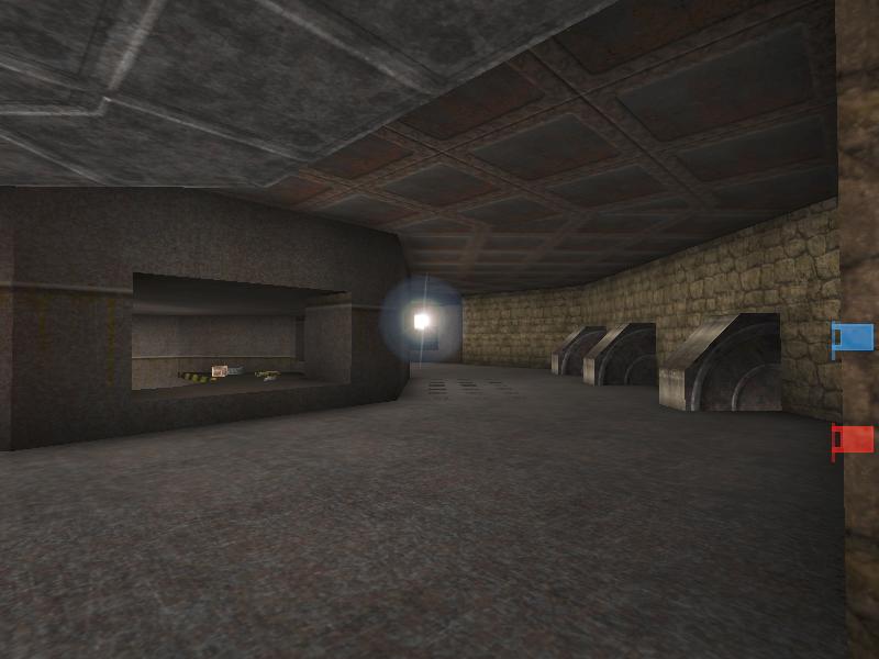
Ok, now down to business. Nothing special with this map in looks. Mine.utx pack is used most predominately, and could have been used a little better. The map looks really brown and rusty, really blah. Evilmonkey did a fair job at aligning part of the ceiling textures to match the angles of the room, but a seem is still obvious; and really should have been all aligned in one direction, even adding some more architecture to the ceiling to draw your eyes away.
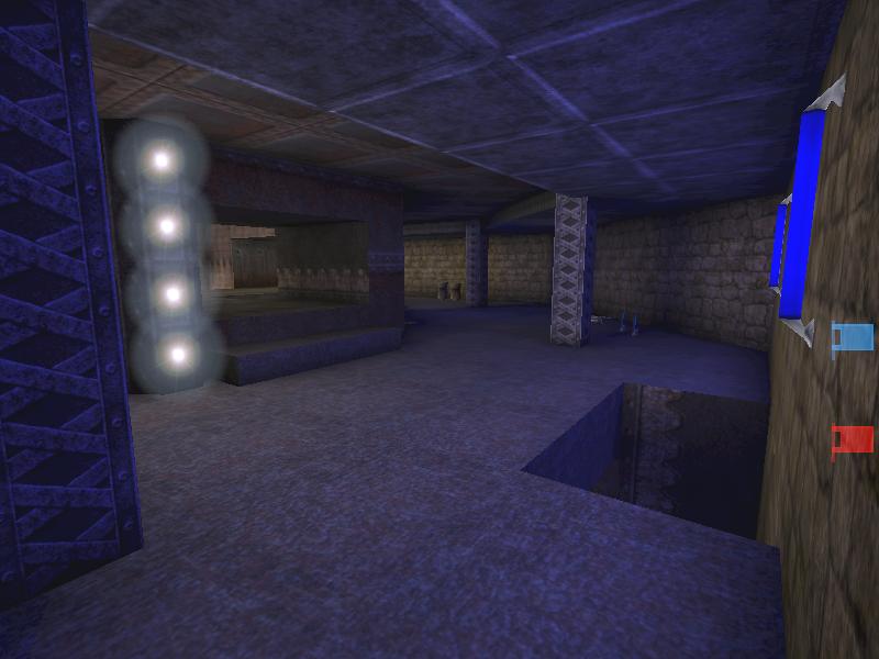
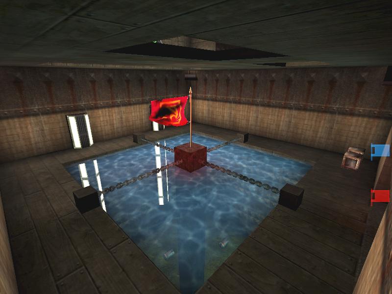
Architecture is mostly basic brush shapes. There is some signs of vertex editing, with some angled supports and pentagonal lights. The flag room looked sloppy in the upper corners, as there are openings a hall above. There's no practicality to it, nor anything aesthetic about them either.
Lighting is enough to be sufficient for gameplay, as far as looks and realism goes, it's not that great. Several places lack light sources, while light sources were just set to unlit to appear bright, with the surrounding lighting rather dull.
BUILD: 1
Too few ambient sounds to have much effect. As I mentioned above the holes in the flag rooms are just poor brush-work. Lifts and doors are bump activated, slowing the flow down with the doors, triggers are practically a must with doors. Fortunately, I didn't come across any BSP or HOM problems.
CAST: 1
Gameplay suffers mostly from flow. Steps leading to weapons are too high, slowing you down by having to jump, and can be a pain while your attention is focused on an opponent, and you want a more formidable weapon. Also having to stop for the doors to open creates even more stall time. Even the second route, which is under water, slows you down by having to surface for air in the middle of the map; which also limits your strategies for attack as it's the only other route to the enemy base.
Item placement is lacking, especially the items that are located at the bottom of a large spiral stairway, which is the only way back out as well. Layout of the map has deadends in 3-4 locations. As far as botplay and capturing the flag goes, it's pretty good. Grabbing and running with the flag is tough due to the flow, too many slow ups allow the opponents to catch up too easily.
SCORE: 3
This map just falls too short in every aspect and won't occupy your attention long. |
| |
| | | | Map Comments |
| Nilash
04-23-2003 09:50 PM MDT | Rating: 7 | | The design id OK and the gameplay is fine. 7.
| Vertigo
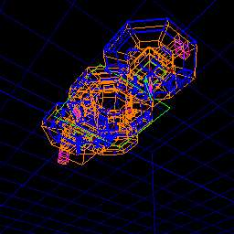
04-24-2003 04:21 PM MDT | Rating: 4 | | HEY THERE ARE SOME RULES WHEN YOU ARE TAKIN SCREENIES.
WHAT KIND OF SCREENSHOT IS THAT?
LOL thx for the support Cryss :)
And Evilmonkey, plz, turn the light on in this map too, at least in the central zone.
| Cyrss's Female Dog
04-24-2003 10:03 AM MDT | Rating: 0 | | Screenshot looks crappso..Vertigo is rite,If not there should be a screenshot code of conduct(lol)saying SHOW IN-GAME SCREENSHOT OR NO SHOT!!!!!
| Fodder McFly
04-25-2003 03:22 PM MDT | Rating: 6 | | Someone should make a "Screenshot Code Of Conduct." LOL. Not a bad map. The screenshot had me VERY worried! Better than DM-Scimitar....
| Shao
07-18-2003 06:04 PM MDT | Rating: 0 | | what the heck is this screen and how the hell can we plying this?
| darkjaxx
11-11-2003 09:20 AM MST | Rating: 7 | | screen=lol
bwah, ok some good map
| Taydawg
11-13-2003 08:31 PM MST | Rating: 2 | | What the **** is that screenie infravision?
(review based upon other users comments... i dont think ima play this map if that screenshot is so ****** like that... :( not a smart idea to make that screenie )
| C0der
01-10-2004 11:59 AM MST | Rating: 4 | | too simple geometry and lighting but it deserves at least 3.5
| homophobe
01-13-2004 05:46 PM MST | Rating: 6 | | game play is good its a short map but it has some pretty unique qualities eg:u have to jump for the flag i noticed that near a door there were bars spaced enough to fit a rocket through i know this aint anything special but i have NEVER seen something like it its better than average but just barely.. this map encourages you to use the water entrance and doesnt derseve a 3
| <[DecoY]>
01-31-2004 05:40 PM MST | Rating: 5 | | well...
I suppose 1on1-ctf is possible here, if it exists (porlly does, so don't nag me about it)
pretty short, item placement is somewhat symmetrical, with the exception of the gangway above the flags.
i guess it will stay on my drive, but I won't be playing it much...
I'd give it a 3.0
And to all you screen******'s above:
What the Fosjeez are you thinkin!? He's showing you the map, isn't that what a screen is all about? sure it's a different way but at least it's original!!
+2.0 for originality and style of screen!
| Eddy Merckx "The Ripper"
02-01-2004 04:53 PM MST | Rating: 5 | | What a screenshot I thought first: waauw!!
So I downloaded it immediately
BUT... IT'S A TRICK!!!
the map doesn't look like the screenie at aLL
;))
anyway, I give it a 5
|

|
|
 |
 |
 |
 |
|
 |
|