|
|
|
 |
|
 |
 |
 |
 |
| DM-Sentinel | | | Map Info |
| | | | File Name | dm-sentinel.zip | | Author | EzKeel | | Gametype | UT2k3 Deathmatch | | Date Added | 04-18-2003 | | File Version | 1.00 | | File Size | 1.36 mb | | Player Count | 3-16 | | Map Description | None | | Review Rating | 3.5 | | User Rating | 8 | | Overall Rating | 4.5 |
|
|  | | | | Review |
| | Reviewer | Mister_Prophet | Awe Score: | 1.0/3 | | Date | 04-28-2003 | Build Score: | 1.5/3 | | Review Schema | Cast Score: | 1.0/3 | | User Point: | +1 | | Overall Score: | 4.5/10 |
Sentinel is the newest map by the oldskool mapper, Ezkeel. To be honest, Iâve never liked any of this authorâs previous maps too much, and went into this hoping that this guy finally got his handle around his own style. But I ended up seeing oldskool Ezkeel injected straight into UT2K3.
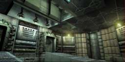
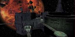
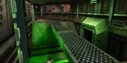
The map takes place in the typical Phobos 2 style floating space station, complete with the whole looming Mars thing. The first thing that that flew out of the monitor and struck me in the nuts was the mapâs lighting. This is typical Ezkeel lighting, which means that it isnât too great. Some really hard colors here as well as some awfully generic white space lighting (you figure that this place is floating in orbit of a red giant, why would the celestial light cast be bright white instead of red?) I even noticed some light fixtures were emitting blue coronas while the light they cast was green. Some walls even are completely black, even with a light fixture placed directly on that particular wall. Hmmm. Building design is adequate but below average. Whatever isnât your basic brush additive or subtraction is masked by typical mesh placement. All the lifts are just flat squares lying on the floor and they zip you up to another level. What bothered me most was the layout. You got a very wide open outside area and a really really really really tight, under-scaled interior area. In fact, the interior is tight even compared to UT1âs standards. Donât plan on double jumping indoors. All in all, the place is just a casually setup map with a thematic execution that tries to mimic Phobos2.
Gameplay was rather unbalanced. Like I said, the outer area is huge and relies on a style that makes use of multiple jump-pads and low gravity. Iâm not the kinda dude who particularly likes pads, but I can appreciate when they are used well. In here, they are used alright, but at times the direction you head in doesnât seem like the direction you want to go. I would have preferred if the map stuck to a strictly outdoor, pad style, that way it would have a better fluidity since the interior areas are sooo frickin tight. And some spots, Iâm talking really tight. Like, Nun tight. Really unbalances the speed. Item placement is kind of excessive, but understandable with a map this size. When youâre bouncing through space looking for a kill, two redeemers and an ion painter actually can add to the enjoyment (there isnât much more fun to the map aside from nabbing the mega weapons and nuking your opponent). The two redeemers are placed on remote platforms suspended by long catwalks and accessible from the upper platforms. I liked how both the platforms were visible to each other. I recall a moment where Brock and me were both running to the redeemers on opposite platforms. We turned and fired at each other from across the void at the same time, and I guided my missile straight into his crotch and vaporized him, then regained control of my player and dodged his missile and watched it fly toward the distant planet that loomed behind me. Priceless. But small gimmick moments like that donât give a map good gameplay. I also noticed that there were lots and lots of shield units lying around, I stopped counting at four. All the guns are in the map, as are all the power-ups (except boots, or so I didnât notice them). To top it all off, there were spots where you can snag yourself, and the rotating satellite dishes from Phobos2 are placed here and you can jump on them while they rotateâ¦.in which case they freak out and speed wildly and your screen streaks. Be warned, squeamish players may vomit.
The Prophetâs Verdict: More of the same from good old Ezkeel, but sadly he seems to forget that UT2K3 isnât the same as U1 (or UT) and that the new game requires a different kind of gameplay. Tight rooms and things are more of a hazard now in UT2K3. The outer area of this map can provide some fun for awhile, and the inner area can be avoided since most of the guns are outside anyway. But at the heart of it all, the map has enough things wrong with it to keep it from achieving the PAR placing along with other UT2K3 maps.
|
| |
| | | | Map Comments |
| SUNAY MOON
04-19-2003 12:54 PM MDT | Rating: 8 | | I'm not a big space map fan but, this was pretty good. The ship lay out has decent flow with some Z action. You can venture outside if you like low gravity. Some good fraggin to be had . Take it for a spin!
| EZkeel
04-29-2003 05:07 AM MDT | | Thanks for the review.
Actually I agree with the criticisms, apart from the fact the stuff about the interior being too tight. That was deliberate and supposed to be a contrast to the open exterior. Good point about the light from the red planet not being red though, it didn\'t even enter my head! (d\'oh!)
Perhaps 3.5 is a little too harsh though for the type of errors you\'ve pointed out, its not really consistent with the feedback I\'ve had elsewhere.
| SuperApe
12-16-2003 07:01 PM MST | Rating: 7 | | Awe: 1.7; although some of the textures and shapes and decor were simplistic, it's consistent and an interesting layout. I actually appreciated the narrow spaces in contrast to the wide opens. Hey, as long as I and bots can pass thru easily, it just makes for more interesting gameplay as well.
Build: 2.6; a problem with the big roof fan's volume caused glitchy accending. I'd make it extend out to the walls. Some optimizing would help, although I didn't notice much slowdown, suprisingly. (I enjoyed deep space just before making a crater.) The antennae do make you upchuck when you're on them. Maybe set mover's Object->InitialSetting to ConstantLoop instead of BumpOpenTimed; should fix, might need rotation setting. Ambient sounds inside are way too quiet.
Cast: 2.0; I found ammo and weapon placement okay. Minor lack of usable cover. The bots had most places covered with paths to use. But, it's really hard to get bots to work well in lo-grav with no floor. Quite a few cratered. Z-Axis provided mostly by lo-grav helps the lack of Z inside, of course due to being a spacestation.
I enjoyed the time spent on the map description and the follow up on the design.
Total Score: 6.3 (-> round up to 7)
|

|
|
 |
 |
 |
 |
|
 |
|