|
|
|
 |
|
 |
 |
 |
 |
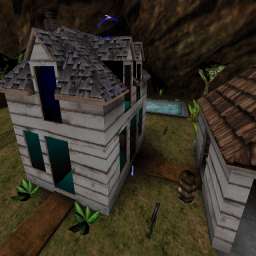
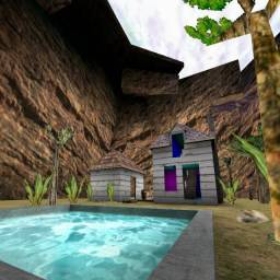
| DM-SmallHouse | | | Map Info |
| | | | File Name | smallhouse.zip | | Author | thomas | | Gametype | UT Deathmatch | | Date Added | 03-09-2003 | | File Version | 1.00 | | File Size | 637 kb | | Player Count | 2-6 | | Map Description | The house looks small, but it's over 3 time the size on the inside. | | Review Rating | 2.5 | | User Rating | 4 | | Overall Rating | 3.5 |
|
|  | | | | Review |
| | Reviewer | Mister_Prophet | Awe Score: | 1.0/3 | | Date | 12-28-2003 | Build Score: | 1.0/3 | | Review Schema | Cast Score: | 0.5/3 | | User Point: | +1 | | Overall Score: | 3.5/10 |
There comes a time when a map title comes along that really tells you what to expect.
Small House is a small house in an enclosed terrain area with a helipad outside. The author states that this is one of their older maps, and I would like to see some newer stuff cus this one didnât tickle my pickle. Visually, the map isnât flat out UGLY like some horrid examples such as DM-1on1-Turbine or CTF-AndAction. I can tell the author tried to make the place look decent, but because the nature of the design is novice and since the gameplay is a cluttered spam fest, I didnât have much fun in here.
Gameplay suffers mainly due to the erratic layout of the map, which has no sense of real order. Itâs like a headless chicken that got raped by a purple elephant during a flying monkey sex orgy. The item placement really is one of the biggest contributors to this, since the âhouseâ is stocked with such a weird placement of inventory (excessive in some areas to say the least) and the architectural layout really cramps my style. Everything is narrow inside and bots flip out all over the place. Not as spammy in that stupid way like CTF-DagneyâsTubesofSuck, but spammy in that way that makes you say, âThere is no way I can form a cohesive strategy in here.â
The Prophetâs Verdict: I can see the author tried and I hope to see better work in the future, but as a map this one just didnât do it for me. The gameplay consists of spawning and killing enough people before you get sucked into the spam and then to respawn again and repeat the process and hope you get the most kills first. The excessive weapons in some areas will leave human players to camp these locations. Real UT players don't camp. Visually below average and plenty of weird texture glitches inside the house that I noticed, but the mapper at least tried to form an image of a theme and had the good sense NOT take a dump in a box, write âDM-1on1Turbineâ on the outside, and drop it in my lap. Better luck next time. I'd like to give an A for effort, but in the real world that kind of pansey B.S. doesn't cut it.
NOTE: I donât include a screenshot because the preview shot above shows the whole map already.
|
| |
No review screenshot available |
|
| | | | Map Comments |
| storm
03-09-2003 10:24 PM MST | Rating: 5 | | what the hell is a helepad doing in this map can you answer this question?
BAD MOOD >:(
| Fernando
03-10-2003 01:18 PM MST | Rating: 3 | | This map was a clever idea, but it was poorly implemented.
The flow of the map is poor. The arena outside has few items, and there are many visible teleporters around that take away from gameplay. You should make the terrain more interesting and if possible, remove some of the visible teleporters, they hurt your map's flow.
The bots have some trouble navigating the map. I recommend that you add more pathnodes- especially in front of doorways. You may also need to add jumpspots, as bots often get stuck trying to run into a window.
There are multiple graphical errors. Looking into the attic or the ledge in the cliffside outside, for example, I noticed clipping errors.
You have a skybox, but no skyzoneinfo or textures flagged as 'fake background.' The skybox will not work without these things. The textures are panning very quickly as well. You can fix this by editing the "TexUPanSpeed" and "TexVPanSpeed" in the zoneinfo's 'ZoneLight' properties. I recommend reading a tutorial on skyboxes, such as this one.
http://www.birrabrothers.com/drac/dmain.asp?dbp=32
The biggest problem with your map is it's architecture and texturing. There are few furnishings- and when they do appear in the house, they are usually metal boxes. Add in more furniture- chairs, tables, TV sets- fill up some of the empty rooms. The rooms are rectangles, you should make them more interesting. Perhaps round some of the corners? Also, spend more time on your textures. The walls and floors are almost one color and they are too boring. It wouldn't hurt to have rooms with linoleum or wood flooring, for example. Finally, add in light sources. Your house is bright, so you should have an abundance of ceiling and floor lamps.
Overall, this is a gimmick-based map that does not deliver. I recommend that author think about how he/she wants the map to play and fix the graphical problems.
| perfusion
03-10-2003 03:46 PM MST | Rating: 5 | | a little bit to small,
the houses are a good idea, but not good worked out
| PapaBear
03-10-2003 08:59 PM MST | Rating: 3 | | Fernando pretty much said it all, great concept, some potential - just needs alot of tweaking. Tone down/blend the colors, lower the polys, yada....yada..
| thomas
01-18-2004 08:42 PM MST | | The helipad is in this map because it is the only way in and out of the cayon is for the hover car to go up.
Thanks for you comments Fernando. It's one of my older map, but it need more to it. my doing some stuff for the house on the side, while I'm working on my new map DM-GhostHouse which I have posted in the fourm for feedback. As for the skybox I don't know what happened to the skyZoneInfo. The clipping errors are from the warps being so close together. They were not realy ment to be used like this. The only way I come across to fix the clipping errors is to have they equal to the distance that they are on the inside the house. But then I wouldn't need to have the warps, and the map was mean to larger on the inside then the out side. If you know another way to do it let me know. The warps can also cause errors in the fake background.
I'll try to have update of this map next weekend.
*edit - jan. 18
The first map I've tried useing warps in this way I made back in April 14, 2001. Ive done this style much better since then DM-HauntedHouseXa http://nalicity.beyondunreal.com/map_hub.php?mid=6317
| Tsunami
01-04-2004 01:15 AM MST | Rating: 4 | | Sorry but i hate this map .....IF u shot in a window Whit(for example) plasma rifle...u will see ur shot stop(beware! the window is open...)However!! I love pool!!! its nice! give u a 4 4 the pool...
EDIT:CHANGE THIS....note that is a reall bug
NOTICE:Make the next one ...a bit biger and less Teleporter...it will be really better...
WHITNESS:do u agree?
READER:sorry for my english...im poor ..comming from canada QC
PLAYERS:Yo i make map too...i seend a FTP to masscHaoss and if u like morpheus...U will really like this one ....DM-UNREALCITY ..and for ut2k3 a great map called DM-PHOENIX
| MegaZorch
01-18-2004 03:19 PM MST | Rating: 3 | | I am disturbed by the apparent lack of any real inspiration in new maps that are appearing for both UT and UT2k3. This map looks like something from Quake 2 (shudders). The UT engine is capable of much better detail than this.
|

|
|
 |
 |
 |
 |
|
 |
|