|
|
|
 |
|
 |
 |
 |
 |
| DM-Aquifer | | | Map Info |
| | | | File Name | dm-aquifer.zip | | Author | hellfirexq | | Gametype | UT2k3 Deathmatch | | Date Added | 02-24-2003 | | File Version | 1.00 | | File Size | 4 mb | | Player Count | 2-6 | | Map Description | None | | Review Rating | 4.5 | | User Rating | 6 | | Overall Rating | 5.5 |
|
|  | | | | Review |
| | Reviewer | Hourences | Awe Score: | 1.5/3 | | Date | 03-14-2003 | Build Score: | 1.5/3 | | Review Schema | Cast Score: | 1.5/3 | | User Point: | +1 | | Overall Score: | 5.5/10 |
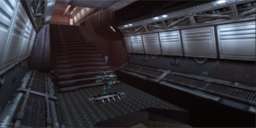
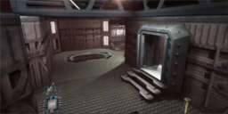
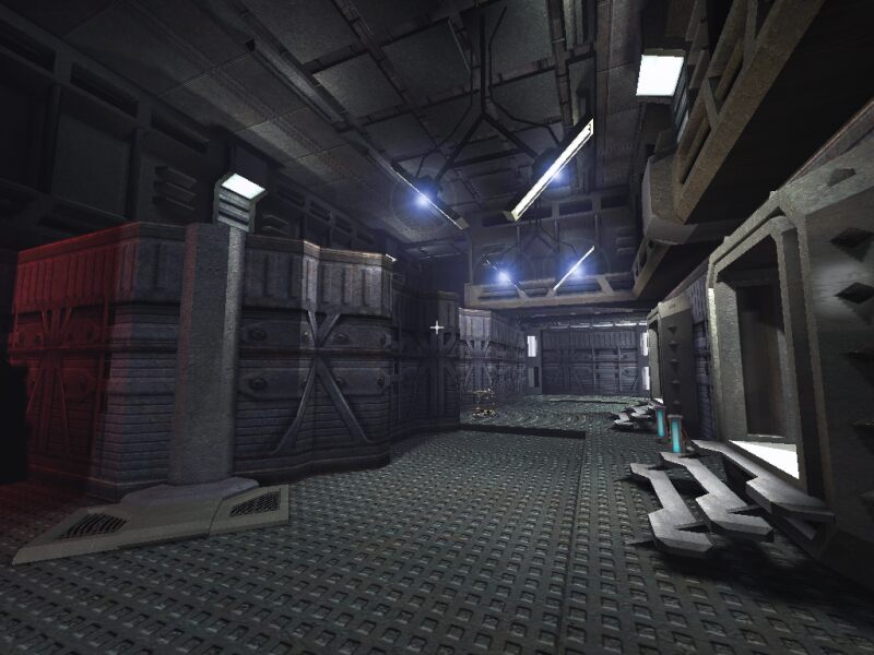
A small DM map, set in an underground cave with a futuristic base build in it. The floorplan and flow are pretty "classic", it looks a bit like some old DM maps for Unreal and UT and other games. But throughout the years the floorplans have evolved a lot, more flow and tactical possibilities, and thats what I kinda miss here. There aren't any dead ends, but there are a lot of rooms and places with only 1 exit and 1 entrance. A little bit more flow and connectivity should have done the map good. For the rest item placement might be a tad overkill, a damage amp. a big health, a large armor etc. all in a small map is a bit much.
Than the graphics.
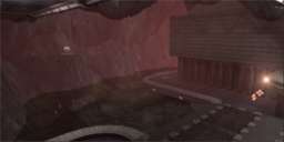
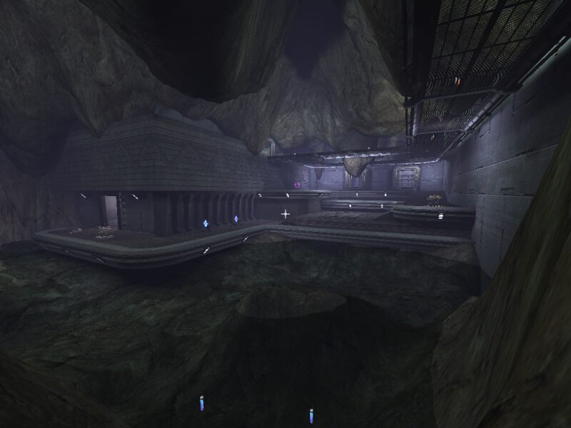
Most of the geometry are heavily BSP based rooms, with some prefabs, and "outside" the cave is formed by using 2 terrains. Not a bad way of doing a cave, but it's a little bit too smooth for a natural cave, maybe in combination with a few large prefab meshes it could have been better. Having more contrast as in more sharp edges and sudden breaks.
For the rest of the architecture, it's pretty empty, some more meshes everywhere, with some more flow in the geometry (yes I know this is hard to accomplish with prefabs only, but I still think it can be done a bit better), will improve the graphics a lot and bring it more up to the height of UT2k3, rather then still looking a bit UTish with cubic corridors.
Next thing I got a problem with is the water, I really don't see it that I'm swimming, there is no fog or anything to indicate I'm in the water. That irritated me a bit.
Also the distance fog in the rest of the map is rather blue'ish, and so are some of the coronas on the lamps, a bit less wouldn't been bad, or some more blue light, because now it's blue coronas and fog, and white light. That doesn't quite match.
Other concern about the lightning is that "outside" in the cave, there are lamps on the trim of the floor, but right next to the lamp it's equal bright as 500 meter further down the wall. The lamp should cast high brightness light to everything that is close, the wall right around it and any objects.
That being said, 1 last point that could use some improvements are the sounds. The author stated in his readme that he tried to make a atmospheric cave, but there are barely any ambient sounds in the map. Some good sounds would help A LOT if you want to create a cool atmosphere. There are a few sounds, but I can barely hear them in game, I really have to turn of all music, be completely silent and then listen very good, and maybe if Im lucky the sound is louder then the fans of my pc and I can hear it...
All in all an average map with quite a few points which can use improvement and nothing that makes this map really stand out, in quality or any special things.
|
| |
| | | | Map Comments |
| Burner
02-25-2003 01:01 PM MST | Rating: 8 | | You still got it, thats for sure. Excellent combination of natural and man-made environments makes for an interesting and varied map. Weapon placement is also very good, never been really short on ammo or hunting round for too long looking for a gun. The map gives no indication why theres a partially "dug" looking terrain on the inside of the building, wouldn't mind seeing some redundant tools or machinery in there to explain it? Overall an excellent map with variety that sets it apart from the rest. Hope to see more of you work!
| Doctor Nick
02-25-2003 05:07 PM MST | Rating: 8 | | Nice map. Has good flow, and it looks the part too. FPS is through the roof throughout. Only problem I have found is the respawn under the stairs near the shield belt, it can be very annoying having to jump out of there to start playing.
| Theshark
03-10-2003 04:04 AM MST | Rating: 6 | | A Good Map!
It's good to see some imagination used with the editor. I get a feeling there is a story for this map!
It plays extremely well - great use of static meshes, inside and partial outside zones.
Only real fault is lighting. The mapper could genetrate some real atmosphere with more realistic lighting and use of emmitters.
But this map does not fall short of detail. Overall It's Good!
| GIdenJoe
03-15-2003 03:53 PM MST | Rating: 4 | | Hmm, dude, just checked the map myself, and if you call that good flow? Cough.
The inside areas are made to spam, you mostly have one entrance and one exit.
Btw, there are a few meshes overlapping each other causing Z-fighting, like the doors and some of the trims.
I have nothing against, less poly maps, but this one lacks refinements, and to be honest, you rocks look like chocolate pudding that has gone harsh in some years.
| hellfirexq
03-16-2003 02:33 PM MST | | Sorry about complaining earlier, all the comments I've gotten have been good really, until now, and I just thought my map WAS good, but I guess it isn't..oh well.. I already released another just recently, called DM-PressurePoint, and I'm sure everyone will think it sucks too.
| zeromorph
03-15-2003 08:41 PM MST | Rating: 6 | | Potential!
There is a lot of potential for this map but only on a larger scale, it's a tad too small for my liking.
When I dl a new map I run around it for a while bot-free checkin out the work and looks, but it felt like I was running out of presents to unwrap on Christmas Day. It was over too quick. But I did enjoy what Santa brought though.
| Shadowlurker
03-16-2003 09:59 AM MST | Rating: 5 | | Omg, the author of this map actually went out of his way and complained on his site.
The map is ok as it is, pretty average. You want to make maps that everyone likes and plays? The best bet is to make your own meshes and make a good layout. Pay attention to the review and to critisism. If you don't like critisism, then you shouldn't map.
Also, I don't like to sound horrible, but on your site you write like you are god. Sorry to tell you but you arn't.
| Algus
03-17-2003 12:24 AM MST | Rating: 6 | | Not a bad effort.
It seems a little simple.
More flow is needed.
| scirmast
03-18-2003 05:40 PM MST | Rating: 4 | | Nice map, but is not a keeper for me. Suggestions for the author: Next time, spend triple time designing your next level. Your map is too simple now. Make the next more complex, and it will be better.
| jmbwi
03-26-2003 05:54 PM MST | Rating: 4 | | The flow of the level is lacking. There a lots of places to get stuck and the map, as small as it is, doesn't flow from one area to another very well. The concept behind the level is good, but would be better excuted with a larger scale. For being such a small map, it doesn't seem to have the same sort of frantic pace that other similarly sized maps do.
|

|
|
 |
 |
 |
 |
|
 |
|