|
|
|
 |
|
 |
 |
 |
 |
| DM-Golgotha | | | Map Info |
| | | | File Name | dm-golgotha.zip | | Author | w.r.e.c.k.s. | | Gametype | UT2k3 Deathmatch | | Date Added | 11-03-2002 | | File Version | 1.00 | | File Size | 4.22 mb | | Player Count | 4-8 | | Map Description | None | | Review Rating | 4.5 | | User Rating | 6 | | Overall Rating | 5.5 |
|
|  | | | | Review |
| | Reviewer | Mister_Prophet | Awe Score: | 1.5/3 | | Date | 01-02-2003 | Build Score: | 1.5/3 | | Review Schema | Cast Score: | 1.5/3 | | User Point: | +1 | | Overall Score: | 5.5/10 |
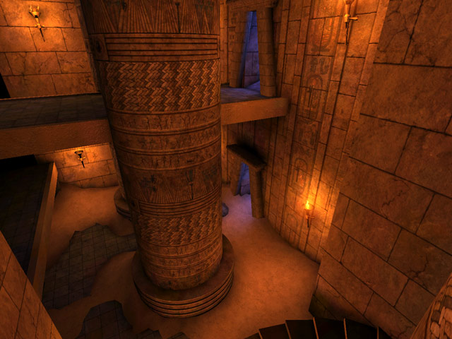
I love the Egyptian concept for a map, I love everything about it. The sand, the orange tan tint to everything, the way the map makes you feel the heat of the desert. The way the liquid-like haze grows on the edge of the horizons as the temples stand the testaments of time against sandstorms and age. I love that. Well, I love it when all those things are actually in a map.
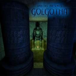
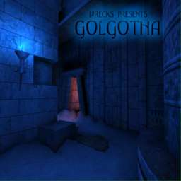
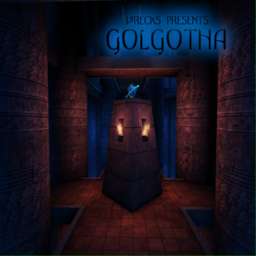
DM-Golgotha seemed like it should have been a religous, gothic map from the title, and I was pleasantly surprised when I started and saw it was an Egyptian themed map. The map isn't large and consists of several levels of bridges that rest overhead a floor covered in sand and a pool with a statue in it. The map tries very hard to be a convincing Egyptian evironment, and at first glance it succedes. But after a few moments, I began to see it for what it was. First off, the map is very dark in places, and while I almost NEVER complain about this in a map, some times it just may be too dark for some people's tastes. I do respect the fact that the lighting is done very close to how an actual temple might look if it were lit only by torches and....blue fire. The problem is that some corners are dark to the point where if a player is camping behind a pillar and shoots me with a quick blast, I could turn around and miss his location completely until another stream of shock nails me in the balls. I personally wasn't bothered all that much, but I can see right away how this little detail will kill it for some people. Actually, the only real issue I have with the lighting is the fact that the pool of water casts a huge bright light around the entire water alcove where the sitting statue holds the super health. When are mappers gonna realize that water does not give off light? Have you ever been in the ocean, or a swimming pool, or even a bathtub where the water shines light all around you? It isn't magic, it is water. Stop making it into a light source!
Lighting aside, the map would look much more basic if it weren't for the lighting, meshes, and sand terrain on the ground. But these elements mask the map's simplicity and I have to admire that, few maps can pull that off. The only real indication that the map is a temple is the fact that all these Epic decorations are present, the author could easily replace them all with tech decos, change the light, and bam your on a space ship! I have yet to see a map for UT2003 that makes an interesting Egyptian theme, and this one tries.....it really does.
Gameplay works, but it isn't astonishing. Bots know the map and they can kill you if you screw around. The water I thought slowed the pace down, but it is a good method to make the dive for the powerup risky, instead of just placing it on a ledge or whatever. I personally hate Jumpads but they are a neccessity in this map to reach the higher platforms, although I successfully beat 5 rounds by just staying on the lower levels, which goes to show that a) I'm lazy, b) bots can't snipe, c) jump pads in this map can be abit quirky at times. Very often when I did use a pad, I didn't know which direction it was taking me till I flew in that direction, hit a pillar, and fell several floors where I damaged myself. That was another thing, falling happens alot in this map and you take damage so you have to watch yourself. Alot of the items are placed in these little uphill alcoves, which I don't particulary think are a wise choice because they force the player to stop, turn around and come back. If there was just 1 or 2 of them, and they stored strong power-ups, then I could understand....but most, if not all, of the weapons and health packs are in these things and thats one too many alcoves.
The Prophet's Verdict: This is one of the better attempts to make an interesting UT2K3 map in recent weeks, but it is not without it's share of flaws. I recomend this map to anyone who is sick of all these cubular ut2k3 maps. It isn't a great map and it doesn't quite reach that 'average' appeal set by most of the Epic maps but it could be fun for some people until better maps show up or if you grow bored with the 2 or 3 good UT2003 maps out there. |
| |
| | | | Map Comments |
| Gus
11-21-2002 06:33 PM MST | Rating: 7 | | Nice to see a good map for a change.Only 2 minor problems I found. One was the sand next too the bottom stairs, it's tearing when you look down on it from the next level up. Second, never could find the RL even though the bots could /grr
| 1/2LuNaTiC
11-22-2002 06:08 PM MST | Rating: 8 | | Nice map. Only wish it was slightly more open sometimes. Overall this one of the few maps ill keep on my HD. I noticed the sand too and on some of the official maps so i dont think he can do much about that.
| SpectralShadows
11-24-2002 05:44 PM MST | Rating: 8 | | I never found the rocket launcher either, but I'm not that bothered as I could just take it from one of the other bots.Overall though a decent map with very good use of lighting I would say, and sparse weapon placement which helps to keep things interesting.
| Hasimir
11-25-2002 04:19 PM MST | Rating: 5 | | Sorry, I don't like it that much... I don't like all the "box canyons" with the weapons in it. Honestly, I don't want to run into a corridor with one end closed. Breaks the fluidity. It's a bit too dark I think. Otherwise a good map, I just did not like it that much (no offense meant) :)
| {DAM}MoxNix
01-02-2003 09:30 PM MST | Rating: 4 | | A Nali City review that's bang on for once. Wow, what a surprise!
| Agent X
01-02-2003 11:57 PM MST | Rating: 2 | | way to big, & it has terrible weapon placement. Theme is ok, but the weapon placement kills what otherwise would be an average map. I'd give this a 4 or a 5 if the weapons were not placed in dead end hallways with no flow.
| elfshotthefood
01-04-2003 01:01 AM MST | Rating: 6 | | Too many dead ends for my liking; looks fairly nice.
| SkaarjMaster
02-09-2003 09:19 PM MST | Rating: 7 | | Actually, the deadends weren't as much of a problem for me, but everyone to their preferences. I will admit that it can mess with the flow at times though. I really liked the atmosphere and the fact that this map is a lot different from other UT2003 maps so far. Actually, it seems that no half pts. are allowed, so my score should actually be a 7.5.
|

|
|
 |
 |
 |
 |
|
 |
|