|
|
|
 |
|
 |
 |
 |
 |
| DOM-Mementomori | | | Map Info |
| | | | File Name | dom-mementomori.zip | | Author | Matthias Worch | | Gametype | UT Domination | | Date Added | 05-28-2000 | | File Version | 1.00 | | File Size | 1.55 mb | | Player Count | 4-8 | | Map Description | None | | Review Rating | 5.5 | | User Rating | 7.5 | | Overall Rating | 6.5 |
|
|  | | | | Review |
|
DOM-Mementomori (UT99)
A medium-sized DOM map set in a gothic/castle atmosphere. A decent layout with some lava mixed in, it looks fairly good, and plays fairly well, but is missing a enough to keep it from being great.
AWE: 1.5
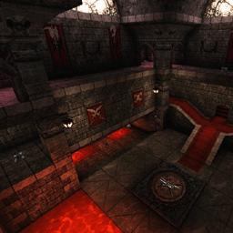
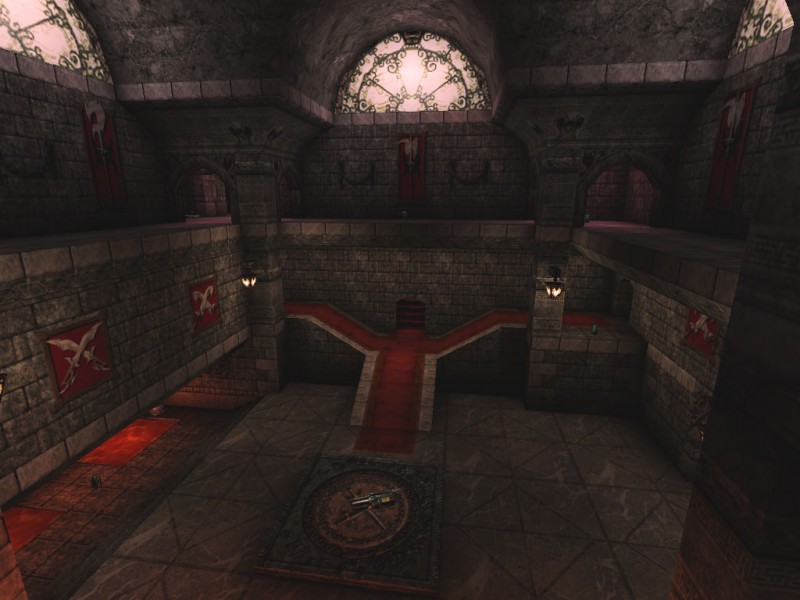
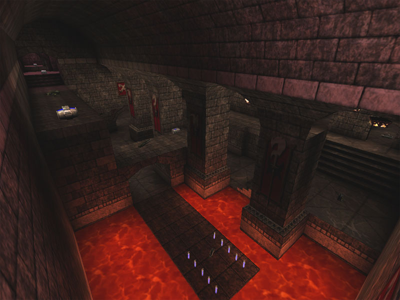
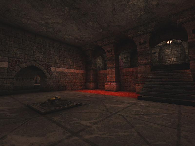
The texture work is very nice and nothing seems to be obviously misalinged. Pretty much what you'd expect from a gothi/castle map, pretty much everything is stone. This lends itself to a certain homogenaity that doesn't really help the map excel. Aside from the lava, the UTwomen, carpets, lava, and the windows, it pretty much looks the same whereever you go. Part of textureing a map is to provide landmarks. Most people mistake this as only being implemented in the architecture portion but it pertains to lighting and texturing as well. Although some rooms have a few distinctive textures, like the UTwomen room, all the connecting corridors looks the same so it becomes more difficult than it should to get to know the layout of the map. Althought the textures are well implemented, and well aligned, their variety is lacking.
Lighting is really quite a dissappointment in this map. It's executed well in various areas with nice 'pools' of light along corridors and some nice shadows elsewhere, but there are only two colors used in the map. White from the lights, and red/yellow from the lava. Again, like textureing, more variety is needed to help set up the various rooms as different from each other somehow. On the plus side, nothing's too bright, nor too dark, nor oversaturated.
The architecture is really where the map brings out the awe factor. Classical gothic forms in terms of arches and vaulted ceilings dominate the corridors, doorways, and walkways. However, despite the fact there are some largish rooms, it really feels more like a dressed up castle/chateau basement that the main area. Some of the larger rooms have nice carpeting, windows, and the somewhat desultory UTWomen. However, it doesn't really pull of the feel of 'grandeur' one would normally get from such a setting. Perhaps this is because of the uniformity of shape and size of the connecting corridors because the map is fairly R-C-R.
In general the map has a lot going for it but this is balanced in the opposite direction by a lot of missed potential. The texturing may be quite good, but lack of variation keeps it from being great. Same with the lighting - the implementation is good but the lack of variety is not. The best section of the AWE score but again, it lacks grandeur despite its perfection in classical form.
BUILD: 2.0
The BSP work is simplistic but executed well. Nothing's HOM'd, it all fits together well, and provides a somewhat seemless variety of connections through the map. There are no jumppads nor lifts so nothing to comment on there. As for sound. It seems like the only sound is for the lava - a bit too loud, it's a bit overbearing. However, curiously enough, it's radius matches what I would expect it to be. However, with the lava as loud as it is, it seems like the radius should be larger. These two values are not balanced together and could use some tweaking. Unfortunately, this is all the sound you'll get. No ambient sounds, no trigger sounds, no other locational sounds, this is really unfortunate because a gothic/castle map just begs for noises to augment its ambience.
In general there's really nothing to complain about except the sound, however it's such a big part of themes in general and certain themes, like this one, just beg for more. This map doesn't heed the begging.
CAST: 2.0
The tightness of the many corridors really kind of hurts the gameplay. To get from one DOM area to another you are forced to go throgh narrow doorways and narrow corridors. Any team who stocks up on flak cannons will always have the advantage when traveling. The DOM areas are somewhat well-designed - some better than others. There's one in particular that was of questionable quality. Located on the second 'level' of the area with lava nearby, a few entrances, and a limited way up from the ground floor there are many good aspects of DOM point design mixed in with a few bad ones. First of all, the DOM point is just stuck on top of a 'bridge' with no real designation of its being a special location. Second, one of the access points is above the DOM point on a walkway that holds a keg of health. Any defender that stays up there will have a pretty easy job defending not only because the only access to that walkway is from another room, but it's also a one-way path which makes it easy to defend especially because you'll be sitting on the keg of health. Another downside is the lower access route to the second level where the DOM point is. One has to traverse the length of the room to get to the stairs going up which leaves one open to many attack opportunities from the defenders, despite passing under the 'bridge' the DOM point rests on. It seems like this DOM point was more of an afterthought than a purposely designed gameplay arena.
In general the weapon layout was satisfactory as was the overall arena layout (aside from the previously mentioned narrowness) although I rarely found myself or the bots using the upper areas much.
Overall the map's gameplay is above average but it still has plenty of deficiencies. There's good z-axis and a decent layout but the narrowness, pointless DOM point, and unused map areas bring the score back down.
Looking a Mementorum as a whole, the map is fairly pretty and fairly fun. However, to be fair, several design aspects could have been addressed much better to enable the map to meet its full potential. More variety in textureing and lighting, more ambient sounds, wider play areas, and reducing the R-C-R would have made this a much better map. Add a revised DOM point and the map could have been a contender. Still, it's not anything to turn up your nose at. UT DOM lovers should give it a go but the rest of us may just pass this one by.
|
| |
| | | | Map Comments |
| Charon
05-09-2005 11:50 AM MDT | Rating: 7 | | 5.5/10 is for average or just above average... this map is not an average map, so sorry Arcadia, but you're not right:)
deathmatch version is cool too:)
| Torn_Agressor
05-10-2005 06:48 AM MDT | | not a bad map, the pink lights were a bit strange but i guess its different....but anyway, now the rant
its quite disgusting to think that actually 90% of the maps today dont even look or mabey even play as good as this....this is 5 years old... :/..so much for "no graphics all gameplay" maps we see today, they arent achieving anything.
| FraGnBraG
05-13-2005 07:25 PM MDT | Rating: 8 | | the review would be bang on, but only if this were a map made yesterday (or last month). i'd like to see the nali review schema amended in the case of "classic" maps (ie those made during 1999-2001)
these are "first" and "Second" generation maps. The constraints ruled design, unlike today. The measure of one's skill was how well they could work within those constraints. you should also consider what was in "vogue" at the time, the trends, etc etc. Again, well written and thoughtful review AV, but it's like suggesting ford failed because their 1968 mustang should have been roomier, should have had better fuel economy, and a cd player and air-bags... none of those things were relevant in 1968, and it was an excellent product (in it's day) ...
btw, for anyone intersted, this map was made by a professional LD (Legend Entertainment - RTNP, WOT, Unreal2) it is a well made map designed by a diciplined mapper in 1999 - you _should_ download this map and try it just to see what a decent map used to be...
the rating i give considers a historical context and the contraints to whcih the map was designed ... where the map deserves to sit in year 2000 ... i remember it was fun, ran like hot snot on my slow P2 system back then, and it looked damn good ...
cheers
| IronMan
05-20-2008 10:55 PM MDT | Rating: 8 | | As I mentioned for the DM version, I like how this map plays in DOM better than DM. Looking for a good Domination map? Try this one.
|

|
|
 |
 |
 |
 |
|
 |
|