|
|
|
 |
|
 |
 |
 |
 |
| CTF-SkaarjFace | | | Map Info |
| | | | File Name | ctf-skaarjface.zip | | Author | Rob | | Gametype | UT Capture the Flag | | Date Added | 05-14-2005 | | File Version | 1.00 | | File Size | 2.02 mb | | Player Count | 12-16 | | Map Description | None | | Review Rating | 7 | | User Rating | 7.5 | | Overall Rating | 7 |
|
|  | | | | Review |
|
CTF-SkaarjFace (UT99)
The infamous CTF-Face re-emerges as a twisting mix on both the original map and the skaarj theme. Blending the layout from, arguably, the most played Unreal CTF map ever, with new paths and a new theme, this map is quite the interesting remake.
AWE: 2.5
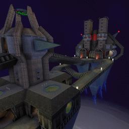
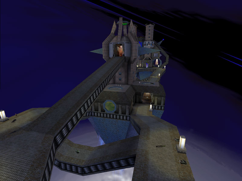
The texture work is quite creative if somewhat disjointed at times. The textures are very well aligned throughout the map - which was certainly a challenge due to the many shapes and forms all over the map. The overall texture pallete is predominantly grey metal but there's such a myrid of variations within this texture set that the textures combined with the various lighting colors make the texture work seem even more varied than it actually is. The textures in the skybox are another matter entirely. Completely incoherent in terms of matching the mapâs theme and ambience, it feels more like something out of a 1980âs Dr. Who episode than anything Unreal. Still, it is creative and interesting to see the skybox.
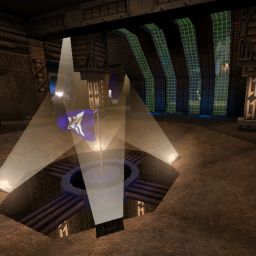
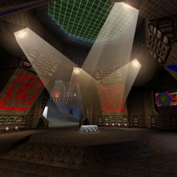
Lighting was fairly well-done. A fair portion of the map seems a bit ambient lit but this is probably the eyeâs reaction to seeing so much grey metal. However, there is some nice âhotspotâ and shadow work to balance it out. The team colored lighting I thought was a little overdone but not in terms of the usual overbright neon corona usage one usually sees. I just think some of the team lighting could have been replaced with non-team lighting and everything still would have been okay.
The architecture is what really makes this one stand out. This map completely abandons the classic face theme and replaces it with a theme that the map name implies is Skaarj-related. Iâm not quite convinced this âfacilityâ was built by the Skaarj, although it certainly harkens back to that theme. Itâs more a fusion of geometry, Skaarj, modern art, and, um, pointiness than anything else. I donât feel I can really describe the architecture adequately so Iâll stop trying. Needless to say it certainly is creative and captures the eye, although Iâm not quite convinced its aethetics are the most appealing out there.
To wrap the AWE up into a single description is something that eludes me. The texture work is detailed and interesting, the lighting is done competently, and the architecture is also quite interesting. Not the most beautiful or clearly themed map out there, it certainly is eye-catching at the same time.
BUILD: 2.5
The build is fairly good. With all the BSP work in this one, Iâm sure avoiding HOMs was a horror but the author did pull it off fairly well. I think I only found 1 but I couldnât replicate it/find it again so⦠The teleporters work well and look pretty good with their âliquidâ surface. Other than the HOM issue, the only other thing I have to complain about is the ambient sound. Thereâs not much general ambient sound, there are a few locational sounds, and I donât believe I encountered any others. The location sound in the flag bases is misleading as it sounds like pumping machines. But thereâs nothing pumping in the flag room nor is there an impression that there ever was. I did like the locational sound next to the blue teleporters one falls into.
In general a good build with only an HOM and bad ambient sound work pulling the score down.
CAST: 2.0
The classic face gameplay is generally the same â emphasis on generally. The center has been mixed up a tremendous amount with the addition of a tower, and extra paths, although these extras arenât really âin addition toâ the old center path but they alter it significantly. At the top of the tower are 2 Damage Amps â yes 2. However, theyâre neatly separated by an instant-death laser field. Iâm unsure about this tactic as the idea to separate them is essential if one is going to have 2 Damage Amps available. However, theyâre still close together enough that a player can grab one, jump down to the lower portion of the tower, make his way up the ramp toward the opposite base, and then back up the opposite center ramp to grab the other one. And thatâs not using the Xloc. If you add the Xloc into the equation, then they really are too close together and the gameplay becomes affected by this placement in a detrimental manner.
As for the flag rooms, theyâre still on the ground floor but the large central door has been replaced by two doors flanking each side of the center, and the flag room consists of the many teleporters and the flag in the center above a long drop to a death teleporter.
Instead of one sniper tower, there are now two â one on each side of the base. This is a good thing considering the addition of the central tower blocking the view of the center paths. This gives back the advantage snipers have in this map â but the central tower takes some away making, IMO, a much more balanced sniper advantage than the original.
As for the redeemer itâs still there, but itâs all the way in the back of the tower and far out of the way of all the action. As such, the bots never seem to want to go for it.
So overall, itâs quite a mix-up of the original and gives quite the fresh feel to the classic Face map. I would say that based on the new layout there are some balance issues, however the original was not without these either. The only significant problem I had with the map, is that the teleporters are not landmarked as well as they could have been. Youâll only figure out which lead where by trial and error and It may take a little while to get used to them.
To put it all together, the visuals are worth checking out solely for their creativity. The texturing and lighting overall is well done but the architecture is the jewel here. The gameplay varies greatly from the original face yet still keeps it intriguing and interesting to play. Despite a few item placement decisions, Iâd say this is almost as entertaining as the original. Anyone who played the original face, should check this one out. Thereâs nothing that really makes it better, or more fun, than the original, but to see what a good creative remake can be is the attraction. CTF fans rejoice â itâs time to play face again.
|
| |
| | | | Map Comments |
| Denny
05-17-2005 12:11 AM MDT | Rating: 7 | | This actually ain't a bad remake of face. The texturing is really good, the architecture ain't bad. Flow is what you would expect really, i mean it does take after face. The bots played good.
The skybox is kind of weird though, not sure what to make of it. The lights on the walkways weren't too convincing for me anyway (not that big of a deal though), i mean they can't light up the whole level like that. It can also get kind of laggy outside looking at the opposite tower but it isn't too bad.
Overall this isn't that bad of a level really. I know face clones aren't on everyone's A list, but this is more of a remake than a direct clone, and a good one at that. Give her a try.
| XepptizZ
05-15-2005 08:06 AM MDT | Rating: 6 | | Heck I don't even consider it a remake.
Absolutle everything is different including the lay-out (center has made some radical changes).
The skybox is prett weird yeah, and doesn't really add atmosphere.
At the snipertower you can go to the edge and the poly's skyrocket to 800, a little to much for my taste.
Not that I take taht in consideration with the scoring.
Textures are indeed pretty nicely used, but skaarj is a bit of a lowquality-set IMO.
The lay-out is nice to with some major changes to improve the old face lay-out (better cover against the snipers and some extra paths)
The architexture was a bit of a downer though, it felt a bit to unlikely.
Hmm, sound, well, there's not much sound to really enhance the atmosphere.
| Sicko Teddy
05-15-2005 10:35 AM MDT | Rating: 9 | | OOh, See! SEE!??
not all remakes are bad. It's a mater how it is done!
Here is a cool example!
All looks great. Even though the skaaj stuff is not my favorite, and the map looks dark(as most of other UT maps) still I think it deserves 9.
| [_SUPER_VEGETA_]
05-15-2005 11:37 AM MDT | Rating: 7 | | The design is very cool but it runs slow on my computer.
Good map :)
| buffyslayer
05-16-2005 05:55 PM MDT | Rating: 10 | | nice I want UT2004 version too !!! please make too ;)
| John DiFool
05-24-2005 10:23 AM MDT | Rating: 6.5 | | Anyone know how to turn off those laser beams in the
middle of the map? I searched everywhere for a trigger.
I also noticed that if you fall, you get teleported to
the top of the middle tower (where you invariably go
"splat", tho bots often survive).
Edit: There's something in the CTF code which makes bots
much more likely to survive falls. Dunno if it is an
intentional or unintentional feature...
| Evil Snack
05-17-2005 12:47 PM MDT | Rating: 8 | | Very nice!
| Freedomshaoray
05-17-2005 04:05 PM MDT | Rating: 7.5 | | oh cool!
| SoH_Ghost3021
05-18-2005 11:37 AM MDT | Rating: 7.5 | | i love teh skaarj mapz.... =D
i likes it very much =)
| Defeat
05-18-2005 05:14 PM MDT | Rating: 7.5 | | >Nice map but it lags on my computer and that pretty bad considering the stuff I have, mabye it's the skybox. I didn't really like the skybox but when you fall off the death is cool. Very well made.
| Dragons_Tear
05-19-2005 04:26 AM MDT | Rating: 8.5 | | I liked it,i like the layout,bot's played decent,u can tell that it favour's face1 but it doesnt ina way and i like a change,tired of everyone playing the same old face,i like the change,nice job ^^ (love the skybox too) wicked =p
| Rob
05-23-2005 02:05 PM MDT | | 7 ?! Wow... Thanks!
The architecture is sure not skaarj-looking. It's my personal vision of it. And the skybox, it's all fancy. :)
The UDamages... Yes, I hesitated putting 2 of them. I could have placed only 1 right at the junction of the laser beams, but then bots wouldn't pick it.
Sorry for the lag. :/
John DiFool: You can't turn off these lasers. And I've mentioned in the readme bots can survive the big fall. No idea why.
Buffyslayer: UEd 3 gives me pimples. :P
| Commander2
08-04-2005 10:21 PM MDT | Rating: 6.5 | | Although the map is REALLY good, it was very jerky and maybe over-done. All the extra crap stuffed into this map didn't make the map really enjoyable.
However I love the texturing and concept of it, and that counts for something.
| redfist
08-05-2005 01:57 PM MDT | | From the screenshots this level looks like the layout would be more fun,compared to face.
Hehe and again surprised you aint getting zeros,especialy this map.it looks good.
| Aalexanderrr
08-06-2005 07:26 AM MDT | Rating: 7 | | Nice skybox!!
|

|
|
 |
 |
 |
 |
|
 |
|