|
|
|
 |
|
 |
 |
 |
 |
| CTF-Rrajigar | | | Map Info |
| | | | File Name | ctf-rrajigar.zip | | Author | David 'DAVIDM' Münnich | | Gametype | UT Capture the Flag | | Date Added | 05-28-2000 | | File Version | 1.00 | | File Size | 2.18 mb | | Player Count | 6-14 | | Map Description | None | | Review Rating | 6.5 | | User Rating | 7.5 | | Overall Rating | 7.5 |
|
|  | | | | Review |
|
CTF-Rrajigar (UT)
Set in some type of mine, probably on Na Pali, this is a large CTF map with maybe too many options. From caves through metal and cut stonework, to just metal and into a lava cave, this map throws lots of places to run, jump, ascend and defend at you.
AWE: 2.0
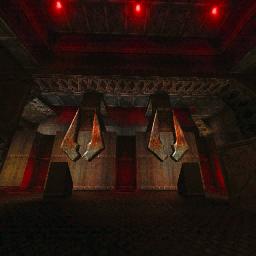
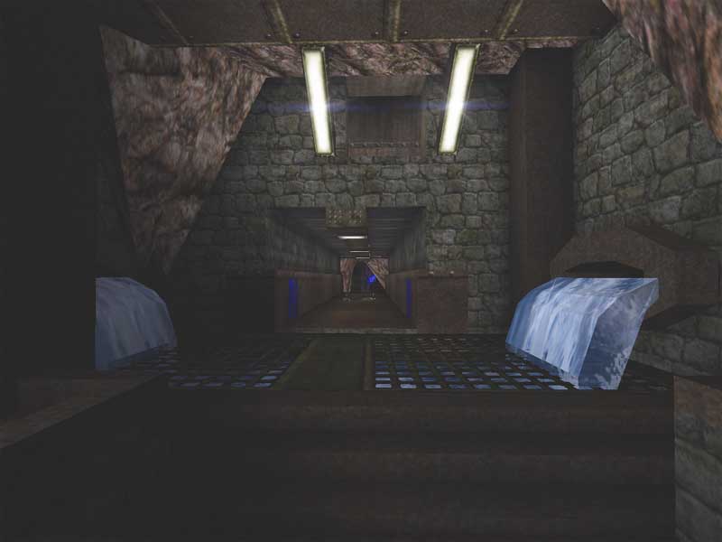
The ambiance of a large Na Pali mine is unmistakable here. The typical Unreal cave/mine textures are put to good use, minus the wood. The cave theme then moves fairly smoothly into dressed stone walls bordered and ringed by heavy iron. Moving to one side will bring you more dressed stone with much less metal. The other direction with lead you to all metal. Finally, moving through to the other teamsâ base, youâll enter a massive lava cavern with lare metal catwalks to get you across. Overall the textures are aligned well â there was certainly plenty of texture work to do. There are a few spots where a little more alignment could have been done. I noticed an N symbol edging into the floor, the cave textures in the flag rooms looked too small and repeating an the rocks in the lava room werenât aligned at all. But the texture choices could have been a little better in terms of design continuity. There were a couple different rock textures used in the flag caves and a completely different one in the main lava room. There were a couple of different dressed stone textures which should have been limited to 1, and the metal textures could have had the variation turned down a little. Texture varity is important to spice up a level, but with so much variation the continuity of design gets a little lost. The architecture is nicely executed. Everything fits the theme pretty well overall. There are some spots where it seemed like the author threw in some geometry just to get things connected but theyâre not many. And there are nice curves in ceilings and corridors from time to time. Lighting is very nice throughout. Nothingâs overly saturated with color and thereâs a nice variation between brown/yellow, white, blue, and red. My only big lighting complaint is that the main lava chamber is a little too ambient lit. The lava glow seems to be the same from top to bottom where it should have lessened as the light rises to the ceiling.
BUILD: 2.5
The author must have spent a long time in construction. There are so many cuts and drops and then, of course, the caves and the curved corridors and ceilings. Well, everythingâs assembled well here. The doors work well and at a good speed, as do the movers. Perhaps the lifts are a little too fast, but they work well. There some nice ambient sounds scattered around the map â lights buzz/hum, waterfalls splash, movers make appropriate sounds as do the movers. But in between these sounds there arenât any others. Since the level is so large, it would have been nice to hear a few more things while cruising through the map. My only complaint about the build is that there are some side rooms that seem like theyâre too much. The either could have been cut from the map or simplified a bit. As it is, thereâs so much lateral room to explore that until the layout is memorized, a player could spend quite awhile just getting out of whichever base theyâre in.
CAST: 2.0
The bots put up a pretty good fight. They tended to favor the central route over the sides but I did have to chase them through the side tunnels from time to time. The always had someone on defense camping the flag and there was always a fight in the lava room. The weapons were spaced out pretty well and I was never found lacking. Some of the corridors were a little too narrow for comfort. I like a nice dangerous narrow route from time to time but some of these should have been widened a bit. There was lots of nice defensive z-axis but not a lot of offensive z-axis which sometimes made it quite difficult when capping. On the other hand, when running with the flag, there was lots of opportunity to âescapeâ using a lift to give a little breathing room. Finally, the FPS was up and down all over the place, but with all the brushwork thatâs understandable. Never dipping to unplayable, it may sometimes be a little bit of a bear on older machines. Overall the bots and layout provided for some fun matches. If the defensive z-axis had been lightened up on a little more, some narrow corridors widened, and had the bots used the side routes more, this would have been great. And if you get stuck for strategy, the author includes a strategy guide.
A large CTF map with some good Na Pali mine atmosphere, this map provides some challenging flag capping. Some of the textures and geometry could have benefited more from some better conceived continuity of design and some of the side spaces could have been removed/reduced. But with the bots working well, or with a dedicated team online, this one is a keeper for the CTF lovers out there. For anyone else, I would recommend it, but some will keep it and some will throw it away.
|
| |
| | | | Map Comments |
| DiFool
01-30-2003 01:26 PM MST | Rating: 8 | | Gritty underground map (well, it is set in a mine), with
multiple flag routes, good bot play, and some kewl
twists and turns here and there. Some spaces are
unnecessary for play, and could have been shrunk or
eliminated, but otherwise is well-done. Even the
large central cavern doesn't lag.
| Vertigo
11-20-2004 02:26 PM MST | Rating: 8 | | no matter what other ppl say. DavidM will always be the best,period
| SoH_Ghost3021
11-20-2004 05:39 PM MST | Rating: 9 | | davidm strikes again! wOOT! hey, this looks like that one level for Operation:NaPali.
| quillion
11-21-2004 06:57 AM MST | Rating: 4.5 | | After playing this map for a while, i wondered how it was getting high scores. The first thing i noticed is, a lot of the lighting is very basic and some sources, look totally unlit. Some parts of the map get lit, although from the lights direction, it should be shadow. A good few places where ambient light is used, it kills the light from the source itself. One example is in one part, you have red light on a ceiling from a source, but the light source itself is more orange. Some tunnels are lit blue, but contain no light sources at all.
Before you say 'is it your video settings?' no, it is not. Other maps have full and nicely lit sources, take DM-Dinashar for example.
Light textures are also misaligned, in places. The approach to the red base (tube) contains a bsp error, causing you to be blocked by nothing. A lift in the red base (near pulse) is actually blocked. It travels through the two floor plates/platforms.
Texture alignment is a few places, badly overlooked and not used well at all (base tubes). Infact i found the textures frankly, boring.
Architecture is bland. Nothing is really supported and you don't get the impression, that those beams that are there, are doing anything worthwhile. The lack of trim and flow in the construction is all too obvious to see. I get the feeling that the author, had enough of the map and couldn't be bothered with it. The whole place is very square (apart from the caves) square blocks intersected from the ceilings, in my opinion looks, well, how to say this nicely? Rubbish.
Gameplay is good, but like in the review, some rooms need serious attention, or to put it another way, deleted. Getting the flag, then running into a dead-end, is a real flow killer for me. Flow is restricted at times by poorly placed light housings, e.g. the (fast) lifts, the housings can block you and exiting the bases, a pain when youâre getting followed.
Quite honestly, im at a loss as to how this map has received high scores. Flow blocking brushes and poor lighting, make this just an average map, with average gameplay and looks to match. If the name 'DavidM' hadn't been attached to it, i wonder how it would have been received then?
[EDIT] cursed, i'm one of them. The word 'arrogant' springs to mind.
| CursedSoul1
11-21-2004 05:56 AM MST | | most people dont even like davidm.
I think back then the map was quite good,
compared to nowadays standards (in ut) it might not be so good, but back then....it was 2000 there where a lot of maps that where waaaaaaaaaaaaaaay crap compared to this one.
| Drunken Peamole
12-05-2004 03:26 PM MST | Rating: 8.5 | | HEY, Sir Drunken Peamole da GREAT is back and drunka thn EVAAAAAA!
Woooooooweeee!
Yaaayaaaah!!!
WOW! What a piece or shART!
Wonderful. NO... Wonderful with cave-like benefits in addition to spactacular game-play, bot-tactics, and architecture!
SO, Good oll David M's here, Aee!
Haya Doin!
PS: My first map comin up. DM-%SPACE FLOOR%.
Try it when it goes out on Nali City.
Only for UT99. (I hate UT03 & UT04) "crapy weapons".
| Derdak2rot
12-06-2004 01:03 AM MST | Rating: 6.5 | | Not the best work of DavidM . the archi is boxy and the lighning is not great . the good point are the bothpathing and the layout , but it's not my prefered map for that ( mmmh!! Shadar !!). in my opinion , average map .
Edit : me too , i don't like UT03/04 for their weapons but i would like to try the UTXMP for UT2004
|

|
|
 |
 |
 |
 |
|
 |
|